
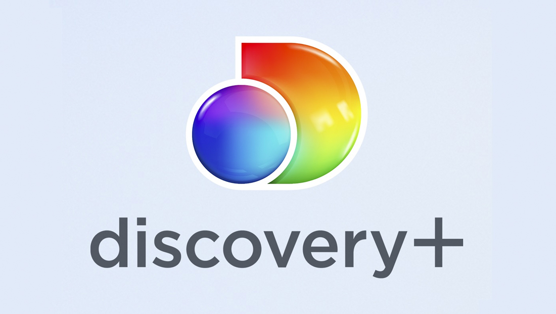
Discovery+ goes with colorful geometric logo with nods to multiple corporate sources
Weekly insights on the technology, production and business decisions shaping media and broadcast. Free to access. Independent coverage. Unsubscribe anytime.
With the announcement of the Discovery+ streaming service coming to the U.S. just after the start of 2021, there is also the unveiling of a new logo design for the service.
According to notes on brand assets released by Discovery, the logo shown here is destined for the U.S. market only.
Overall, the new logo is a take on a variety of existing Discovery brand elements, though the basic shape and form appear to come from the Discovery Inc. corporate logo’s globe and “D.”
Discovery Inc. corporate logo.
Discovery Inc. and the flagship Discovery Channel have two different logos — with the corporate brand set in a customized sans serif with a globe icon, a longtime feature of the company and channel’s brand, jutting into the left side of the “D.”
It’s worth noting the lockup eliminates the dot above the “i” and also features a tweaked arch in the “r” that accommodates the slope of the “y” next to it.
Some iterations of the corporate logo feature a more photorealistic version of the globe, while others offer an outline only one with north and south America shown at a slight angle.
Compare that to the Discovery+ logo design, which is available in both the stacked version shown above and this horizontal version.
The horizontal lockup of the Discovery+ logo.
For the streaming service, the typography appears to be Gotham, which has similarities to the one used in the Discovery Inc. corporate logo as well as Sharp Sans, a font used for headlines and primary text on Discovery Channel website. The font also has some similarities to the open-source Montserrat, which is used for much of the text on the corporate website. The Discovery+ website, meanwhile, uses Gibson from Canada Type for body copy and Bebas Nueu Pro for headlines.

To quote Chandler Bing, “could there BE any more fonts?”
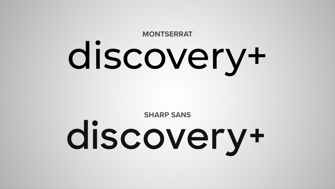
How the word ‘Discovery+’ appears when typed out with Montserrat, top, and Sharp Sans, bottom, without any customization.
Most prominent in the Discovery+ logo design, however, is the use of the simplified shape of the “D” and globe as a circle (again, borrowed from the Discovery Inc. logo design).
The Discovery+ logo also sports a gel-like rainbow effect, with, if one squints, has the faint suggestion of north and south America in the blue and violets that make up most of the hues in the circle.
When used against a colored background, the design gains a white outline, as opposed to the curved gap that separates the gel like shapes when set against white.
This Discovery Channel logo, from agency Roger, debuted in 2019. The logotype has some notable customizations, including the angular ‘y’ and distinctive ‘s’ and ‘c’ as well as the ‘D’ that lacks a left vertical stroke and features a rather crammed version of the world in it.
Of course, it wouldn’t be a proper “plus” branding without a prominent “+” sign added — and Discovery has included a simple and straightforward approach that aligns with the baseline of the word “Discovery” (which, by definition, excludes the descending “leg” of the “y”) and with a height that matches the highest point of the logo — the vertical bar of the “d” and top of to dot on the “i.”
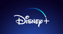
The stroke thickness has been designed to mirror the ones used in the characters found in the logotype but follows the symmetrical and straight line rendering of “+” as opposed to the slight curved found in the Disney+ logo design that acts as a continuation of fairy dust arc or the angled and thicker and slightly angled look for ESPN+ (both of these properties happen to be owned by Disney).

tags
discovery channel, Discovery Networks, Discovery Plus, Disney Plus, ESPN Plus, fonts, logo design, OTT, streaming
categories
Branding, Broadcast Industry News, Heroes, Streaming