
Q&A: Newsy rebrands with focus on balance, multiple angles
Weekly insights on the technology, production and business decisions shaping media and broadcast. Free to access. Independent coverage. Unsubscribe anytime.
Newsy, the streaming news service of E.W. Scripps, relaunched on October 1 adding an over-the-air footprint on stations across the country.
As part of the change in direction, the news channel used the opportunity to roll out new branding and on-air design along with a new studio in Atlanta. For the project, Newsy partnered with Elevation, which has worked with Scripps’ Katz Networks on projects including Court TV and Escape, to reimagine the network from all angles.
We recently had the chance to speak with Dianne Frisbee, art director at Elevation, about the project.
Talk a little about the client brief and scope of the project?
Newsy was an established streaming news service that was acquired by E.W. Scripps. They set a goal to launch Newsy as a free, over-the-air, 24-hour news service and asked us to work with them to create the new on-air brand.
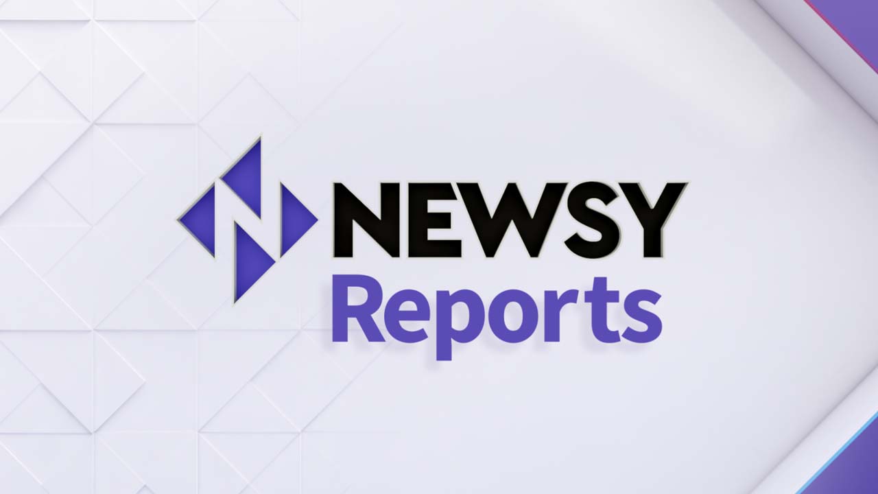
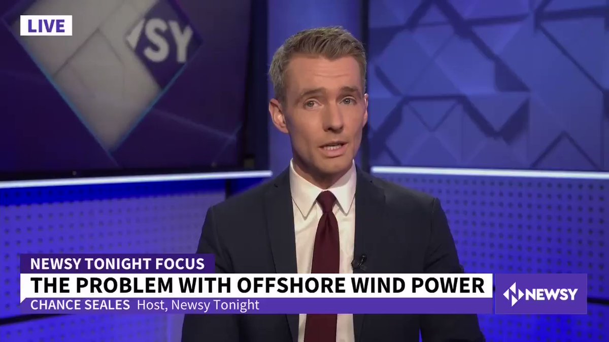
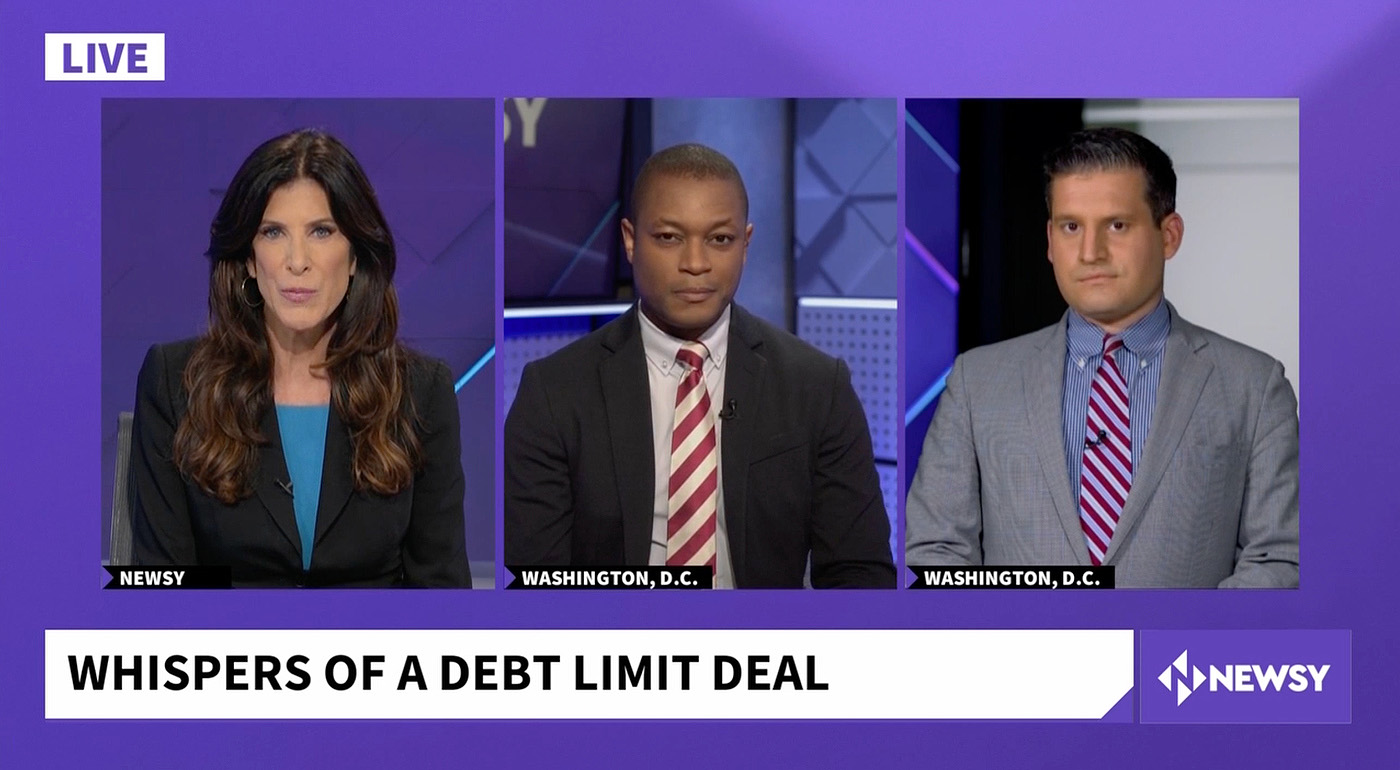
The scope of work included a new logo, brand aesthetic, live graphics system, promo toolkit, monitor content for their sets, and branding elements for social media. We needed to think about how the look of the network would progress from Morning to Night, as well as how to differentiate a select number of primetime shows.
One of the challenges for this rebrand was that everything was evolving simultaneously. From entirely new set designs and branding to additions within the leadership team. The timeline for the scope of work was ambitious, and the Scripps and Newsy Teams established open lines for quick communication.
How did you land on the overall style and direction?
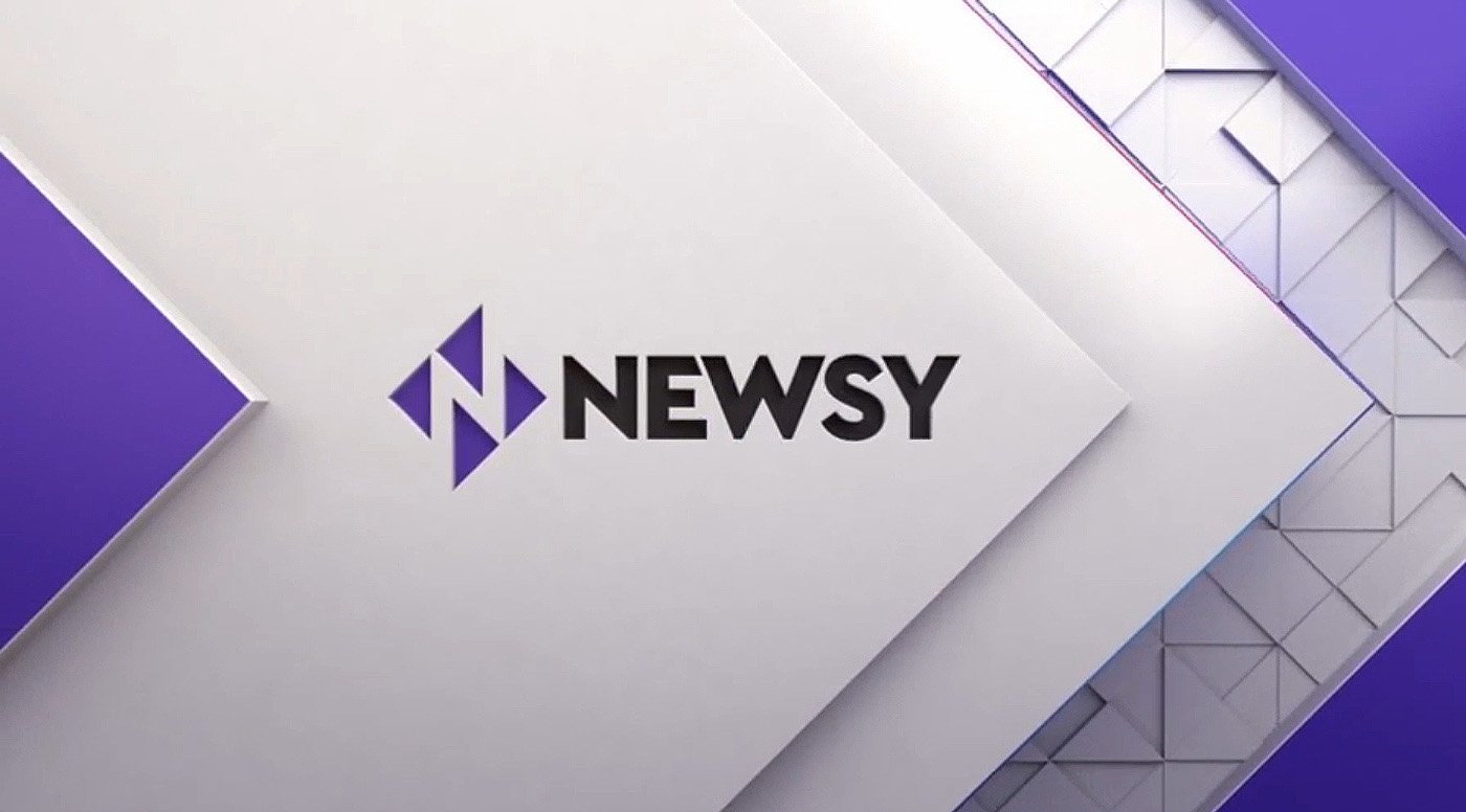
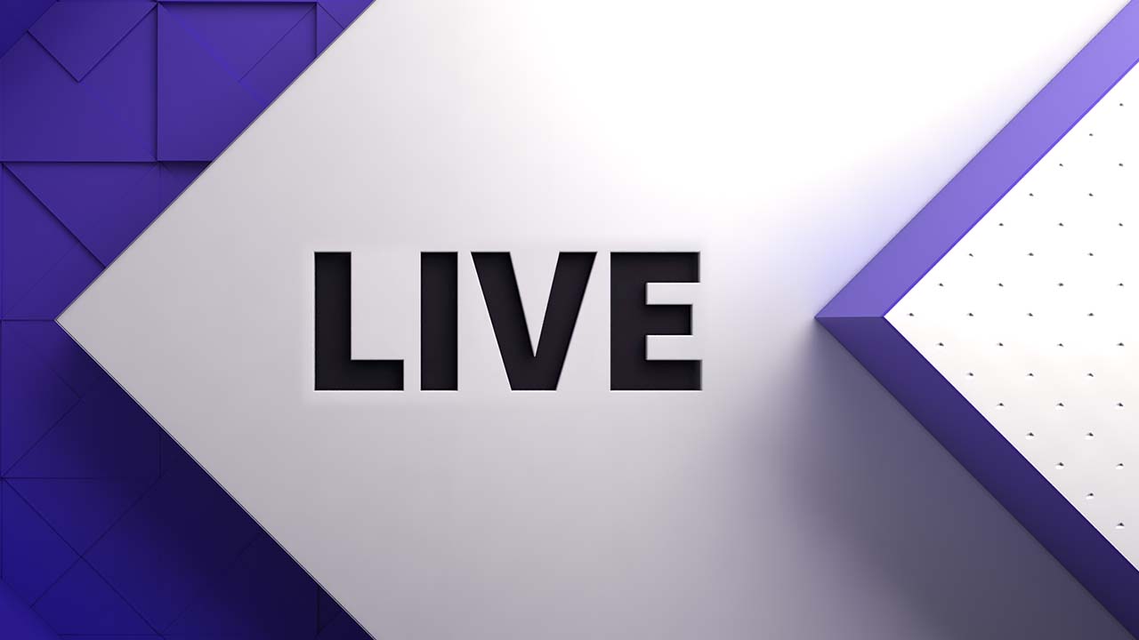
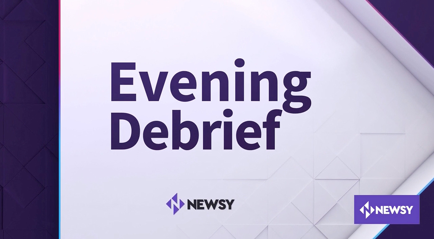
We began with a new logo design. Initially, we explored options that expanded upon Newsy’s existing logo and the theme of conversation. After a couple of rounds of development, our 4 arrow design surfaced.
All design decisions that were made had to promote the theme of “balance” – not left or right. The icon is made up of four arrows: 2 pointing left and another set pointing right. It acknowledges the political nature of news without promoting one direction over the other.

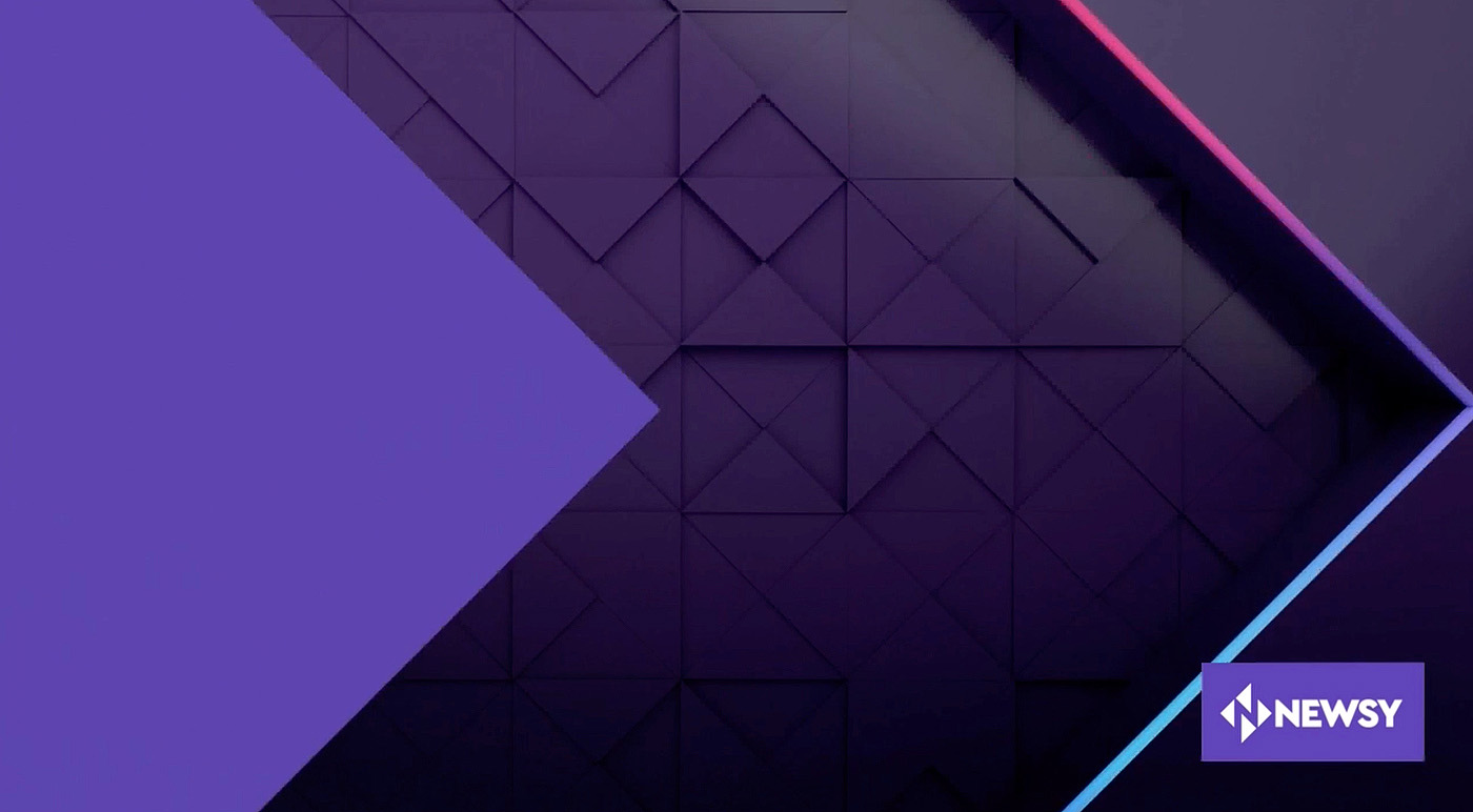
We wanted to establish a clean, neutral space to showcase the dimension of the arrows with natural lighting and matte textures. A second theme emerged around the idea of “depth”. Newsy prioritizes depth over debate; so we incorporated layers of our simple, geometric triangles in tension either stacking or receding to create a visual for how investigative journalism covers all of the angles.
Newsy is unfiltered and opinion-free. They are authentic, providing context, and striving to make meaningful emotional connections. These qualities influenced our aesthetic decisions.
How did you approach brand differentiation?
At the beginning of the project we reviewed news services and the competitive landscape to determine Newsy’s position in that environment. We defined the Newsy audience as sitting between the old guard media viewer and youth culture targeted news media consumer.
Color and the 3D material and textures were ways we could bring something unique to the brand. Newsy isn’t trendy, glossy, or smoke and mirrors. The application needed to communicate what Newsy is and isn’t.
How was the color scheme chosen?
We explored several colors: from keeping their original Newsy blue to an ultra-modern, Aqua Menthe.
Our top pick was ultraviolet/ purple. The rationale is that the traditional political colors are red and blue. When you combine red and blue you get purple. It seemed like the ideal choice to promote our theme of balance. Another advantage was that the color is somewhat underutilized in the competitive landscape and would help the brand stand out.
With full transparency, we included a gradient from red to blue illustrating how the purple sits in the center of this spectrum.
What fonts were used in the package?
The logo font is based on Cera Pro bold. It feels modern but friendly and open. Plus the negative space in the “N” was closest to the isosceles right triangles we wanted for our four, 90-degree arrows in the icon.

We made the modifications to the N and other subtle adjustments like the cap-heights W and Y.
For on-air, two open-source typefaces were selected: Oswald and Source Sans Pro. Oswald is a condensed display font for headlines and main titles. Source Sans Pro is a sans serif font family with 6 weights that combines geometric characteristics with a few humanist touches, like the tail on the lowercase l.
These fonts were selected for their legibility and Open Font License (OFL) that makes them easy to use for different applications.

tags
Dianne Frisbee, E.W. Scripps, E.W. Scripps Company, Newsy, scripps, Scripps Broadcasting
categories
Branding, Broadcast Design, Exclusives, Executive Session, Featured, Graphics