Louisville station rides the ‘WAVE’ back to its past for new logo design
Subscribe to NCS for the latest news, project case studies and product announcements in broadcast technology, creative design and engineering delivered to your inbox.
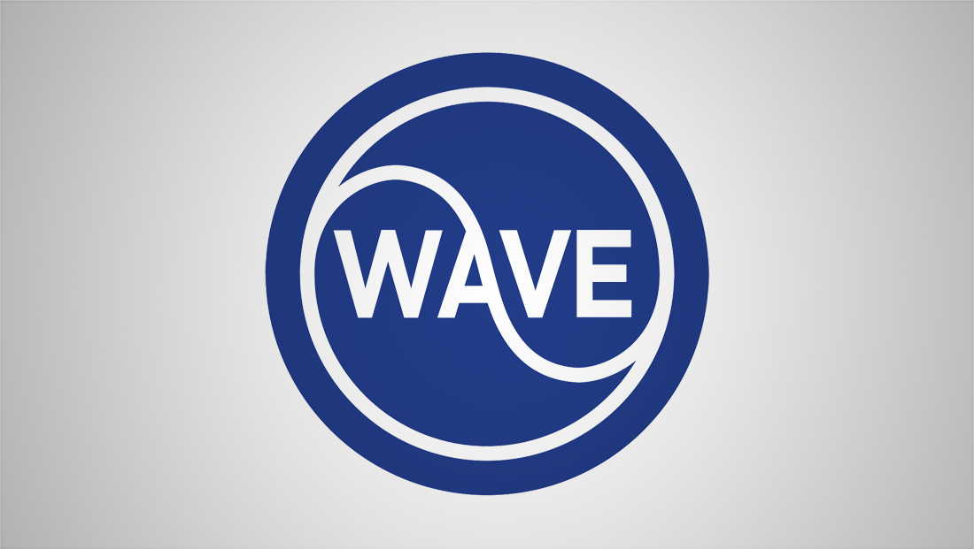
WAVE, the NBC affiliate in Louisville, Kentucky, has switched to an updated logo design that draws on the station’s history and has a bit of fun with the word that its call letters spell out.
The new logo features the word “WAVE” spelled out inside of a circle with an additional ring reversed out.
There is then a curved stroke that starts above the “W” in the upper left of the mark and curves downward, intersecting with the right side of the “A” before starting to loop back upward in the lower right, just below the “E.”
That curved element is a reference to “waves” in the sense of airwaves (as opposed to the ones in the ocean), which is said to be the inspiration for the station’s call letters (Louisville isn’t exactly known for its surfing).
The station is one of a handful in the country that pronounces its call letters as a word — so its “WAVE News” branding is announced as “wave news” as opposed to “W-A-V-E News.”
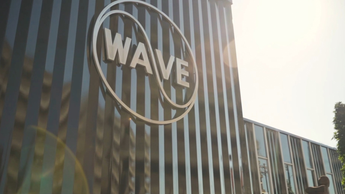
While the new logo is a new look to many viewers, longtime residents might recognize the design from a vintage logo that it used from 1958 to 1974 and still adorns the station’s building today.
After cycling through some other designs, the station went back to its roots in 1988 — its 40th anniversary — with a ring-shaped logo.
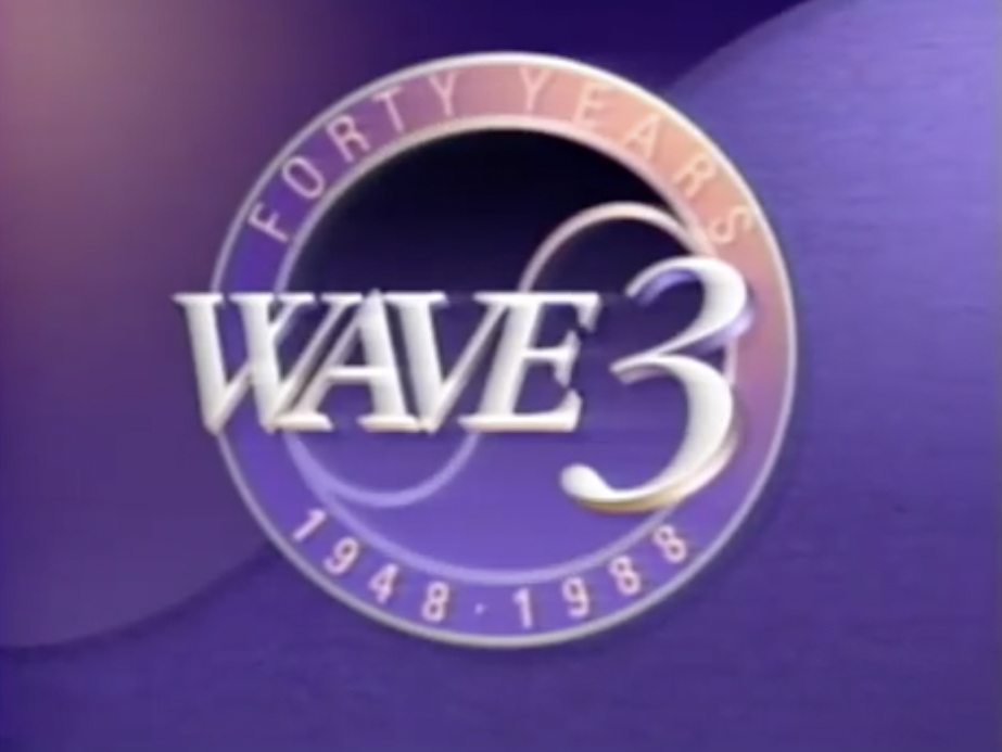
That logo did not divide the call letters with the wave symbol, which was reversed as well. The call letters we switched to an italic, serif typeface with a stylized “3,” the station’s over the air channel assignment, likely important given that this was still in a time when paid television was still growing.
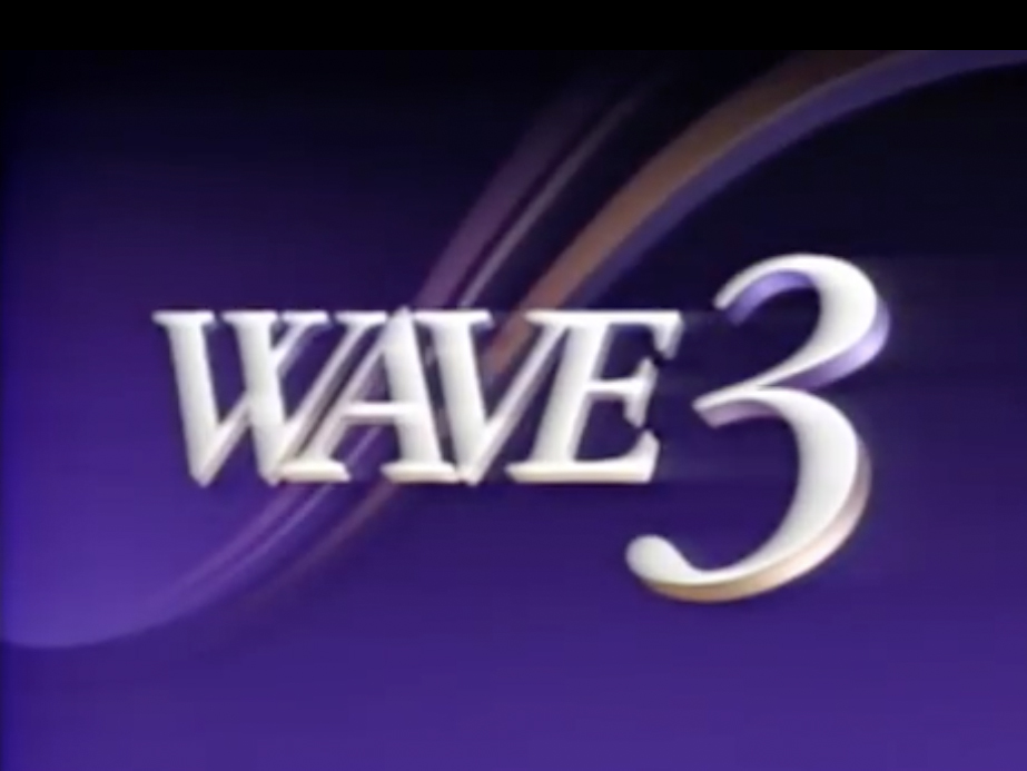
After 1988, the station kept the logotype but dropped the ring and kept around some of the “wave” elements as background imagery.
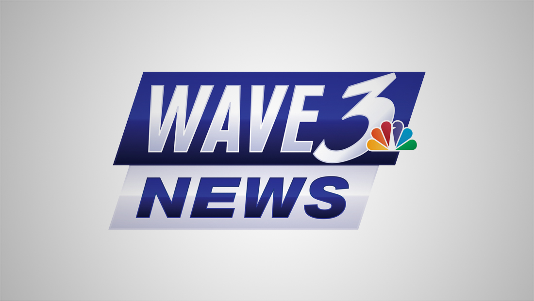
Since then the logo was redesigned multiple times before landing on the sans serif italic look seen here.
The logo lost all circular references, with the exception of the prominent curve in the stylized “3” glyph, which had also switched to sans serif. The logo also gained the NBC peacock.
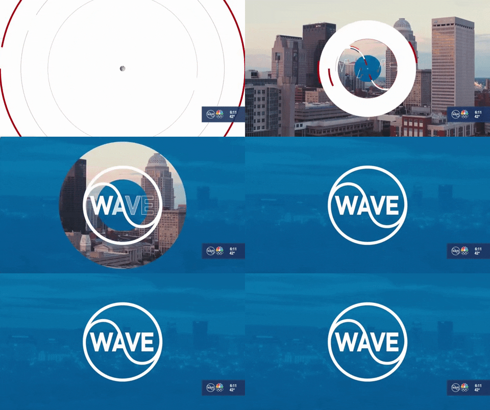
When creating its latest logo, the station did opt to refine the look over the 1958 version, most notably making the waveform, which went back to the same general path it sported, part of the letter “A.”

Other changes included using a slightly less bold font that roughly matches the thickness of the ring and “wave” element.
The station kept most of its existing graphics package, though there were updates made to incorporate more circular elements, which have a bit of a different style than the glassy, 3D look used in other animations.
WAVE is owned by Gray Television.
Subscribe to NCS for the latest news, project case studies and product announcements in broadcast technology, creative design and engineering delivered to your inbox.


tags
gray, Gray Television, Louisville, wave
categories
Branding, Broadcast Design, Featured, Graphics, Local News