
OBS graphics package, seen by millions around the globe, had many firsts this year
Weekly insights on the technology, production and business decisions shaping media and broadcast. Free to access. Independent coverage. Unsubscribe anytime.
With the 2022 Winter Olympics in the book, one of the most noteworthy changes for TV viewers was both prominent and subtle — an updated graphics package from Olympic Broadcasting Services that was full of many firsts for the look.
OBS is an organization that provides rights holding broadcasters with pool-style video feeds of events along with insert graphics showcasing timing, scores, athlete names, standings and other information. It also provides instant replays.
For the 2022 Games, OBS introduced key design elements that have become popular in the world of sports broadcasting over the years but haven’t quite made it into their look.
2022 marks the first year the OBS graphics package featured a prominent, illustrated reference to the winter events in the form of a snowy peak incorporated into the header bar of many elements.
It also marked the first time the host country was referenced prominently, thanks to a small illustration of the Great Wall of China running along the mountain slope.
During the Tokyo Games, the OBS look did include references to the organization committee’s segmented icon subtly faded into the background.
There are also blends of blue and highlights along with animated snowflakes falling in select portions of the look — another big step in the evolution of the design style.
By going with the snowy and mountain motif, OBS is able to complement the looks used by many of its RHBs, many of whom often incorporate snowy mountainscapes in their design for winter games as opposed to the more unique looks used for the summer iterations.
While RHBs still have the option to mix their own feeds, graphics and other visuals into the OBS feeds, most of them use most elements provided during competitions, including the on screen graphics.
This stems from the days before graphics technology wasn’t as advanced as it is today.
Originally, graphics such as the ones provided by OBS would have been too difficult, time-consuming and costly for most RHBs to produce on their own because of elements such as timers, standings graphics and other elements that often need to be updated live or within seconds of an event finishing.
Many of these graphical components, especially timing elements, are integrated with physical systems on the ground at events, such as the official clock, or rely on data tabulated on the fly from judges and displayed on in-venue video boards at nearly the same time as it appears to TV viewers.
So, OBS came up with a solution — it would handle inserting this information onto its feeds.
To make this possible, OBS created its own graphics package that would be seen on broadcasters around the globe.
The ‘boxy’ look that was used for many years.
This look was then used for about 15 years, keeping the ‘boxy’ parts in some elements but added an angled edge and curved corners to others.
The look then evolved into this, a green and blue look that used rounded corners and sides almost exclusively. It added gradients and hints of 3D as well.
For the delayed 2020 Summer Olympics broadcast in 2021, OBS introduced a major overhaul that included green and white semi-transparent backgrounds, the switch to the typeface Frutiger. This look also included hints of the Tokyo 2020 logo in the background.
2022 look
In 2022, OBS continued to use the basic concept introduced in 2021, but with notable changes.
The Frutiger typeface, which uses faux small caps in many titles, remains.
Updates, however, included the aforementioned white mountain shape with gold wall accent. When used, it also serves as a container for the Olympic rings icon.
Perhaps not surprisingly, the green color scheme was also replaced with a blue one, a common hue used for winter Games graphics on RHBs’ own broadcast design packages.
There are also gold-yellow accents used throughout the look that matches the wall reference.
Much of the semi-transparent white background boxes have been replaced with a pale blue-gray. This notably could have been done because so many events in the winter Olympics take place in snowy environs, meaning graphics needed a background specifically designed to account for this to ensure the container and text remain visible.

Headers, which are shown in blue with snowy accents, have all or most of the transparency removed.
Meanwhile, the boxes gained slightly curved corners and select tiers of many graphics got a faded right side that appears to reference snow.
The number of iterations of graphics is numerous, so the screenshots below attempt to present a representative look across all events, but is by no means comprehensive in the sense that it captures every layout or graphics option in the package.
Slight variations of the looks shown below are also used in different or similar events, with information swapped out as needed.
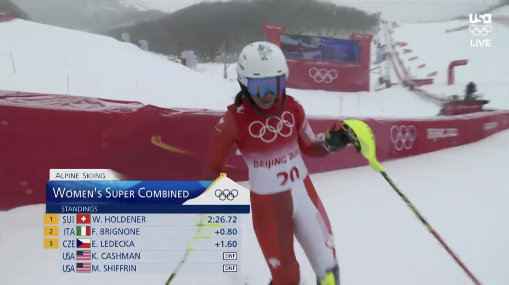
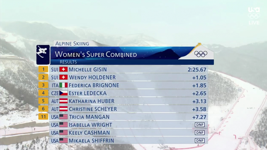
This alpine skiing graphic features the faded element in the top tier with the event name, mountain and Great Wall element and blue-gray boxes for rankings as well as gold boxes for top three ranking athletes. A ‘DNF’ (for ‘did not finish’) is done in a small white and dark blue rectangle with rounded corners.
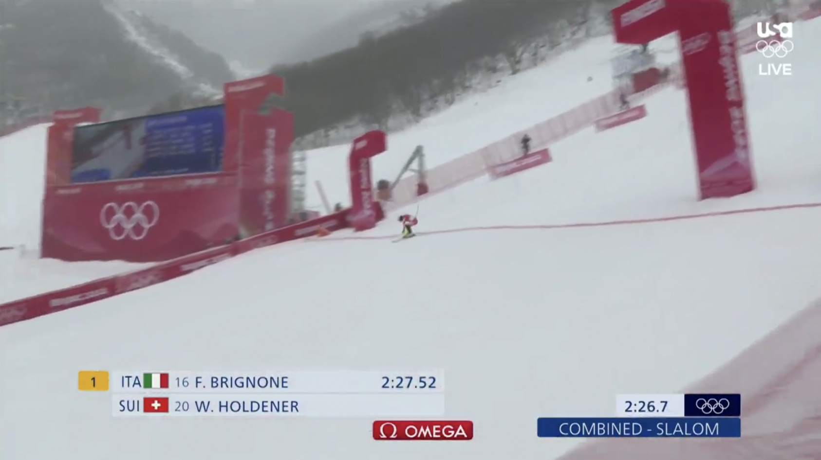
In this design, the need to make the previously white semitransparent background elements a light blue-gray to make it stand out against snowy landscapes is particularly evident. Also, note the Olympic rings in the dark blue box and Omega logo frequently shown on screen during timed events.
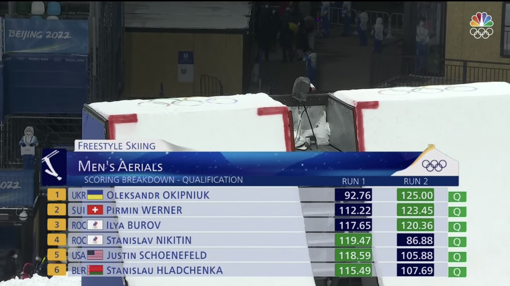
This full width freestyle skiing standing graphic features the traditional event pictograms along with a larger example of the animated snowy background in the dark blue header.
This athlete identification lower third also includes key performance stats, with the numbers in a medium blue box without rounded corners. There’s also a faded, angled element between the two qualification scores in the lower right.
One of the more simple looks, with a top five ranking stack along with clock and Olympic rings ‘bug.’

Curling, being the unique sport that it is, requires a special score box — that includes small icons representing the handles on the stones to designate how many are still in play. Most Winter Olympic events with scores and timers put this graphic in the upper left.
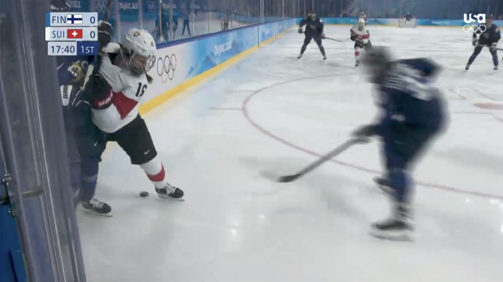
The graphics for hockey are also inserted in the upper left and incorporate the three digit country or team designation with flag next to each team’s score. There’s room for a game clock and period indicator.
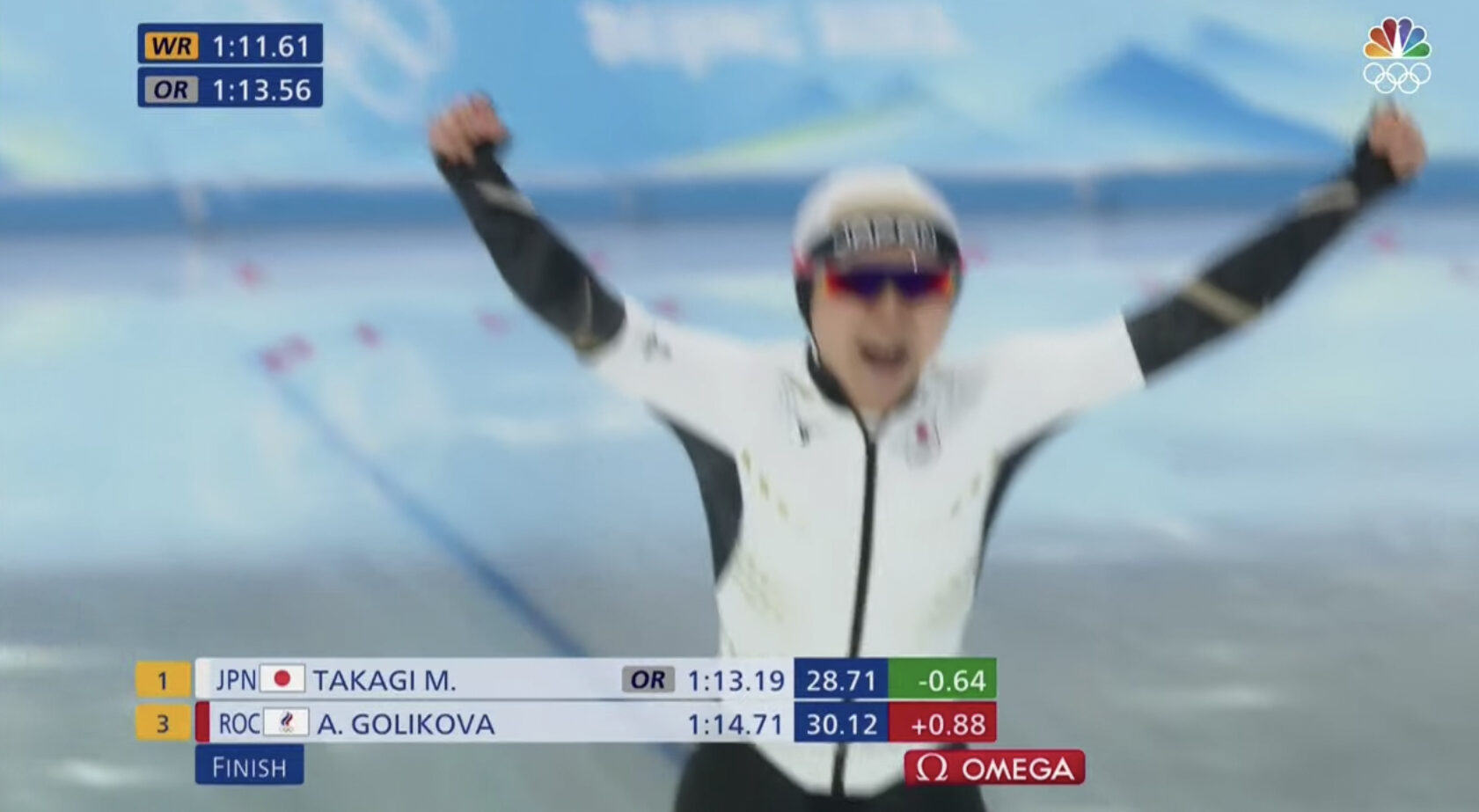
For select events and runs, a ‘WR’ (world record) and ‘OR’ (Olympic record) indicator can be inserted in the upper left of the screen. This image also shows rankings with times, an ‘OR’ designator for the Japanese athlete and their over-under times.
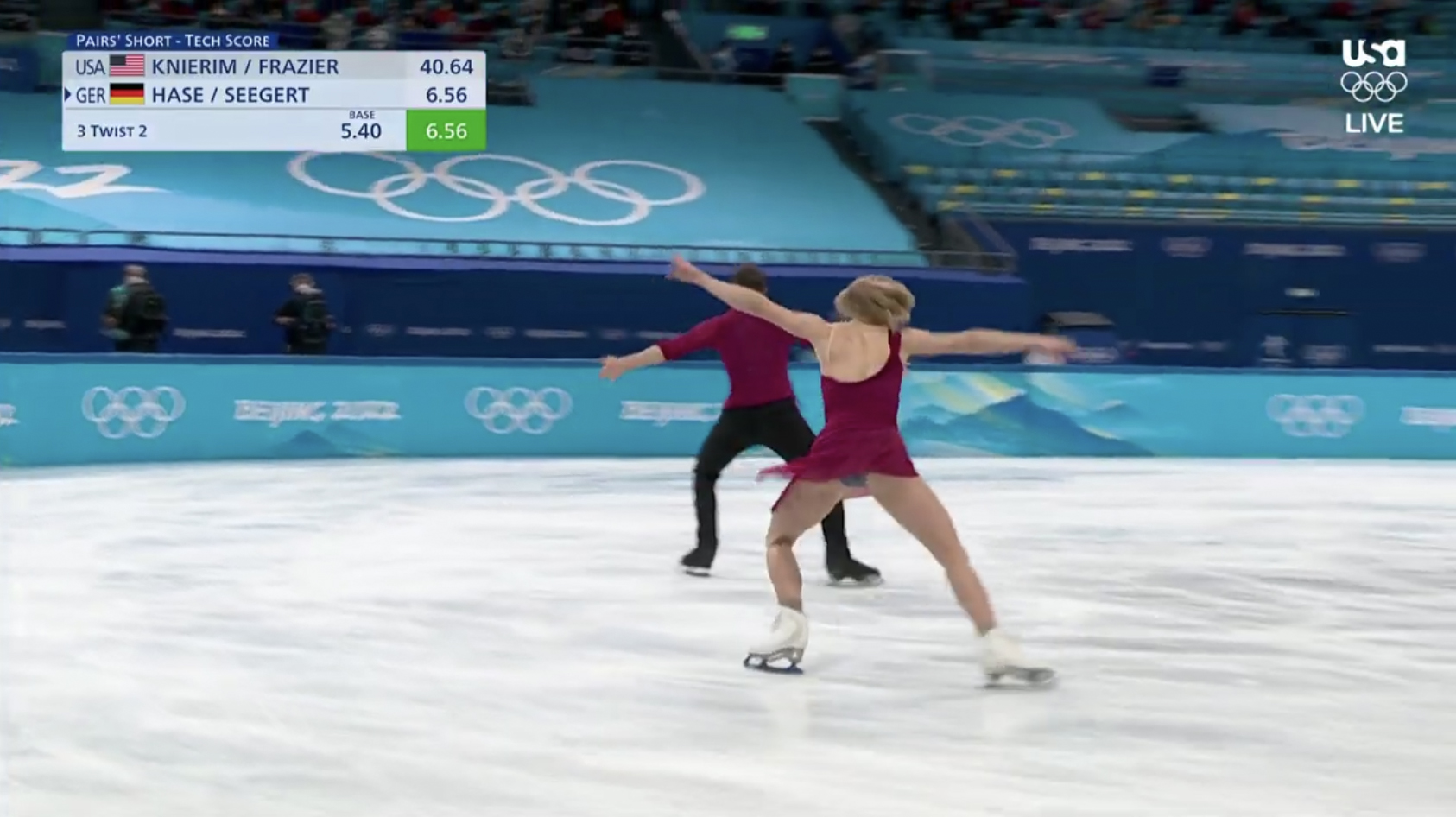
Figure skating events are some of the most complex to score and can include real-time score updates from the judges that are displayed in a variety of ways, including this fairly unobtrusive look that also identifies specific elements used in the program.
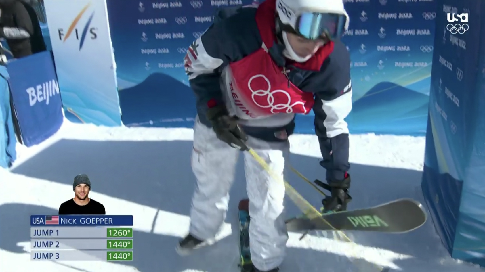
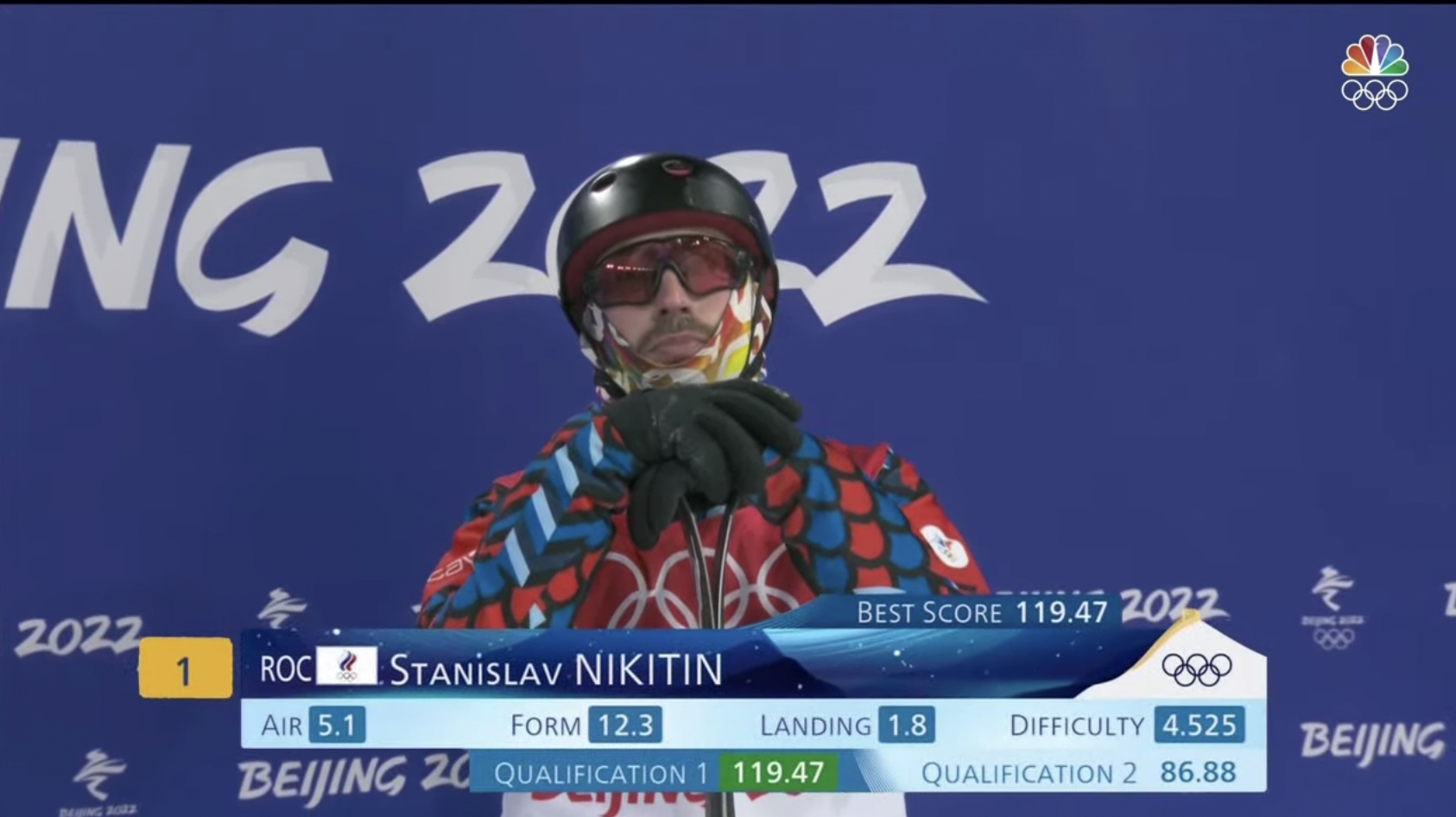
This is another simple design that includes rotation data for freestyle skiing events. The numbers are higher than 360 degrees because the event includes multiple rotations.
This simple lower third style graphic showcases a player cutout, country code, flag, ranking and name along with the Great Wall and snowy slope look.
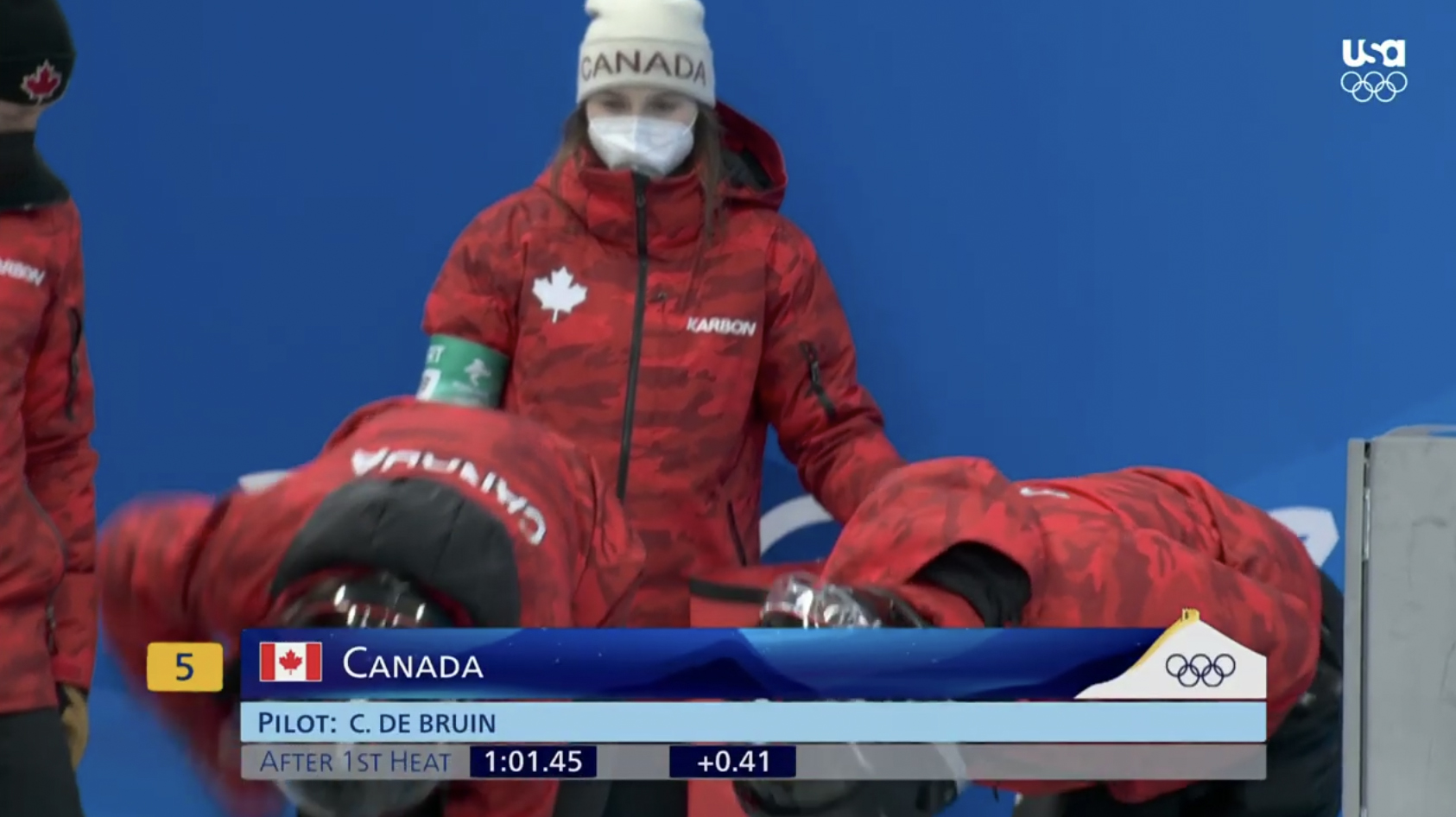
Another simple lower third style look can showcase the team’s home country along with other information, including team member names and current standings.
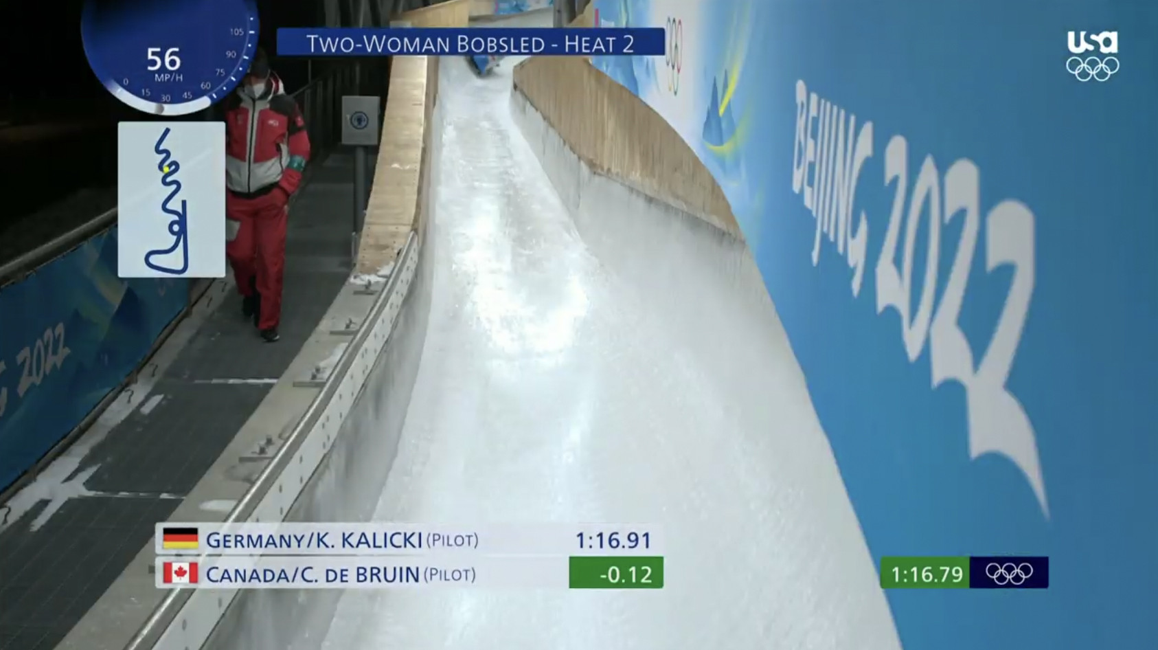
For bobsledding, graphics include a speed indicator ‘dial’ in the upper left corner along with a simplified map of the course with a yellow dot indicating a team’s current location. It can be combined with other information, including a timer and standings.
The 2022 OBS graphics package continues the goal of trying to be generic enough to use across multiple broadcasters and, in some cases, even combined with their own look.
In many respects, however, it represents an arguably much-needed step forward in terms of aesthetics that, before this year, was often not used in favor of keeping the look in line with that generic goal.
Notably, many RHBs, including NBC in the U.S., appear to be content with the apparent disconnect between their own in-house graphics and the OBS ones despite the often mismatched color schemes and typography.
In the broad scope of things, however, broadcasters likely have realized that adding their own graphics with all of the data OBS provides would be too complex and not worth the minimal advantage of having fully matching looks.
The advent of the OBS graphics package came decades ago — before real-time graphics were available at the level they are today.
Even today, many TV networks still cut to a fixed camera pointed at a video board at the New York Stock Exchange to get the “official” status of the market rather than running it through their graphics system.

Similarly, college basketball shot clocks were previously created using a fixed camera pointed at one of the display boards in the venue, matted out and inserted over the gameplay feed, rather than having the broadcaster tie into the clock’s current status — though today most major sports networks’ graphics systems do integrate directly with both the game clock and shot clock.
Even today, it’s probably technically more feasible than ever for OBS to provide some kind of formatted data feed that RHBs could tap into and generate dynamic graphics with their own looks on the fly. However, considering there’s also such a wide range of data that needs to be considered — some of it unique to specific events — it’s still probably not as simple it sounds.
In addition to the insert graphics, OBS also offers an animated intro sequence that many broadcasters chose to air, sometimes customizing it to add their own logos. NBC notably does not use it regularly, instead of using its own opens, with the exception of The Olympic Channel, which is a joint venture between it and the International Olympic Committee.

tags
2022 Winter Olympics, Olympic Broadcasting Services, Olympics
categories
Broadcast Industry News, Featured, Graphics, Olympics, Real-Time Graphics, Sports Broadcasting & Production