
‘The Source’ brings bright, textural look to CNN+
Weekly insights on the technology, production and business decisions shaping media and broadcast. Free to access. Independent coverage. Unsubscribe anytime.
Despite being a politics-centric show that’s based out of Washington, D.C., “The Source with Kasie Hunt” on CNN+ uses a fresh and bright look that combines references to D.C. without leading on the staid red, white and blue palette.
Produced from Studio B at CNN’s Washington bureau, the same space used by “The Newscast with Wolf Blitzer” and “Who’s Talking to Chris Wallace?” the show’s look illustrates how a single studio with the right blend of technology can take on drastically different looks when planned well.
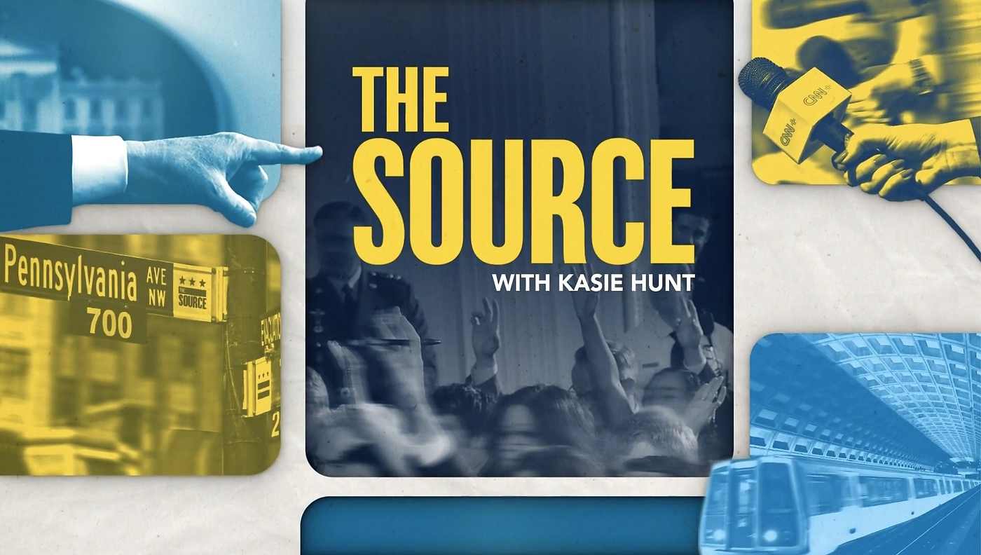
“The Source” uses a blue, bright teal and yellow color scheme featuring rounded squares and rectangles to house a variety of political and Washington, D.C. visual references.
Many of these images have been modified to include references to the show, such as adding its name to the lighter section of street signs normally dedicated to an image of the district’s double bar and star flag design.
The show open also includes animated elements that have been cut out, including a metro train, pointing finger and hand with a CNN+ mic flag.
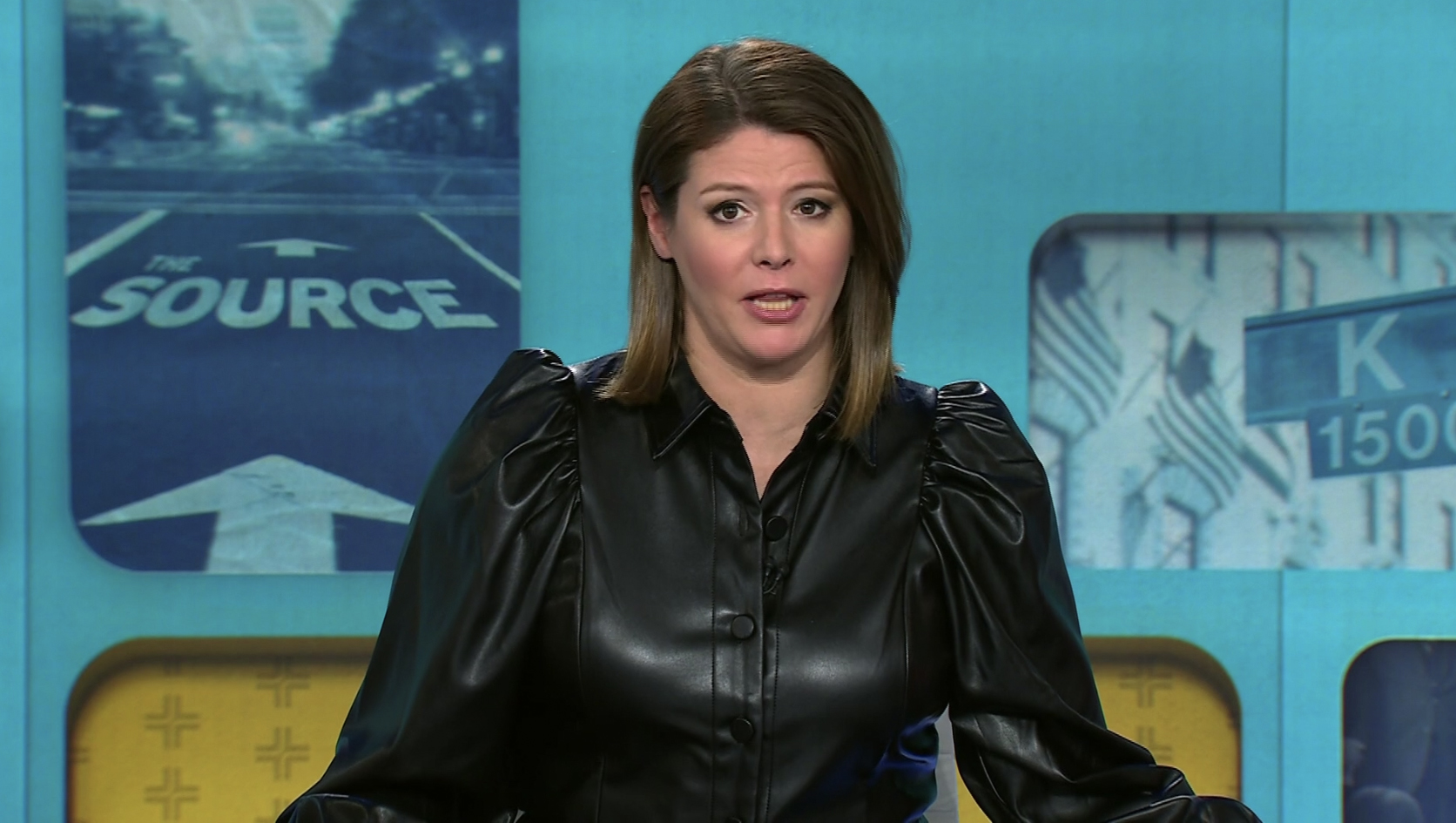
Another example is the image that was strategically placed camera left of Hunt’s one shot featuring a portrait oriented image of the Capitol with a faux street marking with “The Source” and an arrow pointing toward the iconic building. This photo has been tinted dark blue.
CNN+’s design team wisely left the position where Hunt’s head typically is devoid of any image, while a landscape image of a K Street sign, a nod to the core of the city’s lobbyist offices, while also incorporating additional visual interest and branding with a wide yellow block of repeating plus icons that appears approximately mid-torso down.

This graphic also features vertical lines baked into the image to create the appearance that the background is crated using vertical structural panels.
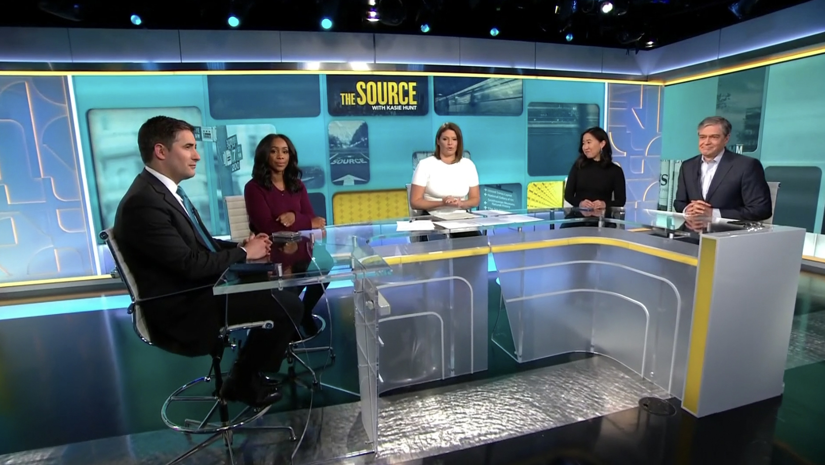
Hunt typically sits in the middle of a U-shaped desk taken from a collection of modular set pieces created for the streaming service by Clickspring Design that also includes a color changing band and end cap.
The desk is strategically placed so that a textured metallic floor accent runs right through the middle.
The frosted glass front features linear elements inspired by the plus icon, similar to the dimensional panels that flank either side of the primary video wall.
The set appears to be designed to accomodate at least four guests, two on each side, who primarily appear in front of the side video walls that sport similar graphics.
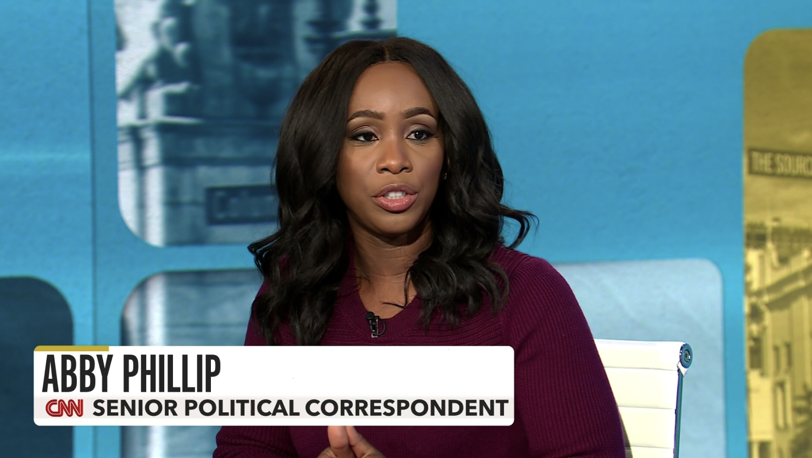
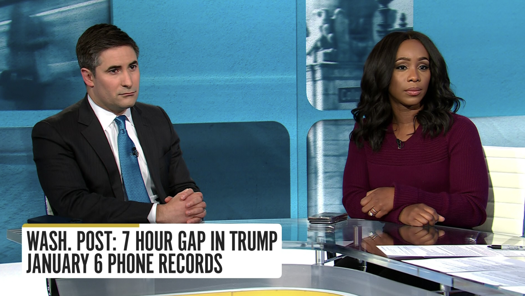
Lower third insert graphics are set in white rounded rectangles with a yellow accent in the upper left that use an odd mix of CNN Sans and a wider sans serif in the second tier, which also includes a faint gray background.
Topical headlines can also be two lines.
Fullscreen graphics also use the rounded corner motif to frame out content.


tags
CNN, CNN Plus, CNN Studio B, The Source with Kasie Hunt, washington d.c.
categories
Branding, Broadcast Design, Featured, Graphics