
FIFA tacks on plus sign formed with circles for streamer logo
Weekly insights on the technology, production and business decisions shaping media and broadcast. Free to access. Independent coverage. Unsubscribe anytime.
FIFA+, a new ad-supported streaming service featuring current and past “European” football games, uses the parent organization’s primary wordmark with a plus sign created using a series of circles.
FIFA announces its own streamer https://t.co/Ewy4H3m4M9 #BroadcastNews #TVNews
— TVNewsMix (@TVNewsMix) April 12, 2022
The streamer’s logo design leverages the 2018 FIFA logotype that features custom-drawn letters in a bold sans serif.
The mark boasts distinctive angled ends of the horizontal bars in the “F”s that match the angle of the left side of the “A.”
For FIFA+, the same base logo was used — but with a plus sign formed using five circles arranged to create a symmetrical symbol that’s similar to the mathematical symbol and Greek-style crosses.
It’s perhaps a bit interesting that FIFA went this direction instead of using something more blocky that integrated more closely with its distinct letters — though it’s also easy how a design like that could have ended up looking like the Chevrolet logo.

One also might wonder why a design inspired by the distinctive patterns found on the physical ball used in the game wasn’t used — but not all countries use the same style ball with the same markings — whereas all of the balls used in the sport are circular (keep in mind that in the U.S., so-called “European” football is referred to as soccer).
In fact, the ball used in World Cup play has gone through multiple designs in terms of both markings and more functional aspects that affect aerodynamics.
FIFA also may have wanted to keep its wordmark, which is often a highly protected piece of IP in sports, distinct from the logo for the streamer.
This approach was alluded to in the recently introduced Apple TV+ “Friday Night Baseball” graphics package through the use of circular lightbulb-inspired elements that, at least once forms a plus sign made up of five bulbs as well.
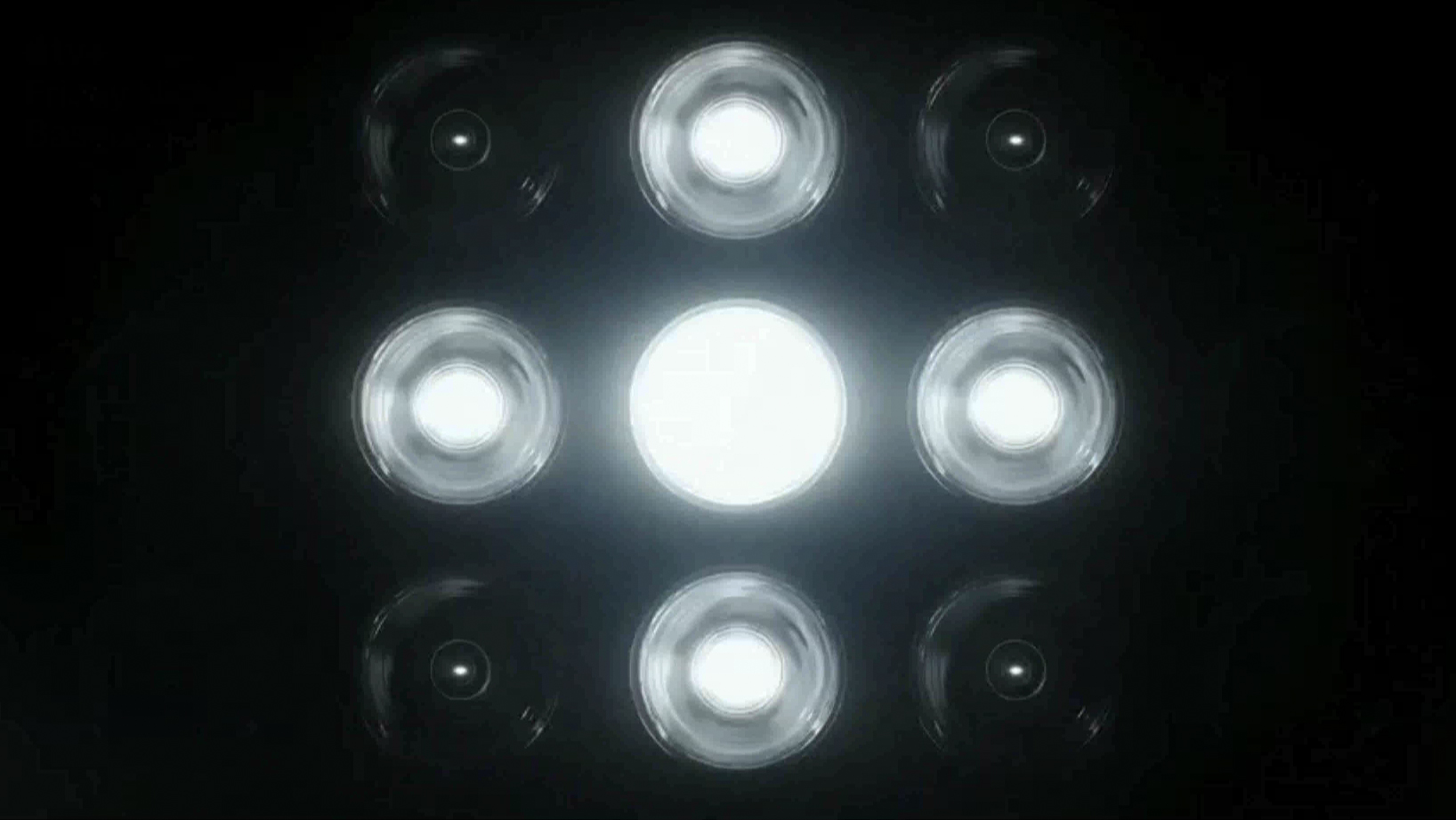
A plus sign formed with five illuminated bulbs among a set of nine in Apple TV+’s graphics for ‘Friday Night Baseball.’
Finally, it’s worth noting that the FIFA+ logo has some interesting similarities to the one created for the NewscastStudio+Max streaming service this publication “announced” April 1, 2022 — with the primary difference being that NewscastStudio+Max’s has a single non-solid circle to match our overall logo design (which some have compared to SoFi’s logo).
We're excited to announce our new streaming service #NewscastStudioPlusMax is coming April 1, 2023 pic.twitter.com/IrgLIWtOHm
— NewscastStudio (@NewscastStudio) April 1, 2022

tags
fifa, FIFA Plus, logo design
categories
Branding, Broadcast Design, Broadcast Industry News, Featured