
What the … W-I-T-‘F’ did this PBS station do with its logo?
Weekly insights on the technology, production and business decisions shaping media and broadcast. No paywall. Independent coverage. Unsubscribe anytime.
WITF, the PBS member station in Harrisburg, Pennsylvania, has unveiled a rebranding with a new logo design that aims to push the envelope.
The station’s call letters remain in lowercase in the logo redesign – which debuted in October 2022 – but now appear to be in a heavily customized typography that borrows heavily from typefaces such as Bauhaus, particularly with the “t” and “f.”
There’s also a distinct wavy “w” with heavily curved elements which tie into the curves found in the last two letters, but with additional diagonal strokes not present in Bauhaus. The far right of the “w” butts right up against the top of the “i,” which has a large circular dot on top, whose curves at least play nicely into the corner elements in the rest of the design.
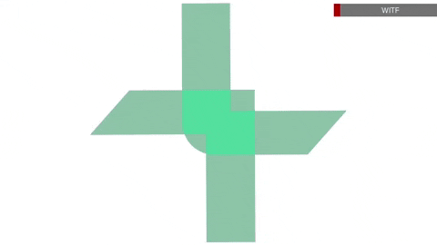
For an accompanying icon, the new logo features a mint green shape that appears to be suggestive of a TV screen (from the 4:3 days, no less). Or maybe a speech bubble. Or maybe a viewfinder or frame of film. Or maybe it’s some kind of symbol meant to suggest the idea of togetherness. It’s hard to say for sure which of these (or other) ideas fit, though perhaps that’s the idea — purposeful abstractness.
It’s also possible that the design is meant to convey portions of a traditional keystone shape, a reference to Pennsylvania’s nickname.
What’s particularly interesting about the WITF logo is that the entire design appears to grow from an x-height “w” on the left to the floating icon that floats above the letters like a cloud (maybe that’s a reference to streaming?).
This could perhaps be a nod to the idea that WITF’s programming features shows suitable for everyone as they grow up and their interests evolve.
Notice that the top curved portion of the “f” ascends higher than the tip of the “t” next to it, despite the fact that both crossbars are at the same level.

It’s also possible to interpret the “itf” characters as human figures in profile, something that the PBS logo has done for decades, with the “w” perhaps meant to suggest the excitement of being a child.
All told, the notion of growth is undoubtedly expressed, but it also creates the feel of an oddly morphed logo that seems to be stretching some kind of limit.
The morphing scale and bold, dramatic typography can also connect with the brutalist trend sweeping the design world now, so it’s possible that’s at least part of the inspiration.
When looking at the icon compared to the lettering, there are references to angles and curved corners in both — but they’re decidedly more exaggerated in the letters and could have benefited from consistency in that sense.
WITF sometimes displays the call letters inside a larger version of the icon, while also using it as an animated element and matte to frame imagery.
In addition to the new logo design, WITF has also introduced a “Let’s discover” tagline, which describes the mission of PBS stations pretty well, but also doesn’t seem to directly tie in to any other elements of the new look. Previously, the tagline was just as generic “Live inspired.”
Back in 2019, PBS itself redesigned its logo and brand identity.
The network, however, doesn’t require its member stations to use the new look, though some have adopted logos that look very similar — including using its proprietary PBS Sans bespoke font, which WITF is using as a secondary typeface on its website and tagline.
Where PBS Sans is elegant and simple, WITF’s new logotype is bold and loud.
PBS did specify a teal shade as a possible secondary color, but the one WITF is using is significantly brighter.
All that aside, the new WITF logo does, at least, attempt to be unique and stand out. It also appears to own its uniqueness unapologetically and embrace the look.
![]()

WITF’s previous logo appeared to be set in a casual typeface along the lines of Calibri or Officina Sans.
![]()
Classic WITF logos took advantage of the strong horizontal line that was formed when the tops of the “T” and “F” were connected to the “W-I” to create a single shape that attempted to be four letters but sometimes ended up looking like a rather hard to read Roman numeral of some kind.
It also ended up feeling incredibly top-heavy.
The circle, incidentally, has been a common element in the station’s look over the years. It appeared as a red glowing orb and as switching to two, more oval-shaped and overlapping ones.
The redesigned logo still features a prominent circular element, though it’s no longer distinguished by making it a distinct color.

tags
harrisburg, logo design, PBS, WITF
categories
Branding, Broadcast Design, Broadcast Industry News, Featured, Graphics, Heroes