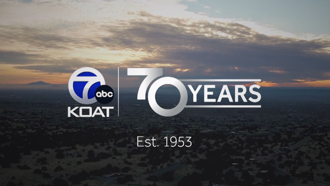
N.M. station marking marks ’70’ years by ‘taking apart’ its circle 7 logo

Subscribe to NCS for the latest news, project case studies and product announcements in broadcast technology, creative design and engineering delivered to your inbox.
Albuquerque station KOAT is kicking of its 70th year on the air with a special logo and content.
The station officially counts Oct. 2, 1953 as its founding date.
Unlike other stations marking key milestones in recent memory, KOAT perhaps wisely opted not to attempt to modify its circle 7 logo.
Instead, the station essentially deconstructed the logo so that the two numerals are both shown together in a separate lockup with the word “years” to the right between horizontal rules.
Because the “7” shape used inside the circle 7 variation KOAT uses has a curved diagonal stroke on the right, it was bumped right up against the upper left quadrant to of the “0,” which is rendered as a perfect circle.
This does result in the “7” being up off the baseline created by the “0,” but the look flows together well and the arrangement creates a sort of nostalgic vibe.
It could also be interpreted as a play on oldstyle numerals, though in most typefaces with the feature “7”s would dip below the baseline as opposed to this high.
It’s also easy to see how an animated transition between the designs could be done if needed.
This approach also allows the station to still use its full logo, a blue and white circle 7 design with the updated ABC globe tucked in the lower right.
It likely would have been relatively easy to add some element to the right of the circle 7 to make the logo read as both “7” and “70,” but it also would have resulted in there being three circular or oval elements within very close proximity to each other.
KOAT also created promos to advertise the special that will also likely play into future campaigns during the rest of the year that combine an announcer extolling on the station’s history and mission while a mix of present-day and archival footage, mic flags from over the years and past logos also make appearances.
The concept of tacking numbers onto station logos to form anniversary years can often be done well, but it also has taken some odd turns. And while it’s arguably not as important for viewers to know channel numbers anymore, with many stations still branding around their legacy pre-digital over-the-air numbers, it’s not surprising that many consumers still have numbers in their minds.
Subscribe to NCS for the latest news, project case studies and product announcements in broadcast technology, creative design and engineering delivered to your inbox.


tags
Anniversary Logos, Circle 7, koat
categories
Branding, Broadcast Design, Broadcast Industry News, Featured, Local News