
‘CNN Primetime’ opens with slightly dated, inconsistent look
Weekly insights on the technology, production and business decisions shaping media and broadcast. Free to access. Independent coverage. Unsubscribe anytime.
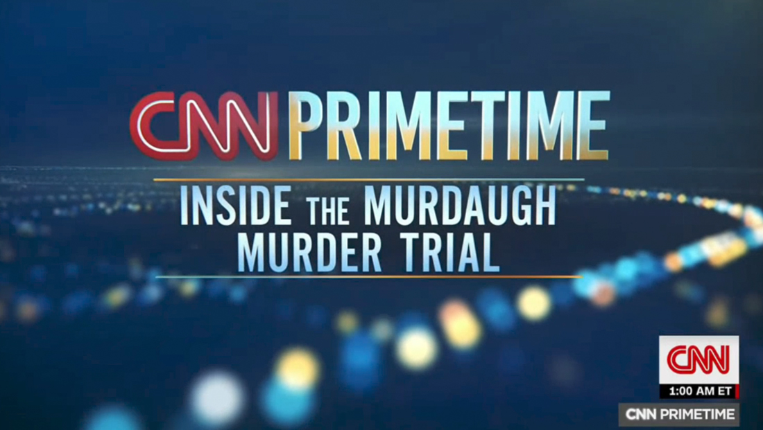
“CNN Primetime” debuted as the network’s 9 p.m. news cycle-driven block of programming Tuesday, Feb. 28, 2023, with a distinct open designed to be customized for each topic the block tackles.
The animated sequence has, at least so far, run after a pre-produced, stylized cold open about the topic at hand.
It uses a background in blues and teals with occasional gold and yellow accents, along with the familiar red in the CNN logo.
The sequence starts with an oversized view of a 3D CNN logo sweeping by before transitioning to side views of the letters “P” and “R” in “Primetime” shown in a sandwich style that manages to convey the visual motif of the network logo.
The top and bottom layers of the letters (or the bread, so to speak) are solid with bevels, while the middle layer is depicted as a glassy surface with dots of light and intersecting lines.
The view quickly shifts to the front of the letter “R” before revealing an extreme side view of the entire word. These letters have a faceted effect applied to them that shifts to a more solid look as the light shifts and are set against a blue background with blue, gold and off-white dots.
Finally, the open shifts to view of what appears to be a horizon, with the dots now imagined as streetlights and other sources of illuminated against the dark surface of the Earth.
The CNN logo zooms into view before sliding to the left as a burst of light serves as the entry point for a glassy rendition of the word “Primetime.”

Below this is space for a title, which, like the word “Primetime” is set in a condensed typeface from the CNN Sans family.
The title can obviously be changed each night as needed and features a light blue and white reflected gradient fill. The line or lines of text are capped with horizontal lines that shift from teal to gold in opposite directions.
A similar, though lighter, palette is used on the seemingly reflective surface of the word “Primetime,” shifting as the open runs.
The final view of the open features a far background with the dotted streetlight design, while the foreground features a sweeping rendition of the look that starts from the left side of the screen and curves toward the right, fading into the background.
These dots are displayed more as blurred bursts, similar to a bokeh effect.
The “CNN Primetime” open does a consistent job of blending the main CNN brand with the notion of the show’s later timeslot thanks to the evening cityscape seen.
It notably eschews the notion, at least from any obvious standpoint, of depicting a particular city. CNN and other broadcasters have become fond of using New York and Washington, D.C. backgrounds, both real and stylized, as background elements.
That said, the design’s 3D and gradient-heavy look largely conflicts with the flatter look being used in promos for the specials. These do include bursts of blue-green shades that could be at least somewhat of a visual connection to the color palette in the open.
There is also no consistent use of red bars or other solid color elements in the open, meaning there’s a lack of visual consistency.
The look also has some stylistic similarities to the “CNN This Morning” look, including the use of facet elements and 3D and bevel effects.
Overall, these looks largely buck the industry trend of creating flatter, more clean looks in favor of more textural, dimensional and glassy elements and typography with bolder gradients and fills that risk encroaching on the “WordArt” look made infamous by Microsoft or an overuse of Adobe Photoshop’s pattern overlay, bevel and emboss layer effects, giving it a bit of a dated feel.
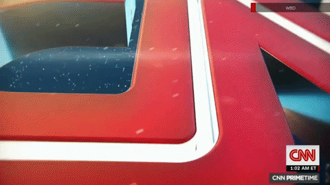
The debut of “Primetime” featuring Maher ran a ticker during its first airing, but then dropped it during the encore presentations later that evening.


On the second night, focused on the Murdaugh trial, the network did not include the ticker during the first airing, instead adding a blue bar in the space it would normally occupy.
The blue shape used here was a bit richer than that used in the open and also did not incorporate any of the cityscape accents, instead opting to simply use the network logo and typography.

tags
CNN, CNN Primetime
categories
Branding, Broadcast Design, Cable News, Featured