Mexican network Galavisión gets new logo

Subscribe to NCS for the latest news, project case studies and product announcements in broadcast technology, creative design and engineering delivered to your inbox.
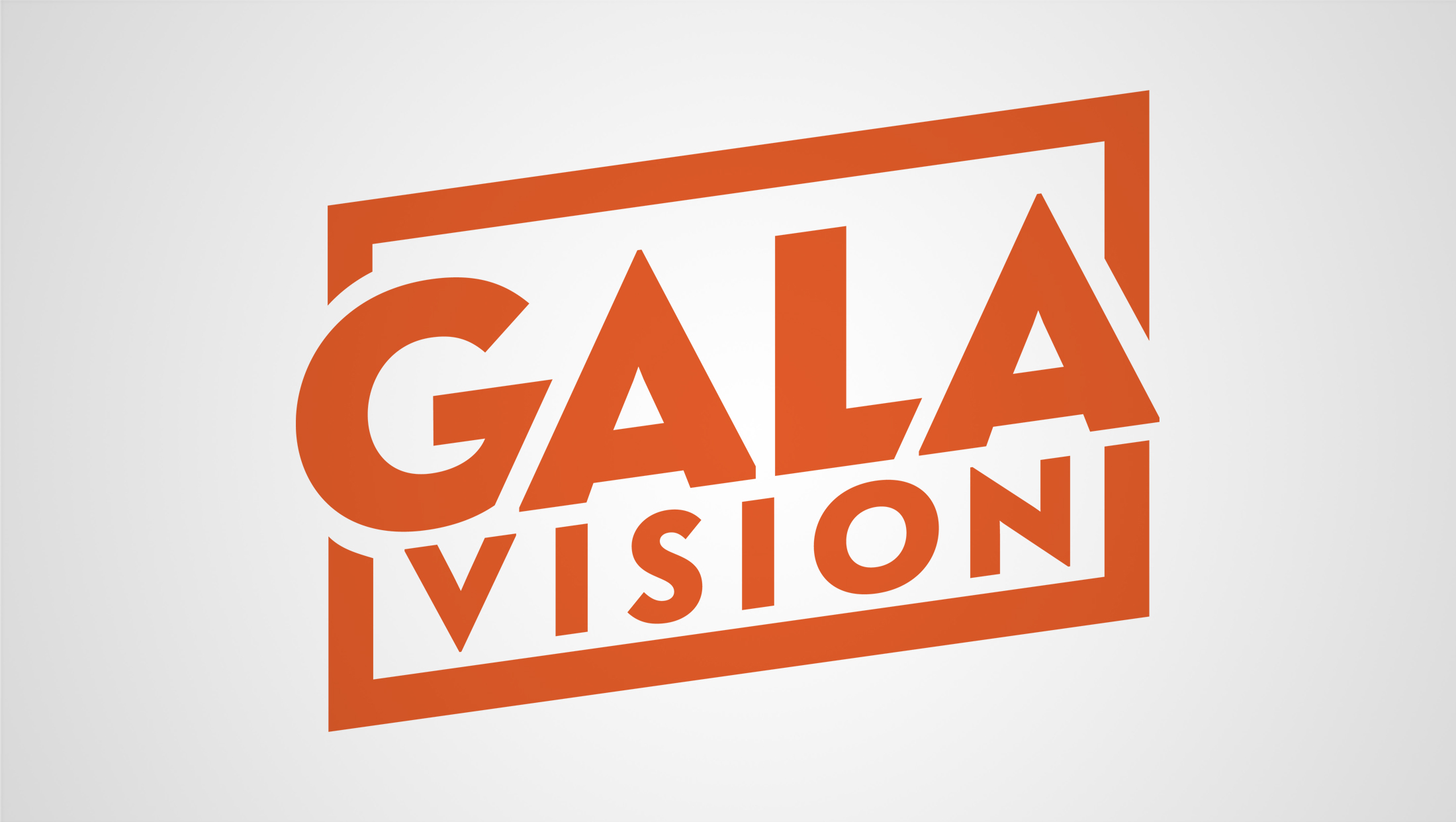
Mexican TV network Galavisión is rolling out a new logo design that, for the first time in nearly three decades, no longer features a large “G”-inspired icon.
The network, which is owned by TelevisaUnivision, retained its bold orange color in the new logo design, which began appearing prominently in the wild in January 2024.
Instead of the large “G”-like icon with the network name below, however, the new logo splits the network name across two lines, bringing more emphasis to the “Gala” part.
Set in a strong, geometric and angular sans serif, the strong diagonals are further emphasized by a diagonal slash that cuts off part of the “G”s’ hook, which would likely be rounded off if not for the tweaked typography.
A similar method slices through the base of the “L.”
Similarly, the “Gala” portion of the logo also knocks out portions of the bold, slightly askew polygonal border that surrounds the entire lockup.
Notably, the “vision” part of the network name stays inside of the border and contrasts with the tightly kerned four letters above, thanks to more generous letter spacing.
Although the accent mark on the “O” is no longer directly depicted, it is possible that either the base of the “L” or the diagonal slash between it and the “A” above are meant to stand in for the stroke.
In many ways, the new design feels sharp and slightly nostalgic at the same time, with a general overall vibe that feels a bit like a combination of several iterations of the TV Land logo.
Despite noting having an actual “tail,” the polygon wrapping around the typography still manages to hint at the idea of a speech bubble, a common theme in network logo designs.

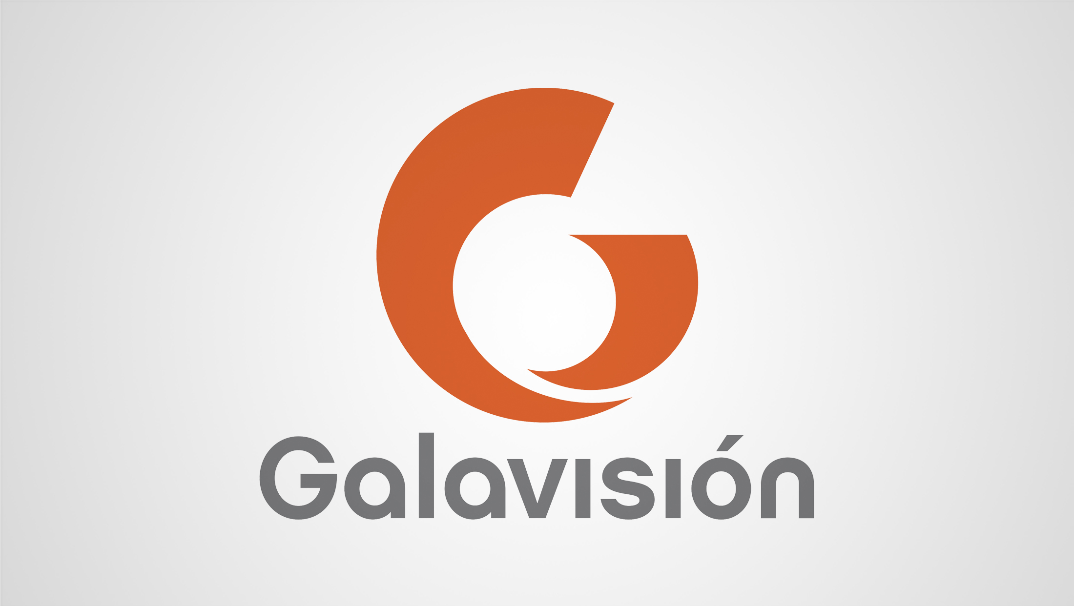
Prior to the redesign, the latest Galavisión logo debuted in 2013. This design featured an abstract interpretation of a “G” formed using two separate, slightly interlocking shapes.
The result was an oddly-shaped icon that looked only somewhat like a “G” and also gave off comma and speech bubble vibes at the same time.
In many ways, the 2013 logo felt like it was simply trying too hard to be more than one thing at once — and the awkward ovoid shape created by the negative space in the middle can make the eye twitch.
This logo featured the network name in a rounded gray sans-serif with distinct “A”s and an “N.” The “G” had a slightly unbalanced feel and the “I”s were customized to not have dots above them, though the accent mark was highly visible.

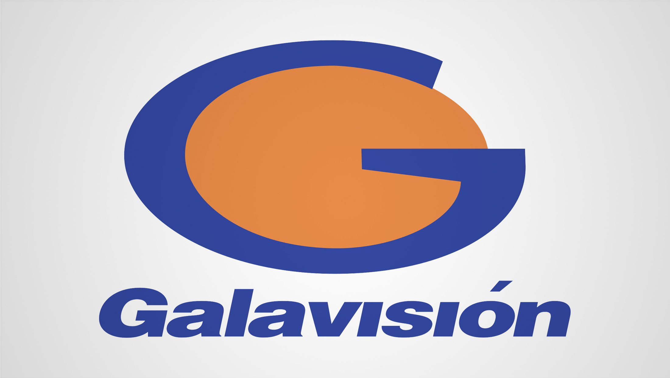
Prior to 2013, the network used a much more literal interpretation of a “G.”
The icon featured a thick blue shape that essentially looked like a “G” that had been skewed to be wider with a distinct angle added to the hook of the letter. Nestled in the center was a large orange oval and the network name was typically spelled out below in a heavy, italic typeface that also felt a bit stretched.
The “I”s in this version lacked dots as well and the “O” accent was also prominently featured.
The Galavisión highlighted here is a pay TV network in Mexico that, despite using the same name, has a distinct history from the free-to-air channel and network that used the same name.
For a time, two outlets with the Galavisión name operated simultaneously, one on a national level and one more localized.
The network using the name previously changed its name to Gala TV in 2013 and then to Nueve, stylized as “Nu9ve,” in 2018, reflecting its virtual channel number in most regions. TelevisaUnivision owns that network as well.
Subscribe to NCS for the latest news, project case studies and product announcements in broadcast technology, creative design and engineering delivered to your inbox.


tags
Branding, Galavisión, logo design, TelevisaUnivision
categories
Branding, Broadcast Design, Broadcast Industry News, Featured, Network Branding, Networks