
BritBox refines logo, introduces cohesive brand system update
Weekly insights on the technology, production and business decisions shaping media and broadcast. Free to access. Independent coverage. Unsubscribe anytime.
BritBox has updated its brand identity in a shift meant to evolve its existing position while creating a cohesive system spanning visual identity, motion, tone of voice and sonic branding.
Like most streamers, BritBox is operating in an increasingly crowded marketplace, so updated brand standards and assets that clearly communicate its unique blend of British content targeted at North America, Australian and Nordic markets.
To achieve this, BritBox worked with Sibling Rivalry to build an updated brand.
“This refreshed identity strengthens the clarity and confidence of the BritBox brand,” said Abby Elkin, the vice president of brand and creative at BritBox, in a statement. “Sibling Rivalry understood our brief to evolve the brand and bring it to life through a flexible, modular system that expands our creative toolkit and elevates premium perception.”
“What stands out most are the ways the new identity captures our perspective and highlights the wit, charm, and nuance that define British storytelling. It sharpens our voice and creates much-needed cohesion for our audiences across the consumer journey,” Elkin added.
The updated branding continues the foundation laid out by the streamer’s “See It Differently” campaign, which launched in the Spring of 2025.
This campaign pushed back against British stereotypes while spotlighting the breadth of productions and genres the U.K. produces as a way to reframe the notion of being “British” from just a place to a perspective.
Continuing along this notion, Sibling Rivalry leaned into the craft, curation and brevity of wit that defines British storytelling, according to the studio.

“The work deliberately avoids clichéd British tropes, shifting away from the stereotypical Union Jack red-and-blue duotone logo towards a simplified, single-color mark and an expanded toolkit of fonts and color palette,” noted Sibling Rivalry.
The end result is a system that embraces a modern, curated and cohesive while still maintaining connections to the existing brand equity.
“BritBox was already successful, profitable and well loved, but its brand lived more in instinct than in a cohesive system,” said Bo Bishop, strategy director at Sibling Rivalry, in a statement. “Our job was to distill everything down to a single, memorable idea and bring that to life in a way that feels confident, contemporary, and distinctly BritBox.”
The box
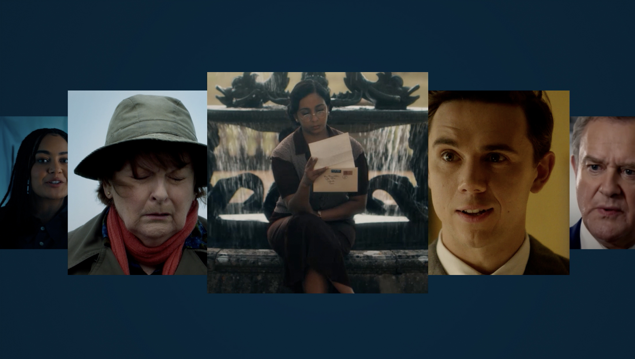
Appropriately, the system is based around the concept of a “box” as a framing device, extending its role beyond a simple logo container into a “quiet curator” that takes on the role of spotlighting characters, members, key UI elements and even creating visual worlds linked to specific shows.
Meanwhile, since it’s borrowed from the existing BritBox logo, it can also serve as a stand-in for the logo even when the wordmark isn’t included.
Sibling Rivalry also created a collection of visual layouts it calls “macro moments” that are designed to reflect the way that British storytelling uniquely marries character and place by reimagining the box as a “portal” into British characters.
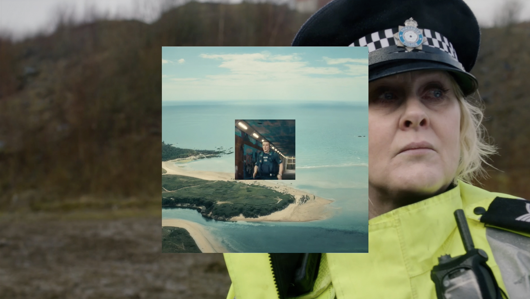
This is paired with a macro texture that brings in the storytelling element of setting.
The box also makes appearances as a sort of bullet point or divider next to key points of text such as show titles, serving as a subtle way to draw the eye there to help reinforce each show title as a sort of brand within a brand and its role as how viewers discuss shows they love with others.
Sonic branding
Sibling Rivalry and BritBox also worked with composer Joel Pickard to create a short, memorable mnemonic that’s described as “warm and confidently British without pastiche” and sporting a lightly melodic motif designed to “leave viewers with a feel-good sensation that matches BritBox’s refined positioning.”

Aural elements don’t end with the mnemonic, however. Instead, BritBox has an entire sonic toolkit that gives it access to variations designed to serve various purposes, ranging from idents, promo endboards and product moments.
The mnemonic was also developed to coordinate with the brand’s updated motion principles, ensuring tight coordination between the music and on-screen movement, featuring the box device moving along the wordmark before coming to rest above the “i.”
“The result is a guiding visual and audio expression that captures the smart, inviting, and humbly refined essence of BritBox,” notes Sibling Rivalry.
Logo
Previous logo.
The update also included a strategic redraw of the service’s wordmark, which largely focused on beefing up the line strokes used in each of the seven characters.
Another key change included refining the tail of the “t” that removes some of the original look’s quirkiness but also ties in to the circular “b, “r” and “o” components.
The dot on the “i” remains as a diamond, which ensures the entire look remains more ownable while also retaining a bit of that quirkiness. It also resonates well with the diagonals found in the distinctive “x,” which stands out from the other characters significantly.

![]()
The color palette of the logo also been refined, largely removing the brighter two-color approach for shading “Brit” and “Box” separately in favor of a monochromatic look.
By default, the preference appears to be displaying the updated logo in light or dark blue, often with the background or box it sits inside using the other shade.
The wordmark can also be stacked inside the frame element and retains its legibility even when scaled down to icon size on smaller devices.

Color
Thankfully, the shades of the blue are distinct enough that they can stand out among the sea of other blue branding in streaming — ranging from Paramount+ to Prime Video to Sling, Vudu and Philo.
The default darker option is a deep blue that actually skews more toward black or dark gray as opposed to something more in the royal blue or navy blue range, while the light shade feels somewhere between baby blue and sky blue — with some hints of lighter gray that brighten it up.
While the deeper version channels a more serious, sophisticated mood, the lighter one feels fresh and bright while still maintaining a bit of sophistication.
Much of the rest of the color palette, meanwhile, uses a similar approach — with a darker shade paired with a brighter option.
The base color selection largely continues the trend of finding a not-quite-as-common version of a particular part of the color wheel — such as peacock blue-green instead of a more generic deep teal, a dusty plum instead of yet another violet.
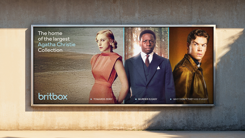
Other brand assets, which are largely designated for use inside of animated graphics, out of home marketing and digital platforms, draws on an a combination of the color palette, frame element while also leveraging the brand’s typography.
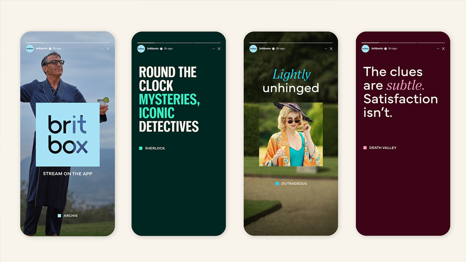
Headline text can be set in a bold, condensed sans serif, with a second, geometric sans serif that pairs nicely with the logotype available as a secondary option. A casually elegant italic serif can be used to spotlight key words in copy, typically shown in color.
Having two sans serif options provides designers with the option to fit more text into a smaller space, while also boosting boldness or switching to a friendlier geometric option that prioritizes legibility.
Brand voice
BritBox’s brand voice tends to skew toward snappy statements with strong adjective combinations, such as “fantastically layered,” which continues the strategy of focusing on the nuances of the content offered. The update also allows for a more straightforward approach when appropriate, such as spotlighting unique value propositions such as the service’s extension collection of British detective and mystery shows.

tags
Branding, BritBox, logo design, OTT, Sibling Rivalry, sonic branding, streaming
categories
Branding, Heroes, Streaming