
CBC blends Canadian heritage with Italian notes in Olympics graphics package
Weekly insights on the technology, production and business decisions shaping media and broadcast. Free to access. Independent coverage. Unsubscribe anytime.
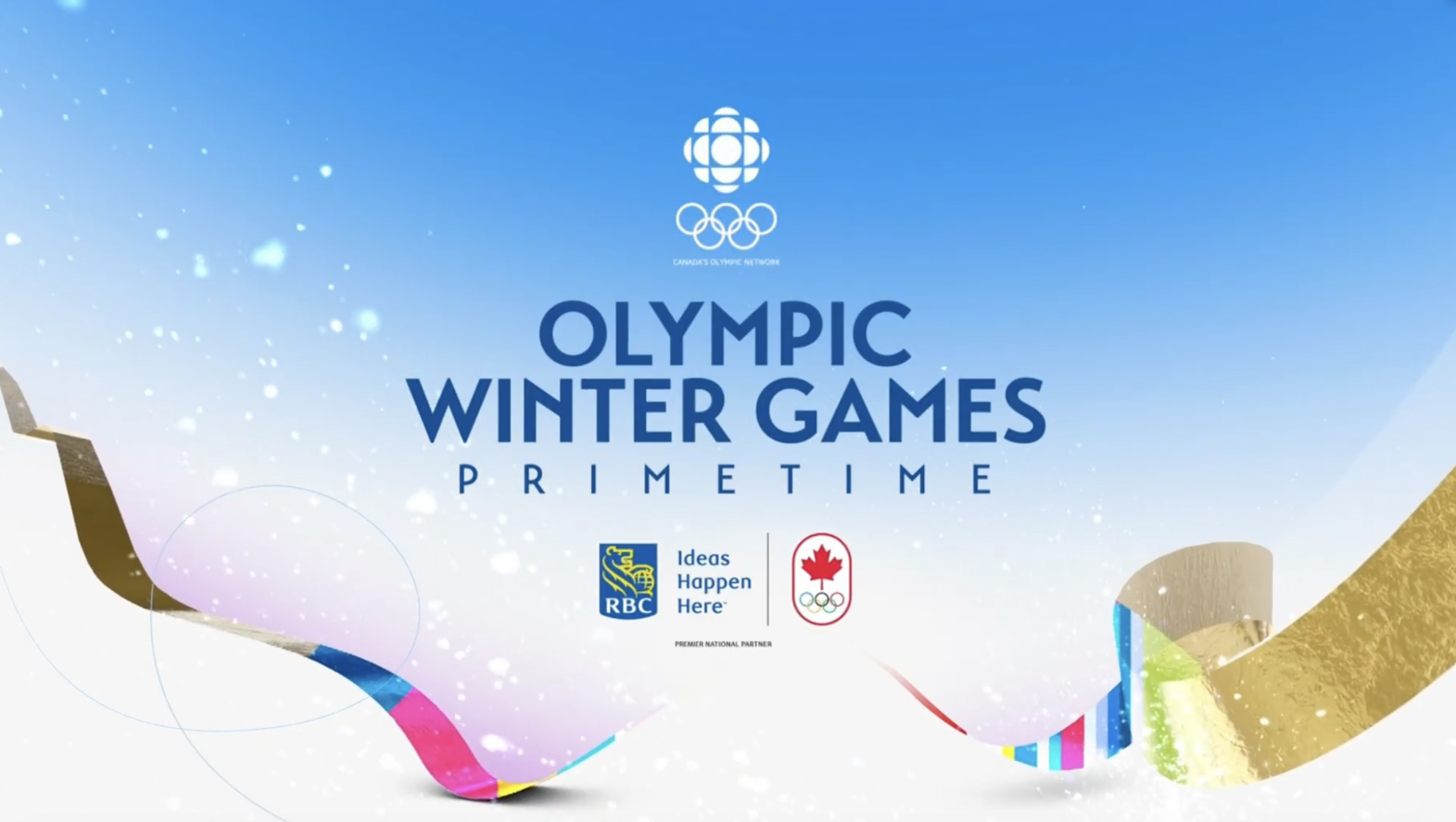
CBC Sports‘ 2026 Winter Olympics graphics package for Milano Cortina is designed to merge Italian visual flair with the broadcaster’s evolving brand system and home country pride.
The creative brief centered on blending Milan’s modern elegance with Cortina’s alpine landscape and ultimately leveraged a layered mix of color, pattern and motion rather than relying heavily on athlete-driven storytelling, the CBC creative team behind the look told NCS.

“The goal really this time was to create a visual identity that really blends Milan’s modern elegance with Cortina’s natural beauty,” said Frydun Mehrzad, art director at CBC.
The team at CBC intentionally minimized the use of athletes in the generic opens, shifting that focus to teases and program content to avoid both editorial redundancy and last-minute changes tied to injuries.
“We did try to put some in and they’d warned, you know, like, well, people get hurt and things happen,” explained Theresa Warburton, creative director at CBC Sports, referring to the work done for the 2024 Summer Olympics “Sure enough, (Canadian swimmer) Fryden finishes it within like two days. So he had to go back in and revise that with different plates.”
Opens also shifted away from longer, narrative-driven sequences in favor of six- to seven-second resolves that carried dense visual detail, a move that was intended to maximize the on-screen impact despite the shortened runtime.
“We put so much in each scene,” said Warburton. “You watch it and I just feel so visually stimulated. It’s entertained me so much. It feels longer.”
At its core, the package leaned on CBC’s gem icon as a structural anchor.


A custom snowflake created from the geometric shapes found in the icon collapses into the CBC logo, tying winter imagery directly to network branding. This transformation reinforced CBC’s core brand mark while anchoring the winter theme.
The design team opted to continue using a Native American pattern, inspired by the Wabanaki First Nation people who first settled what would become Quebec, that was first used during the 2024 Summer Olympics — but with an increased vibrancy.
Italian references included architectural arcs inspired by Milan, blues inspired by the Italian national football team Azurri, fashion-influenced color accents and a recurring Vespa motif.
A gold ring element, a homage to the Olympic rings, appeared consistently across the package as well and served as a way to incorporate iconic Olympic imagery without repeatedly using the standard five-ring lockup.
“This time, that was one idea that let’s focus on the rings a bit more,” Mehrzad said. “So that’s why you can see a hint of the gold.”

CBC also included a little tribute to Andi Petrillo, its daytime coverage host, by incorporating her likeness onto the Vespa rider, which was achieved by projecting her image onto the 3D model used to create the scenes.
Insert titles were simplified to create a reusable, system-driven framework across daytime and prime time, with parallel versions for English and French audiences and shared assets for partners including Rogers, Sportsnet, TSN and RDS, a strategy that emphasized the goal of creating consistency beyond sports and into streaming, marketing and news.
The package also supported variations for specific coverage, including unique curling streams and Inuktitut hockey broadcasts, with localized language elements delivered within the same visual framework.
CBC developed the package in under a year using a relatively small internal team, a decision that allowed tight creative control and consistency across elements.


tags
2026 Winter Olympics, CBC, CBC Sports
categories
Branding, Broadcast Design, Broadcast Industry News, Graphics, Heroes, Olympics, Sports Broadcasting & Production