

CBS Eye marks 75 years as one of television’s most enduring visual identities
Weekly insights on the technology, production and business decisions shaping media and broadcast. Free to access. Independent coverage. Unsubscribe anytime.
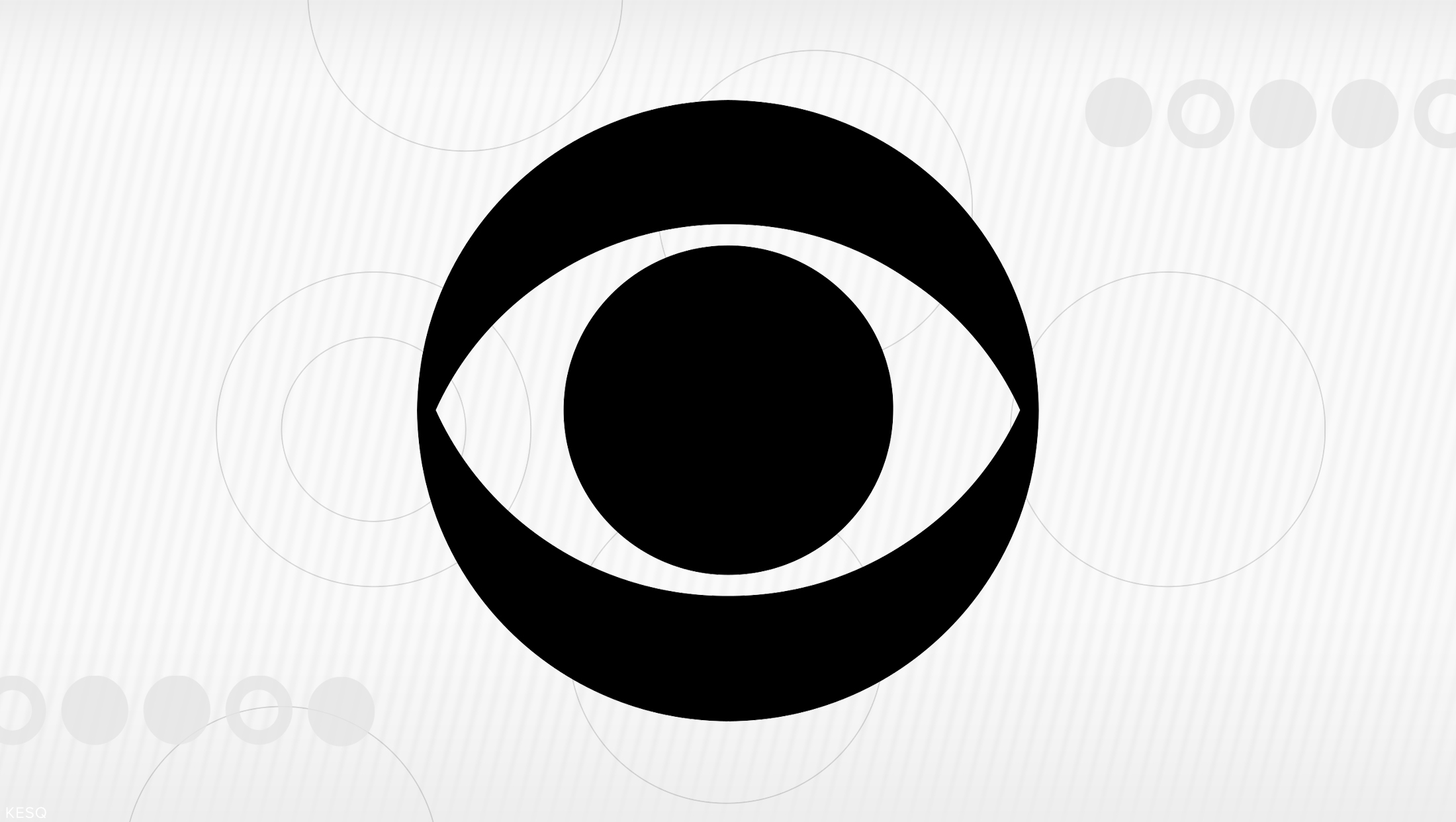
Seventy-five years after its debut on Oct. 20, 1951, the CBS eye remains one of the most recognizable symbols in American broadcasting, having survived decades of changes in television technology, network programming, corporate ownership and graphic design.
The circular eye symbol, created under the direction of CBS art director William Golden, first appeared on the network’s television broadcasts during an era when television was still establishing its visual language. Its longevity is particularly notable in an industry where network identities have frequently been redesigned to reflect changing audiences and technology.
While CBS has repeatedly updated the typography, animation, color and presentation surrounding the eye, the underlying symbol has remained largely unchanged since its introduction.
William Golden and the creation of the eye
Golden, who joined CBS in the 1930s and became the network’s art director, developed the symbol as part of a broader effort to establish a distinctive identity for the emerging television network.
The design was influenced by Pennsylvania Dutch hex signs and traditional American folk art, including eye motifs associated with protection and watchfulness. Golden’s interpretation reduced those references to a geometric mark consisting of an outer circle, an almond-shaped eye and a central pupil.
The result was a symbol that could be reproduced effectively in black and white, an important consideration when television sets offered limited picture resolution and virtually all broadcasts were monochrome.
The Eye also carried a direct visual connection to the medium itself. Television was built around seeing, and the symbol communicated that concept without requiring words or explanation.
Golden’s work was informed by modernist graphic design principles, emphasizing clarity, simplicity and immediate recognition. Rather than illustrating a television camera, antenna or broadcasting tower, the mark gave CBS an abstract identity that could stand independently of the network’s name.

The Eye first appeared on television Oct. 20, 1951, and quickly became central to CBS’s on-air presentation.
Golden reportedly considered replacing the design after its initial use, but CBS President Frank Stanton recognized its value and encouraged the network to retain it.
That decision established an unusual degree of continuity for a television network identity, allowing the symbol to accumulate recognition rather than being periodically replaced.
From animated camera iris to corporate symbol
The Eye’s earliest presentations were more elaborate than the familiar static logo. In its original animated form, the center resembled a camera iris that opened and closed, revealing the network’s identification. Early print versions also placed the Eye against cloud formations.
Those treatments soon gave way to simpler presentations that emphasized the symbol itself.
CBS expanded the Eye’s use beyond television station breaks, placing it on broadcast cameras, studio buildings, advertising materials and promotional merchandise.
The design also became closely associated with the network’s physical facilities, including CBS Television City in Los Angeles, California, and its corporate headquarters in New York, New York.
As color television became widespread during the 1960s, the Eye appeared in new color combinations and animated sequences. During the 1970s, CBS incorporated it into anniversary branding and other network promotions.
The 1980s brought computer-generated versions of the symbol, allowing designers to create dimensional effects and more elaborate motion graphics.
By the 1990s, CBS had returned to simpler applications of the Eye, while continuing to adapt its presentation to changing network campaigns. The arrival of high-definition television and digital platforms in the 2000s introduced additional opportunities for animation, texture and screen-based branding.
Throughout those changes, the fundamental geometry of Golden’s design remained intact.
Didot and the typography of CBS
Although the Eye itself changed remarkably little, the lettering accompanying it underwent several important transitions.
Early CBS identifications paired the symbol with condensed sans-serif lettering, giving the network name a straightforward, functional appearance.
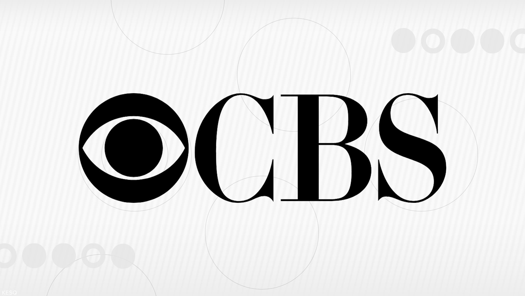
Golden subsequently adopted Didot, a high-contrast serif typeface distinguished by thick vertical strokes, thin hairlines and sharp, unbracketed serifs.
The typography provided a contrast to the Eye’s circular geometry. Where the symbol relied on simple, balanced shapes, Didot introduced an editorial quality associated with traditional publishing and formal typography.
The resulting combination became one of CBS’s defining corporate signatures.
Didot was not widely available to American designers in the form Golden wanted. CBS designers George Lois and Kurt Weihs worked on adapting the lettering, redrawing characters from enlarged reference material.
Following Golden’s death in 1959, Lou Dorfsman assumed responsibility for much of CBS’s visual identity. Dorfsman worked with typographer Freeman Craw to further refine the lettering into a customized version that became known as CBS Didot.
The resulting typeface became a central element of CBS’s corporate graphics, appearing in advertising, promotional materials, signage and network identifications.
The eye and Didot combination became particularly familiar in the classic CBS corporate signature, with the symbol positioned alongside the three-letter network name.
The typography also extended into the network’s physical environment. CBS Television City’s architectural signage incorporated Didot-derived lettering, establishing a visual connection between the company’s broadcast identity and its facilities.

The relationship between the eye and Didot was not exclusive. CBS frequently used other typefaces for individual programs, seasonal promotions and on-air graphics, allowing the symbol to remain recognizable even when the surrounding typography changed.
Lou Dorfsman and the expansion of CBS design
Dorfsman’s influence extended well beyond refining the network’s lettering.
During his decades directing CBS design, he helped establish a coordinated visual approach across television promotion, advertising, printed materials and corporate environments.
His work emphasized the relationship between typography, photography and graphic composition, frequently using the eye as a unifying element rather than requiring it to dominate every design.
CBS’s visual identity became closely associated with the modernist design movement, which favored clarity, organization and purposeful use of graphic elements.
The network’s identity also benefited from the involvement of designers who treated broadcasting as a medium requiring the same attention to visual communication as magazines, advertising and architecture.
That approach helped distinguish CBS’s corporate design from the more frequently changing promotional graphics surrounding individual television programs.
The shift from Didot to sans-serif typography
By the 2000s and 2010s, CBS increasingly paired the eye with contemporary sans-serif lettering in its on-air presentation.
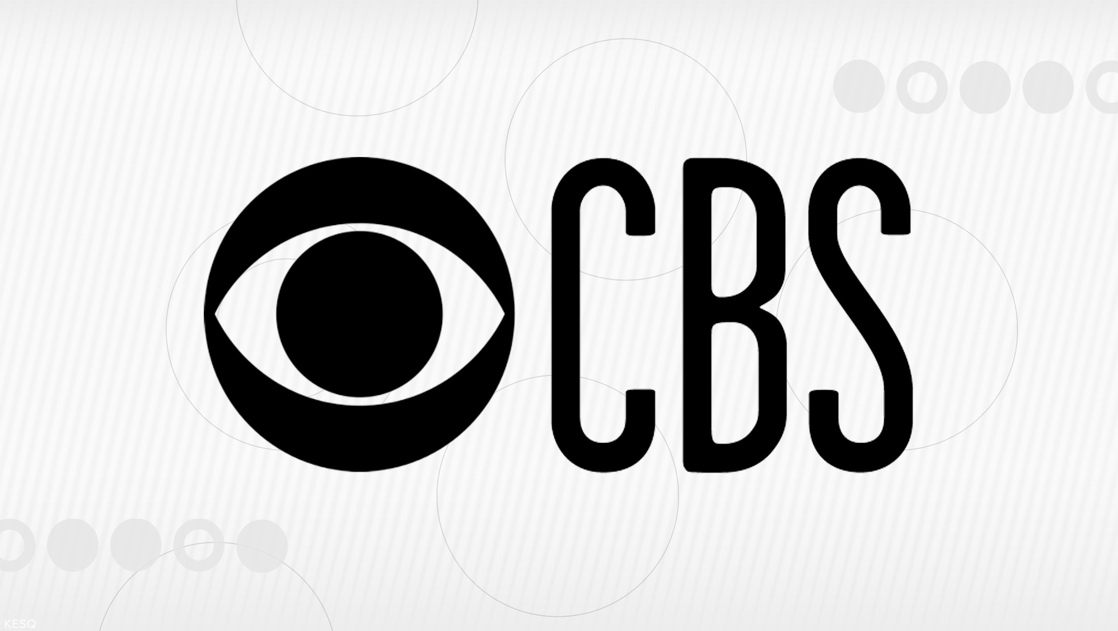
Different network campaigns experimented with condensed letterforms, simplified typography and more flexible placement of the eye.
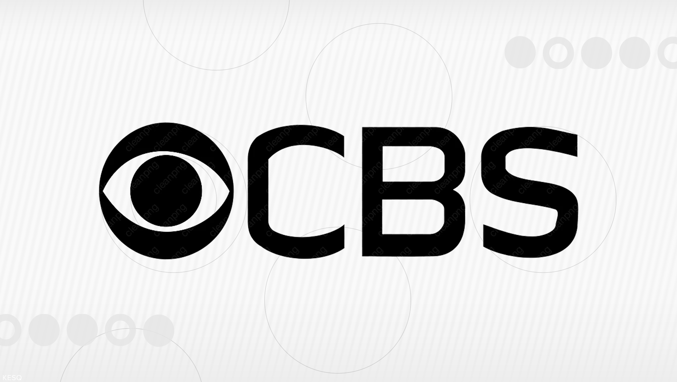
A 2018 graphics package developed by Sibling Rivalry featured a condensed treatment of the CBS name, reflecting a broader trend toward narrow, modern typography in television promotion.

A more comprehensive change arrived in October 2020, when CBS introduced a redesigned identity system developed with New York-based design agency Gretel.
The update replaced the network’s previous condensed lettering with TT Norms, a geometric sans-serif typeface, while establishing a more consistent approach to branding across entertainment, news, sports, studios and local television operations.
The move represented a significant departure from the longstanding Didot-based corporate signature.
Rather than treating the eye and the letters CBS as an inseparable combination, the updated identity allowed the symbol to appear independently or alongside a simplified wordmark.
The system also introduced consistent typographic relationships among the network’s various divisions, including CBS News, CBS Sports and CBS Studios.
Although Didot largely disappeared from the network’s principal contemporary branding, its legacy continued through historic signage, archival materials and selected program identities.
The 2020 redesign puts the Eye in motion
The 2020 rebranding also marked a shift in how CBS used the eye as the foundation of its motion graphics.

Instead of simply animating the complete symbol, Gretel separated its component shapes into a broader visual system.
The outer circle, central pupil and surrounding curved forms became individual graphic elements that could expand, rotate, overlap and reassemble.
The approach allowed CBS to create animations and promotional graphics that referenced the eye without displaying the complete symbol throughout every sequence.
The updated identity also introduced a five-beat sonic signature developed with audio branding company Antfood, drawing inspiration from the cadence of the historic network announcement, “This is CBS.”
The sound was designed to accompany the visual animations, giving the network a recognizable audio identity across television and digital platforms.
CBS described the redesign as an effort to establish greater consistency across its operations while allowing individual divisions to retain distinct identities.
The Eye remained central to that strategy, serving as the common element linking CBS’s news, entertainment, sports and production businesses.
A symbol that outlasted changing network identities
The eye’s 75-year history reflects an unusual distinction between a network’s permanent identity and its evolving promotional presentation.
CBS has repeatedly changed its slogans, on-air graphics, typography, color palettes and animation styles. It has also adapted the Eye to different broadcast technologies, from monochrome television to color, computer graphics, high definition and streaming.
Yet the essential design has remained consistent.
Its durability has also made it a subject of design scholarship. The eye was featured in the exhibition “Revolution of the Eye: Modern Art and the Birth of American Television,” which examined the relationship between modern art and television’s early visual development.
The exhibition explored how designers such as Golden helped introduce modernist ideas to mass audiences through network branding and television production.
The symbol has also been recognized in design publications, including a 1998 New York Times Magazine examination of influential 20th-century designs.
The eye’s longevity owes much to Stanton’s decision to retain the design when Golden initially considered replacing it.
The network president reportedly reminded Golden that designers often become tired of their work just as audiences are beginning to recognize it.
That decision allowed the CBS eye to remain a constant visual presence across generations of television viewers, even as the lettering, technology and corporate organization surrounding it continued to change.

tags
Antfood, CBS, CBS Eye, Didot, gretel, logo design, Sibling Rivalry, TT Norms, William Golden
categories
Branding, Broadcast Industry News, Heroes, Network Branding, Networks