
HLN gets new logo, new look … again
Subscribe to NCS for the latest news, project case studies and product announcements in broadcast technology, creative design and engineering delivered to your inbox.
HLN, CNN’s sister network, has rebranded itself once again with the help of Troika.
The network debuted a new, square logo with rounded corners that sheds the “speech bubble” tail and utilizes a typeface with similar, rounded corners — the latest in a long string of name changes, strategies and logo designs.
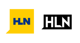
The square appears in a bright yet bold shade of blue.

In addition to the new logo, the network is also sporting a new tagline: “News that hits home,” an indication of the new brand’s direction of re-focusing more on news headlines after its short-lived social media and interactive news strategy period.
Though the new logo doesn’t include a direct mention of the CNN name (nor does it return to using the full name “CNN Headline News), the use of a logo-in-a-box is similar to the mother ship’s brand standards, with the insert graphics also similar in shape and design.
The rounded corner motif also have some visual connections to the iconic CNN logo.
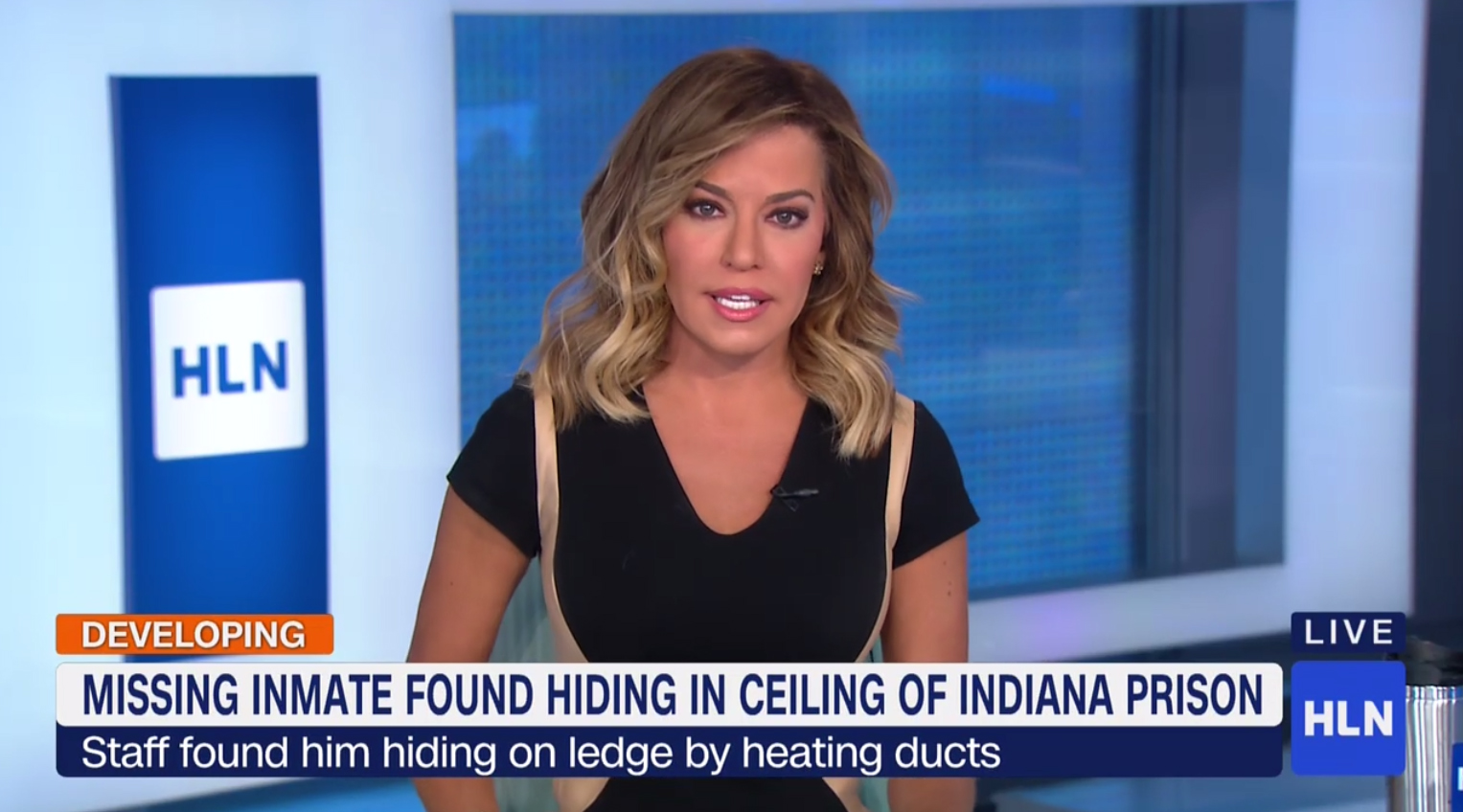

In addition to the logo update, the network’s insert graphics mirror the rounded corner look its lower thirds, logo bug, live bug and other elements.

The graphics mix in orange and yellow along with white and make use of CNN’s proprietary “CNN Sans” font.
The updated graphics package carries on some of the similarities of the modular approach used before.

While most HLN shows appear to be retaining their own individual logotypes, the graphics package also includes a way to incorporate the show’s name next to the logo bug in CNN Sans.
Subscribe to NCS for the latest news, project case studies and product announcements in broadcast technology, creative design and engineering delivered to your inbox.

tags
Branding, CNN, HLN, logo, logo design, rebranding
categories
Branding, Broadcast Design, Cable News, Featured, Graphics, TV News Graphics Package