‘The View’ at 20: A look back at its sets and logos

Subscribe to NewscastStudio for the latest news, project case studies and product announcements in broadcast technology, creative design and engineering delivered to your inbox.
A complete overhaul
After the retirement of Barbara Walters in 2014, “The View” returned from the summer with a completely new look, including a new logo and set.

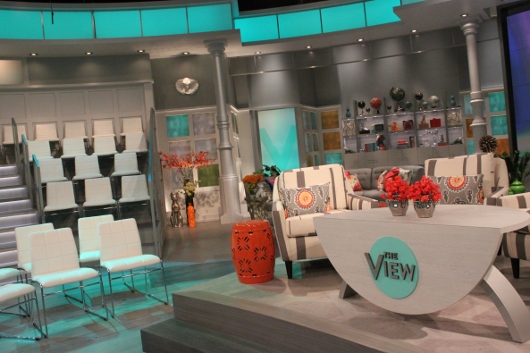
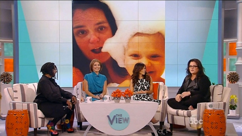
The new logo used a flat teal circle along with a wider, sans serif font. The exaggerated “V” was kept, but was no longer positioned at the center of the lockup.
This season also marked the show’s move from its longtime home to the studio vacated by Katie Couric’s canceled talk show “Katie,” which was also produced by ABC.
Along with the studio move came a completely revamped “in the round” set that leveraged the logo and graphics’ teal tone mixed with grays, whites and pops of orange.

The show also made the switch to using a large LED video wall as well as a new seating arrangement for the hosts, consisting of armchairs situated around a coffee table with the show’s now-signature folded down leaf look.
This new design opened up the show’s space again and included secondary seating areas and open shelving primarily used as background elements. In many ways, this was a stylistic return to the show’s original set’s sprawling look and feel.
The graphics also switched using sharp sloped angles, inspired by the shape of the letter “V.”

While the new look marked a drastic reinvention of the show’s look, a flurry of changes were made to the show’s visual elements, including adding a new cityscape graphic and switching to a more gold tone in place of the bold orange. This period also saw numerous changes to the decorative items on the set.
About a month later, the show upgraded to a larger version of the coffee table and ditched the armchairs in favor of “off the rack” high stools.
“Somebody watered the little desk we had in the garden of desks and it grew,” joked moderator Whoopi Goldberg at the time.

This marked the return to the longtime seating arrangement in favor of the coffee table arrangement.
Only a month later, the show changed up its look again, replacing the teal in the logo with a blue.
The graphics were overhauled to include more defined angles and a new color palette of blue, orange and golds.

The set saw an update, too, with many of the decorative plants and other elements removed and the desk becoming wood toned instead of flat gray.
In addition, the video wall was enlarged slightly and switched to vertically mounted panels and bold blue accent lighting was added to the set’s riser.
Throughout the remainder of the season, small changes were made to the set and graphics — plus a temporary, tongue-in-cheek switch to office chairs after Goldberg had back surgery and could no longer sit on the set’s high stools.
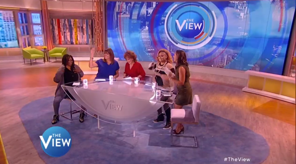
In September 2015, the show tweaked its look yet again, with a glass desk and updated graphics and logo.
The new logo added multicolored ring segments to the edges of the circle, a theme that was carried through on the on-set video wall in favor of the angular look of the previous season.

The season premiere also saw updates to the set, including covering up the open shelving units, changing out the printed graphics around the set and the elimination of the blue riser lighting.
More tweaks were rolled out as the season went on.
Subscribe to NewscastStudio for the latest news, project case studies and product announcements in broadcast technology, creative design and engineering delivered to your inbox.


tags
ABC, ABC Studios NYC, Barbara Walters, Studio TV1, The View, Whoopi Goldberg
categories
Broadcast Design, Broadcast Industry News, Graphics, Heroes, Networks, Set Design, Talk Show Set Design