‘View’ retools open, graphics
Subscribe to NCS for the latest news, project case studies and product announcements in broadcast technology, creative design and engineering delivered to your inbox.
ABC’s “The View” has continued its on air look with the introduction of a new open and modified graphics package.
The show, which has been struggling in the ratings, seems to be going through a period of teenage angst — where it quite can’t figure out what it wants to be.
The show debuted a radical new look at the beginning of this season, only to change it shortly after (and again and again and again and again).
In the new open, stories are teased using a mix of blue and orange bands running in various angles over video clips and still photos, some of which are stylized to match the blue tones, a look that’s somewhat reminiscent of ABC News‘ “20/20” graphics.
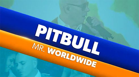
The text treatment used in the opening teases
After the day’s stories and guests are previewed, the show’s co-hosts are introduced. Where previously still photos were used, the hosts are now chroma keyed into full screen graphics that give the appearance of them “standing” within giant letters that form their name.
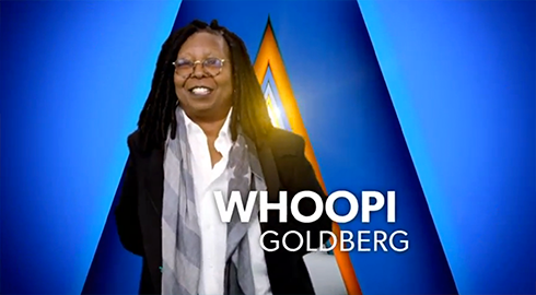
Host Whoopi Goldberg stands in front of the “W” in her her name in this frame from the show’s new open.
The letters themselves echo the video wall loop with a design that gives the appearance of multiple flat planes placed one behind the other.
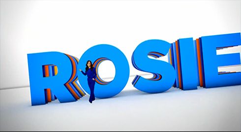
A wide view of host Rosie Perez’s name.
One of the strongest parts of the new open is how each host is positioned within her name so that, when the virtual camera zooms in for a close up, the letter directly behind her forms a unique background that isn’t shared with the others while still maintaining the same look and feel.
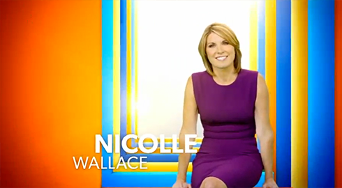
Nicolle Wallace‘s frame in the open has her “seated” on the letters and is a great example of the colorful, layered look.
In some of the shots, however, the a bit of the green screen “glow” is still visible if you look carefully.
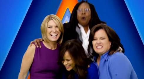
One big happy family
After each host has been introduced in turn, several quick shots of all four women “clowning around” for the camera are shown (perhaps an effort to enforce the idea the cast is one big happy family — unlike some reports suggest).
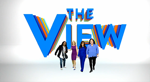
The four hosts in front of the layered show logotype.
The view then zooms out to review the show’s name floating behind a wide shot of the women.
The logotype’s treatment in this view echoes the multi-layered look used for the hosts’ name, but the perspective used makes it a bit more glaring, which affects readability and results in a rather dizzying effect.
Before cutting to a wide shot of the studio audience, another rendition of the logo is shown that has a background the animates between “V”-shaped colored elements and ones shaped like an inverted “V.”
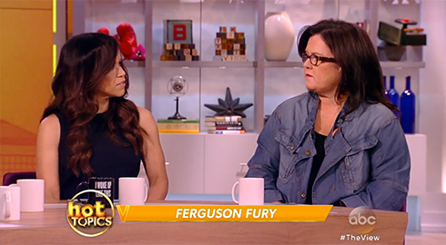
The new “Hot Topics” lower third and bug
Throughout the show, the lower thirds have also been reworked to include the letter “V” on the left site of the angled bar shape that’s been used, in a variety of forms, since the debut of this season.
The show has also added a special “Hot Topics” bug with a fire effect applied to it. During this segment of the show, the bug spins to alternate between the “Hot Topics” version and the blue, virtual show logo, which the lower thirds are turn orange.
H/T Topher
Subscribe to NCS for the latest news, project case studies and product announcements in broadcast technology, creative design and engineering delivered to your inbox.


tags
ABC, ABC Studios NYC, Nicholle Wallace, Studio TV1, The View, Whoopi Goldberg
categories
Graphics, Networks