‘The View’ tweaks on air look

Subscribe to NCS for the latest news, project case studies and product announcements in broadcast technology, creative design and engineering delivered to your inbox.
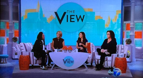
ABC’s “The View” has already started tweaking its on air look, with some changes to the show’s graphics rolling out last week.
Perhaps most noticeable is a new design for the generic, branded graphic that appears behind the hosts on the set’s massive video wall — which now features a two-toned city skyline.
When the show debuted its new look, which included a new set and new logo, for this season’s debut, the graphic included the new circular logo in the center along with subtle letter “V” shapes, but the design was dominated by white and pale teal, as shown below.

The new design, however, is reminiscent of the show’s previous graphics package, which made a stylized skyline a prominent element. It also draws comparisons to the on air look of other daytime talkers — including “The Wendy Williams Show” and “Live with Kelly and Michael,” both of which use the New York City skyline in on-set backgrounds.
In addition to the new background, “The View” has also added an animated bug to the lower left of the screen.
The new background design adds quite a bit of clutter to the background — especially since the skyline has such a jagged edge. While the previous white background was rather plain and bright, it seemed to fit in better with the show’s fresher, cleaner look.
The new bug, meanwhile, is incredibly distracting. Its size and the animation draw way to much attention to it.
It’s worth noting that the on-set video wall is very large — during a “Hot Topics” discussion in this season’s first week, moderator Whoopi Goldberg left her seat and stood directly in front of it and the top of her head barely reached the top of the first row of panels — and there are still three more rows above that.
The set is also designed in such a way that, when shot from a certain angle, only the knee wall below the video panels appears behind the show’s smaller interview setup. During these segments, the riser with chairs and coffee table is parked to the right of the set.
Subscribe to NCS for the latest news, project case studies and product announcements in broadcast technology, creative design and engineering delivered to your inbox.


tags
ABC, ABC Studios NYC, Bug, Live with Kelly and Michael, Studio TV1, The View, The Wendy Williams Show, video wall, Whoopi Goldberg
categories
Featured, Graphics, Set Design