
‘The View’ revamps set, logo
Weekly insights on the technology, production and business decisions shaping media and broadcast. Free to access. Independent coverage. Unsubscribe anytime.
ABC’s venerable daytime talker “The View” has given itself a head to toe makeover.
The show, which relocated from its 67th Street studio in Manhattan, its home since it debuted in 1997, to the former “Katie” studio on 66th, received a complete makeover that includes a new set, new logo and graphics package.
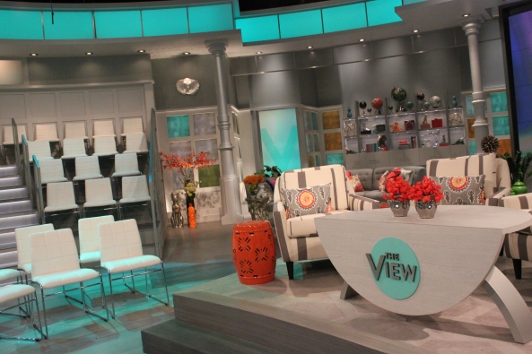
The set, designed by Jack Morton PDG, uses monochromatic light gray color scheme on much of its walls, with accents of teal and orange splashed throughout the space.
Audience members sit on semicircular risers as well as floor seating, all of which face the set’s home base.
For years, “The View” co-hosts sat on dining room-style or padded chairs around a table — but this incarnation of the set includes low, wide armchairs arranged around a coffee table-style table. The designers opted to keep a hallmark of “The View” set — the arched table leaf emblazoned with the show’s logo — on the front of the table.
Directly behind the seating area is a large 5×4 video wall that’s topped with a teal, backlit header element that continues around the entire perimeter of the studio, including the audience area.
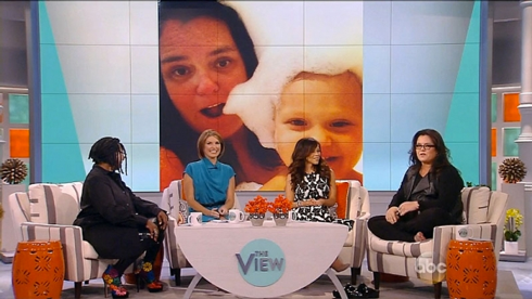
The large video wall dwarfs the hosts
The video wall is definitely a predominant element of the set — and in wide shots it comes across a bit overpowering when compared to the seated hosts.
On the left and right side of the video wall, the gray walls are broken up by square-shaped backlit panels in teal and orange, open shelving with knick-knacks and books.

The right side of the set also features a small bar-style area backed with a video screen. The set’s design also includes columns that are a combination of classical and modern design. These columns also encircle the audience area — making frequent appearances when the directors cut to a wide view of the set.
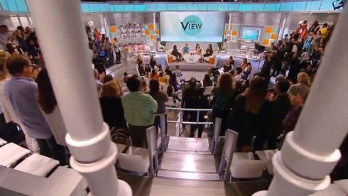
The wide view of the studio
The new set represents a more modern, fresh look for the show — which had been stuck in a bit of a graphical rut. The show previously uses graphics that made heavy use of richer, warmer colors — mainly oranges, reds and golds, along with a rather odd black text treatment that, when combined with the other colors, looked rather harsh.
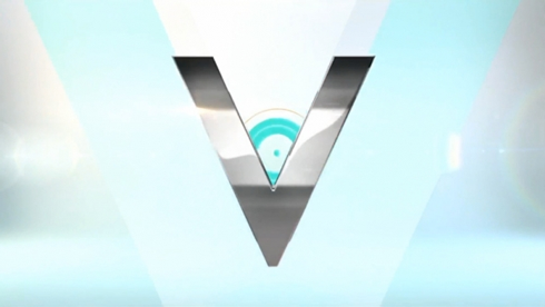
The new logo
In addition to the new set, “The View” received an even more drastic change — a complete logo redesign. The show had used essentially the same logo for almost its entire run — but decided to shake things up this season with a simplified design.
The new logo includes a teal circle and drops the rather narrow and elegant typeface previously used for a wider, simpler sans serif. The design retains the emphasis on the “V” in the show’s title, but moves it away from the center of the logo.
Overall the new logo is a bit unbalanced and unrefined. One aspect that particular stands out is the “V,” which is significantly bolder than the rest of the type and could have benefited from some custom modification to make it appear larger but not out of scale.
Part of the show’s open
The show’s graphics, meanwhile, make heavy use of the “V” as a background element, but also rely heavily on white and various shades of the teal while also mixing in metallic effects and orange rings. In addition to being a background element, the “V” is also used as to reveal the host’s images during the show’s open.
The show previously received a new set in 2011 from Clickspring Design, a look that was dominated by graphical backgrounds framed with metal — but that set was slowly modified over the years and ended up becoming little more than three rear projection walls.
Previously, “The View” used a series of rather uninspired looks, including a single flat wall with a rear projection screen in the center and faux columns above — that made the show look more like a stage theatre production. The show’s original set, meanwhile, was an airy, open loft-style space that was leftover from a canceled ABC show.

tags
ABC, ABC Studios NYC, Jack Morton Worldwide, Studio TV1, The View
categories
Graphics, Networks, Set Design