CBS Evening News debuts new look
Subscribe to NCS for the latest news, project case studies and product announcements in broadcast technology, creative design and engineering delivered to your inbox.

“CBS Evening News with Katie Couric” unveiled its new graphics on last night’s broadcast — a look that gives the show a more modern look but also wanders from the show’s original look and set.
More on the new look and more images after the jump…
The new takes many cues from the network’s election package, including a darker, more sophisticated look that makes use of rectangular shapes and reflection effects. Another dominant element is a series of three globes that are often linked into the CBS eye icon, as shown above. The theme is repeated with the new animated bug that transitions from the plain CBS eye to “CBSNews.com” via a revolving globe.

Globe elements from show open
While the new look is cohesive and clean looking, there are portions were CBS stumbled on the new look.
First, the new look’s rectangular shapes and beams of light seem somewhat similar to the “NBC Nightly News” graphics while the typeface styling is similar to “World News.”
The typeface choices are also rather interesting; the Times- and Century Gothic-style fonts are a bit dated. The old look utilized Palatino, which always looked a bit strange when it appeared next to the CBS News logo’s Bodini typeface.

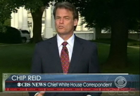
Reporter lower third

Second lower third option
However, one of the biggest issues with the new look is the fact that it doesn’t match the set very well. When Couric took over as anchor, the broadcast opted to utilize brighter colors as a way to stand out from its competitors, including in the graphics designed by the National Ministry of Design and set design by Broadcast Design International.
This was a good strategy that weaved the bright, bold oranges, yellows and reds into every aspect of the broadcast. In this latest iteration, however, the set retained that color scheme while the darker shades don’t quite match the new look.
Perhaps, however, the look was too informal for the program’s renewed emphasis on hard-hitting news coverage rather than its original less formal approach, something that was likely the driving force behind the new look.
The graphics also had a nice flowing look and curved edge not found in other network packages. One of the high points of the old look was the OTS, which blended subtly into the video image rather than with sharp edges, as shown below, another factor that made the program unique.

Old OTS look
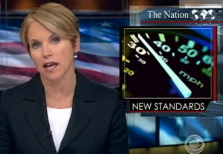
The new OTSs, which have Web-inspired “tabs” does add an additional line of text, adding a category label above the image in addition to the story-specific label below. This is a nice feature that adds a bit of additional of information that, while seemingly trivial, does make it easier to identify stories at a glance.

New OTS
The new look also does a good job of utilizing a shade of blue that’s unique to it. While NBC uses more of a teal-toned blue and ABC skweing more toward the royal blue end of the spectrum, CBS’s darker shade with hints of gray does do a good job of distinguishing itself within one of the most popular colors in TV news graphics.

Full screen graphic
The package also incorporates several design elements, such as semi-transparent layers, subtle ring elements and hollow square accents, that add an element of uniqueness to the look that helps it from looking to generic. However, the diagonal tab look could have benefited from a slightly more refined look of subtle higlights or metal effects since its current form is a bit outdated.
Subscribe to NCS for the latest news, project case studies and product announcements in broadcast technology, creative design and engineering delivered to your inbox.


tags
CBS, CBS Evening News
categories
Graphics, Networks