NewscastStudio announces finalists for ‘best set of 2010’
Subscribe to NCS for the latest news, project case studies and product announcements in broadcast technology, creative design and engineering delivered to your inbox.

NewscastStudio has announces its picks for the best set of 2010 and is asking users to make the final selection.
See our six picks below and vote at the end of this post.
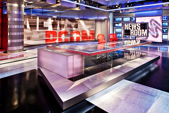
CNN Studio 7
In May, CNN debuted a new set at its Atlanta headquarters from Clickspring Design. NewscastStudio had the scoop when an anonymous source submitted photos of the set under construction.
Despite the shift of more programming to Time Warner Center in New York City, CNN seems to be showing commitment to Atlanta’s role at the network with this investment. The new studio features a wide rear projection screen, sleek shiny surfaces, blurred monitor walls and color-changing elements.
What we like best: The set feels open, airy and modern and the network makes good use of it by moving anchors around the studio frequently and using inventive, dynamic shooting techniques. The set also offers plenty of flexibility with moving elements and the ability to change colors.
What could have been better: The new look, while very sleek and modern, could match the network’s looks in New York and Washington a bit better. For example, the CNN Communications Center in New York has wood elements and uses a bit darker and more dramatic lighting design.
See more: View photo gallery in SetStudio, our sneak-peak coverage and a video tour
ReelzChanel
In late 2010, cable network ReelzChannel debuted a new set from FX Group. Designed by Kevin Vickers and originally offered as a “prototype” design on the firm’s Web site, the set features vertical flat screens, a cityscape background and colorful backlit elements. The centerpiece of the studio is a raised circle riser reminiscent of a film reel, a nice homage to the network’s namesake. The set also features multiple standup areas, each framed by visually exciting backgrounds.
What we like best: First and foremost, we were excited to see a new, innovative look from FX Group. The new set manages to be both modern and warm at the same time and conveys an exciting, vibrant look.
What could have been better: The overall color scheme of the set can be a bit jarring at times, especially with the pink and bold reds mixed with orange hues. In addition, the cityscape background could benefit from a bit more depth to make it seem less flat.
See more: Read our blog coverage and photo gallery
CCTV
Broadcast Design International created a new look for CCTV’s Beijing studios. The set features expansive background graphics, some of which are motorized, allowing for multiple looks in the space, and successfully integrates bold red and blues into its look. The large, block elements give the set foundation and complement the lighted header element and anchor desk.
Perhaps most interesting is the studio’s anchor desk. Made up of three circular surfaces linked together to create a look that’s a bit reminiscent of a molecule, the three-seating positions manage to be both independent and linked.
What we like best: The subtle use of stacked vertical flat screens behind glass also adds a nice touch. In addition, the use of angled edges in the header and anchor desk are an interesting touch. We also liked the seemingly-floating array of three flat screens to the right side of the studio.
What could have been done better: The set perhaps could have benefited from a bit more variety in background elements; some additional on-set technology could have helped break up things a bit. We are also intrigued by the circular desk elements and are curious how that design element could have been carried throughout the set.
See more: Blog coverage and photo gallery
Golf Channel
Golf Channel, the Orlando-based Comcast-owned network devoted to the sport of golf, unveiled its new set at the beginning of 2010 from Jack Morton/PDG.
The new wraparound studio covers an impressive 4,700 square feet and offers multiple venues in a single, integrated look. The studio floor is finished to a gleaming sheen and sports subtle graphical elements of golf-course related imagery. An interview-style area floats off to one side of the studio and is backed by frosted glass and suspended shelving to create a layered look. A suspended ceiling element draws the eye to the two ends of the studio that share a central anchor desk; one that features a mini-work area and floating video wall. Secondary areas include an additional anchor desk, putting green and multiple standup locations.
What we liked best: This set does an excellent job of making use of layering and depth. Numerous elements, from the mini-work area, freestanding interview set and glass panels suspended from the ceiling all do a great job of creating an eye-catching look that pops in HD. The set’s bold, bright colors and lighting also work well.
What could have been done better: The wood box-like elements found on one end of the studio seem a bit out of place. In addition, the secondary set that’s surrounded by vertical frosted panels looks a bit cramped.
See more: Blog coverage and photo gallery
Sunrise
Sunrise, a morning program in Australia, debuted a new look in February from Jack Morton/PDG.
The set includes a geometric, glass-topped anchor desk made from contrasting backlit white tones and wood and sports the show’s logo tucked into a niche. Behind the main anchor area is an almost iridescent background collage of the show’s logo.
What we liked best: The clean, airy and minimalistic design is perfect for a morning program. The lighted shelving set into alcoves gives the studio a bit of a “homey” feel and also allows provides an opportunity for subtle decoration, especially in the sports area, where a ball and other equipment are displayed.
What could have been done better: The set’s logo backgrounds feel a bit dated and perhaps could have benefited from a cleaner graphical layout. In addition, the two standup locations off to either side seem a bit small and make the talent look more like contestants on a game show than news presenters. Finally, the bold red in some of the on-set video graphics is a bit jarring and seems out of place in an area that is otherwise soft and calm.
See more: Blog coverage and photo gallery

KMAX-TV ‘Good Day Sacramento’
Park Place Studio designed a richly detailed new set for KMAX-TV’s morning news and lifestyle program “Good Day Sacramento.” The set has the look and feel of a trendy loft, complete with industrial-style windows, exposed brick and a faux service elevator. The weather area of the set transitions to the feel of a rooftop or similar outdoor space, complete with skyline and faux metal structural supports. Also included is a kitchen set and cafe-style bistro area. The centerpiece of the set is a unique, multi-tiered anchor desk made of backlit material and brick.
What we liked best: The attention to detail on the set is impressive; right down to the radiators and exposed pipes. Not only does this enforce the notion of the show originating from a loft, but also creates a new level of added visual interest. The set is also enhanced with a variety of accent lighting, adding additional layers of depth and texture.
What could have been done better: It would have been interesting to see if the technology found in the weather center could have been integrated a bit more closely into the set’s overall theme. The high-tech flat screens look a bit out of place in what’s supposed to be an outdoor area; though at a certain point reality and the practical use of the space have to reach a compromise.
See more: Photo gallery
The results are in
Our readers voted for their favorites from the six nominees above and here are the results.
Subscribe to NCS for the latest news, project case studies and product announcements in broadcast technology, creative design and engineering delivered to your inbox.


tags
categories
Set Design, Site Updates