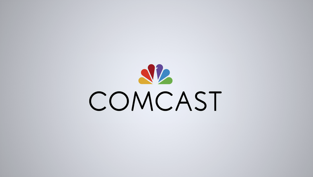
Comcast rolls out less-Comcastic logo featuring NBC peacock

Subscribe to NCS for the latest news, project case studies and product announcements in broadcast technology, creative design and engineering delivered to your inbox.
Media mega-company Comcast rolled out a new logo Monday that drops the red C in favor of the NBC peacock.
The new logo is a big change for the big C, removing the companies bright red for a rainbow.
The typeface was also changed, to a very thin uppercase sans-serif, that seems to lack the power of the previous font. Less-Comcastic, the new logo will take some time to get use to.
The new logo has already made its way onto the Comcast website. The Comcast SportsNet still use a hybrid logo, with both the C and peacock.
Subscribe to NCS for the latest news, project case studies and product announcements in broadcast technology, creative design and engineering delivered to your inbox.


tags
Branding, comcast, comcast logo, comcastic, logo, NBC, NBCUniversal
categories
Branding, Networks