
News Corp. slaps ‘1’ on Fox Sports logo for new network
Weekly insights on the technology, production and business decisions shaping media and broadcast. Free to access. Independent coverage. Unsubscribe anytime.
News Corp.’s Fox Sports Media Group officially announced the launch of its long anticipated national sports network this morning, and along with that announcement came a look at the yet-to-debut channel’s logo.
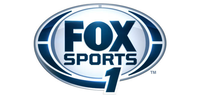
The logo is simply a modification of the existing Fox Sports logo, which itself consists of the “Fox” logotype encased in an oval with dark blue, blade shaped accents on the left and right sides. That dark blue is combined with a light icy blue shade.
For the “Fox Sports 1” network logo, an additional blade shape was added to the outside lower left of the oval, with the number “1” added slightly off center in a generic typeface.
While drawing the base of the logo from its parent network’s logo is certainly a wise branding move, the overall look of the logo seems a bit rushed, with the additional blade shape and number looking like they were, quite literally, just tacked on the existing logo.
The logo also comes across as a bit unbalanced with the additional heavy blue accent on the left but not right side.
The choice of typeface for the numeral is also a bit uninspired, a trend we discussed in an earlier post, and the number itself seems to abruptly cut off the curved blade shape below it, which dampers the sense of motion that shape otherwise would convey.
It would have been nice to see a more stylized “1” included in the logo and a way that is a bit more balanced and in tune with the rest of the logo’s design.

All that said, it’s also entirely possible Fox will update or even replace the logo between now the date the channel debuts in August. It’s not uncommon for new networks to use a temporary logo initially and then switch by debut time (The CW is a classic example).
ABC’s “Katie” also released a logo design when show was officially announced, only to switch it before its debut.

tags
Fox, Fox Sports, fox sports 1, logo
categories
Branding, Cable News, Featured, Sports Broadcasting & Production