
Fox O&Os roll out responsive sites — sort of
Weekly insights on the technology, production and business decisions shaping media and broadcast. Free to access. Independent coverage. Unsubscribe anytime.
Fox O&O stations have begun rolling out what the network calls a “responsive” design designed to give mobile users an optimized viewing experience, but falls a bit short in being as responsive as it could.
Responsive Web design has been popping up more and more in the past year or so and allows a single Web page to be viewed on multiple screen sizes (and hence, smartphones and tablets).
Obviously, one of the driving forces behind responsive design is the proliferation of mobile devices becoming more and more dominant and the new Fox sites are certainly a great way to capture that audience. The new designs are initially being used at its stations in Austin and Memphis, with more rollouts scheduled in the coming days.
That said, the new Fox sites arguably don’t really qualify for what the Web design community would called “fully responsive.”
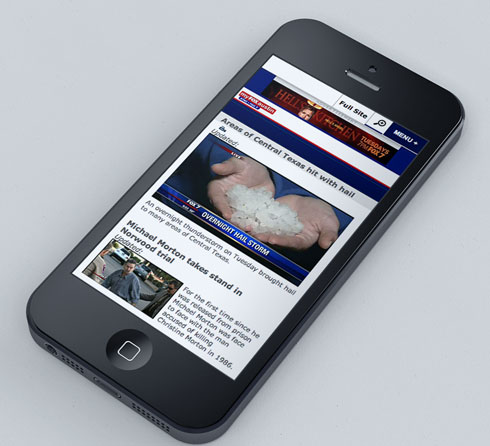
The new Fox design does display differently on mobile devices and tablets, as shown in the simulated screen shot below, but with one caveat: you need to actually visit a special URL to get the responsiveness to kick in.
While the site does “detect” if you’re visiting from a mobile device and direct you to this URL this isn’t as clean as another example of responsive news sites we’ll show you later.

For example, in the URL below (which is what you’re directed to automatically when accessing via a mobile device), notice the extra code at the end of “www.myfoxaustin.com.” This is what tells the site to make the site responsive.
http://www.myfoxaustin.com/?removecgbypass&clienttype=smartdevice
Give it a click and even if you’re on a desktop or laptop browser, you’ll get served the mobile friendly version. Then try making your browser window narrow and see how the design changes. You’ll also notice some of the layout is a bit broken when viewing at full width.
Now try visiting this URL, which is the “standard” one visitors get on a desktop.
Provided you’re not on a mobile device, try resizing this new window. Nothing happens to the layout except content gets cut off.
One of the news industry’s pioneers in responsive design is the Boston Globe, which garnered significant attention when its redesign debuted. Here’s the URL to the Globe’s website:
If you’re on a desktop or laptop, the site should look like any other website (also note that the Globe doesn’t require any special tags in its URL).
Now try making your browser window just a bit narrower.
Notice how everything, from the images to how headlines and body text flows, adjusts in realtime as the window even just a bit smaller or larger. If you go really narrow, say approximately the width of a smartphone screen, the layout changes completely, becoming highly vertical.
The advantage to a full responsive design, as opposed to the more restrictive route Fox has gone, is that you can easily accomodate a myriad of window sizes and user preferences no matter how they access your site.

As monitors on desktops and even laptops bigger, many users like to have different windows open separately, often of different sizes. The new Fox sites wouldn’t hold up well under these situations.
In the end, however, Fox is smart to have at least implemented what is has done. In the “old days,” TV stations often had separate mobile URLs or even domain names that users had to access to see a mobile friendly version of the site (which was often generated by a completely different system), so this is obviously a great improvement over that since a user only needs to remember one domain.

tags
Boston Globe, Fox, responsive, responsive web design
categories
Featured, Local News, Mobile, Online and Digital Production