ABC Chicago changes branding, graphics

Weekly insights on the technology, production and business decisions shaping media and broadcast. Free to access. Independent coverage. Unsubscribe anytime.
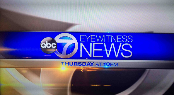
WLS-TV, the ABC O&O in Chicago, has debuted a new graphics package to accompany its return to the “Eyewitness News” branding.
 The new graphics package drops the rich blues and golds found in its previous look for a cleaner, more modern look. The station has retained the blue and gold, but adds white as one of the dominant colors and significantly de-emphasizes the gold tones.
The station originally used the “Eyewitness News” moniker from 1969 to 1996.
Although the station replaced its graphics to accompany the new branding, its streetside set did not appear to have undergone any changes on Monday’s newscasts.

One interesting feature in the new package is that the words “Eyewitness News” are set is a relatively light type weight, which doesn’t give it quite the weight as is often seen for the primary branding in news graphic packages. That said, the lighter style allows the ABC globe and Circle 7 logo to be more prominent — perhaps part of the strategy at WLS-TV.

The rest of the WLS-TV package uses elongated rectangles with rounded corners — such as the promo graphic seen above — as well as two bars that wrap around the bug and give the time and temperature and Web links a home:

Both of these elements echo graphics seen at other ABC O&Os, especially WPVI-TV in Philadelphia.
Interestingly, the new looks has similarities to the graphics at NBC O&O WMAQ-TV and CBS O&O package that NewscastStudio reported on in September and that debuted just recently at Chicago’s CBS affiliate WBBM-TV.
All three packages use blue and white as dominant colors and contain crisp, clean edges from 3D elements. All three packages also use gold as an accent color.
In addition, WBBM-TV’s new package uses circular elements that echo the network’s “eye” logo — and the new “Eyewitness News” package makes use of a circular element that serves as a sort of lens.
Meanwhile, WMAQ-TV’s graphics use the sides of a 3D, stylized NBC peacock as a recurring theme — which looks similar to the round elements that are used on WBBM-TV and, in some ways, the Circle 7 logo in the WLS-TV package.
Here is a video clip of a promo using the new graphics:


tags
Chicago, wbbm, wls, WMAQ
categories
Branding, Graphics, Local News