
Broadcasting & Cable redesigns website
Weekly insights on the technology, production and business decisions shaping media and broadcast. Free to access. Independent coverage. Unsubscribe anytime.
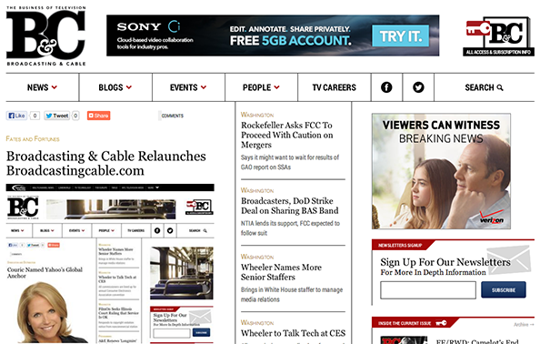
Industry publication Broadcasting & Cable has launched a redesigned website.
The new website reflects the more classic look the publication has taken on over the past few years, mainly through the elegant serif typeface used in the “B&C” icon that now dominates the logo.
That classic look is complemented with serif headlines and sans serif, condensed typography used elsewhere.
The site is also now fully responsive for easier reading on smaller screens.
One of the downsides, however, of the new site, is that it suffers from an overuse of vertical and horizontal rules, making many elements feel boxed in and trapped.
Visit the new site here.

tags
Broadcasting and Cable, broadcastingcable.com
categories
Featured, Online and Digital Production