
MSNBC moves to a simpler graphic look
Weekly insights on the technology, production and business decisions shaping media and broadcast. Free to access. Independent coverage. Unsubscribe anytime.
MSNBC rolled out an updated graphics package this week.
Similar to the 2014 changes by CNN, the updates include an updated header bar and lower third. The new L3 has a singular focus, and removes the previous branding box.
Former MSNBC graphics
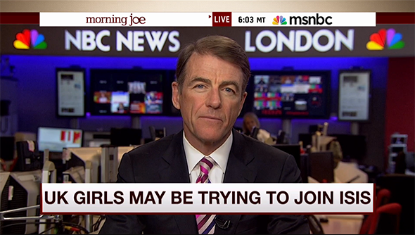
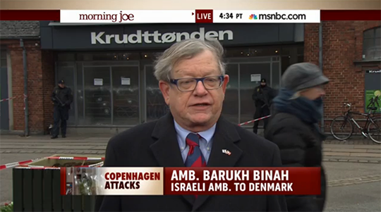
The new lower-third includes large upper case text that spans nearly the width of the screen. The banner is typically one line, but can change to two lines as needed.
The former branding box sometimes reappears, taking up the entire width.
The header bar, which includes the show logo and MSNBC logo, was also widened to match the width of the new L3.
Examples of new look:


Advertisement


tags
Graphics, MSNBC, tv graphics
categories
Branding, Featured, Graphics, TV News Graphics Design, TV News Graphics Package