
ESPN unveils new website
Subscribe to NCS for the latest news, project case studies and product announcements in broadcast technology, creative design and engineering delivered to your inbox.
Disney-owned ESPN has unveiled a completely redesigned website that focuses on using screen real estate for prominently displaying scores and promoting other content as well as keeping a consistent experience across devices.
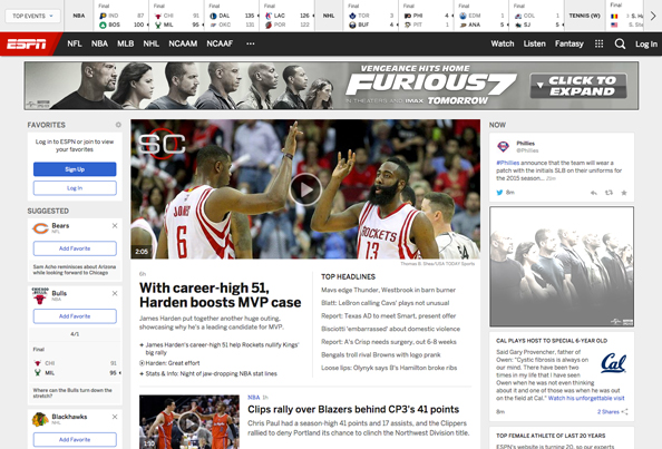
The new design’s most prominent feature is a horizontal strip running across the top of the page that remains visible at all times on desktop browsers.

Doubling as both the site navigation and a score ticker of sorts, a dropdown menu lets users instantly switch between different sports, leagues and dates, while clicking on a particular score links to a relevant story. The bar also scrolls horizontally when needed and also includes a “drop in” animation effect when first loading or switching between content.

Beneath this, a simple navigation menu provides access to various sports news via flyout “megamenus” that incorporate team logos beside each section’s main navigation options.
Running down the left side of most pages, meanwhile, is an infinite list of other stories found on the site.
Interestingly, the top and left bars aren’t featured on some pages — most notably the “SportsCenter” homepage, which also includes a rather odd background image.
The overall design of the new site takes on the more “flat” look that ESPN’s on air graphics have been taking and includes a simple color palette of red, black grays and blue.

The new look seems to struggle between wanting to give users a plethora of information while still trying to keep the look clean.
While it’s far from being a non-cluttered look, it’s clear that at least some thought was put into the amount and use of white space, especially in the immediate vicinity of the text content on story pages.
Although video and photos are prominent parts of these pages, the pages also include a generous amount of white space on either side of the paragraphs (especially on large screens) which makes it surprisingly easy to focus on the text and “tune out” the left and top bars.
The new ESPN.com is also fully responsive, with unique yet cohesive experiences for huge desktop screens, mid-range laptop screens, tablets and, finally, mobile phones.

The mid-size and tablet view, shown above, eliminates the left navigation bar (which is actually quite a relief) but retains the full header bar design. The site’s main navigation moves to the “hamburger icon” next to the red ESPN logo and takes on the form of a vertical flyout menu, as shown here:

On mobile phones, meanwhile, the design takes on a much more condensed approach but still manages to maintain the overall flavor of the full-sized design. Users will still find the main navigation in the hamburger icon:

Obviously, in dealing with such small screen sizes (that also are frequently viewed in portrait orientation and thus limiting the screen width), having the score bar across the top of the page was problematic, but the designers left it accessible via the “Scores” menu in the upper right of the screen, with the data taking over the entire screen when that option is tapped.

Users can still flip between sports and leagues and change dates using navigational elements that are optimized for “fat fingers” — a must on the smaller tap-centric nature of mobile phones.

Subscribe to NCS for the latest news, project case studies and product announcements in broadcast technology, creative design and engineering delivered to your inbox.

tags
ESPN, espn.com, SportsCenter, web design
categories
Cable News, Online and Digital Production, Sports Broadcasting & Production