ESPN’s ‘Monday Night Football’ gets new logo
Weekly insights on the technology, production and business decisions shaping media and broadcast. Free to access. Independent coverage. Unsubscribe anytime.
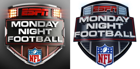
ESPN has switched to using a new logo for its “Monday Night Football” broadcast.
The new look, shown on right above, maintains the same basic shape of the old logo, left.
Notable changes, however, include:
- Much of the subtle accents have been removed or simplified, in keeping with the overall simplification of ESPN’s on air look; most notably is the removal of the “lights” in the top portion of the logo
- Much of the highly metallic effects have been removed, replaced with more subtle gleams of light
- The lower portion has been rounded out a bit more, giving a better suggestion of the shape of a football
- The main logotype is slightly larger and now bulges outward toward the viewer a bit more
- The NFL logo is now more prominent, an effect partially achieved by having it extend outside of the emblem
- The color scheme has bee moved to black, red, blue and white, which matches the NFL logo better; the previous logo was more gold and red — which matched the previous ESPN look closer
It’s worth noting that the typography of the logo remains the same.
Overall, the new logo is definitely more in line with the flatter, more geometric look and feel ESPN has been moving toward in favor of the highly metallic, light-filled and immersive 3D looks of the past.
Here’s a look at some of the past “Monday Night Football” logos from when the broadcast was still under the ABC banner:


Advertisement


tags
ESPN, logo, monday night football
categories
3D, Branding, Cable News, Featured, Graphics, Sports Broadcasting & Production