
‘Meredith Vieira’ season opener sees set, graphics changes
Weekly insights on the technology, production and business decisions shaping media and broadcast. Free to access. Independent coverage. Unsubscribe anytime.
Struggling NBCUniversal talker “The Meredith Vieira Show” debuted its second season with some changes to its set and graphics.

The syndicated show, which also updated the set part way through last season, has added a new roundtable-style area to the set.

This update to Studio 6A included adding additional faux stonework and internally lit column elements on the right side of the set, replacing the 3×3 video wall “window seat” that was previously in this location.
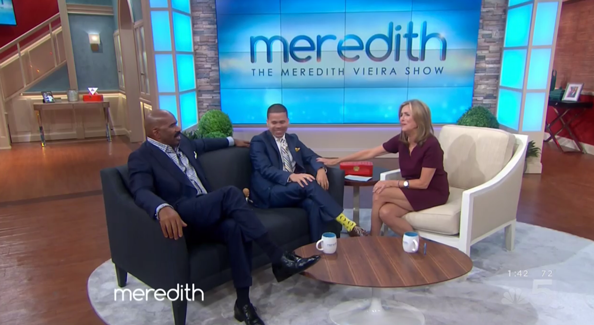
The new wall now boasts a larger, 4×4 video wall that’s mounted in front of the faux stonework rather than into the wall.
For the new “What’s Hot Now!” segment at the top of the show, Vieira and her panel sit around a large, frosted glass topped table.
The table’s dark wood, mid-century style legs seem a bit out of place with the rest of the set’s materials, just as the more modern column elements are bit out of place among the homey-style of the rest of the set.
To make room for the panel area, which also doubles as an interview area with new sofas and chairs, the show’s house bad has been relocated from the far right wall of the set, which now sports an additional video screen, to an area just in front of the audience that was previously used for informal interviews and demos.

In the show’s old interview area, situated on the left side, the fireplace and frosted glass-fronted cabinets remain, but the large white squares have been mostly removed from the wood flooring.

In addition to the set changes, the show has also received a graphics makeover, starting with the logo.
The new look eliminates the thick box around the show’s logotype and now only Meredith’s first name appears in the rounded font. The full name of the show moves beneath this in a clean sans serif typeface, a change that places the emphasis squarely on the host’s first name.

The new graphics also feature a richer blue tone with subtle white and gold light flares and is accented by layers of angled elements on either side, which are quite interestingly, somewhat similar to the the new look at rival daytime talker “The View.”

The show is now featuring updated lower thirds, which are a marked improvement over last seasons.
The white boxes and large, clear typography are well designed and are much easier to read than the smaller type that was often difficult to read, especially when the show chose to color it in a dark blue shade that had almost no contrast between the background color behind it.

“Meredith Vieira” faced some ratings struggles in its freshmen year, but did show some positive growth, which lead to the show getting the green light for a second season.
Producers are hoping to breathe fresh air into the show with the new panel format helmed, most notably, by former N’SYNC singer Lance Bass.


tags
Meredith Vieira, NBCUniversal, Studio 6A, The Meredith Vieira Show
categories
Entertainment, Featured, Graphics, Set Design, TV Set Design