
BBC Three unveils head-scratching logo
Weekly insights on the technology, production and business decisions shaping media and broadcast. Free to access. Independent coverage. Unsubscribe anytime.
BBC Three, a British channel neared toward millennial viewers, unveiled a new logo and viewers aren’t quite sure what to make of it.
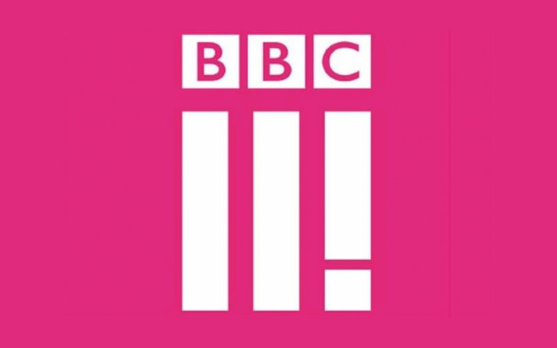
The network, which is owned by BBC, switched away from using the word “three” in a trendy font to a design of three vertical bars — the last of which sort of looks like an exclamation point.
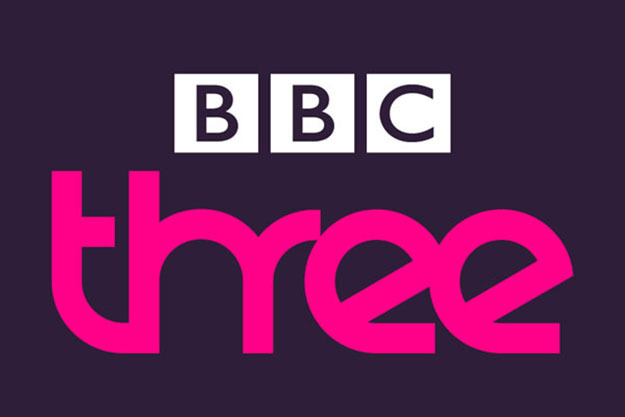
Old BBC Three logo
Users are confused as to what, exactly, the logo is supposed to mean. Is that last bar supposed to be an exclamation point (a la Yahoo! or Jeb!)? And, if so, doesn’t it kind of look like the logo is saying “2!”?
More nitpicky viewers noted the poor alignment and spacing in the logo:
[field name=iframe]
What’s perhaps even more perplexing is that the general concept of the logo could have worked quite well. Since the standalone “BBC” logo is already in three boxes, the Roman numeral idea could have been carried out, with proper alignment and spacing, into the bars below it and read quite clearly as “III.”
That said, the new look is certainly a bit cleaner than the old iteration, which sort of had a free font download look to it.


tags
BBC, BBC Three, logo
categories
Branding, Broadcast Design, Heroes