Notable Channel 1 TV station logo designs
Weekly insights on the technology, production and business decisions shaping media and broadcast. Free to access. Independent coverage. Unsubscribe anytime.
Although, in the U.S. at least, there’s no such thing as Channel 1 in the over-the-air TV signal spectrum, the number one is still used prominently in branding for both U.S. and overseas outlets.
Channel One News
In the U.S., perhaps the most prominent example is Channel One News, a daily news program geared toward school-age kids that’s shown in schools across the country. The show’s current logo includes the name spelled out under a clean circular blue icon with a notch taken from the stop — likely symbolic of a stopwatch or clock.

The show previously used a logo that kept the circular and simplistic theme, but added a funky little “tail” to the “1” numeral.
NY1

Another prominent example of the use of the “1” on a channel name in the U.S. is Time Warner Cable’s NY1 outlet. Since cable channel assignments are essentially arbitrary and don’t follow the OTA frequencies, this channel is actually available by tuning to Channel 1, at least within the New York City metro area.
The channel, founded in 1992, is available exclusively to Time Warner Cable subscribers as part of a strategy to offer customers access to exclusive content and keep them from defecting to satellite or other entertainment providers.
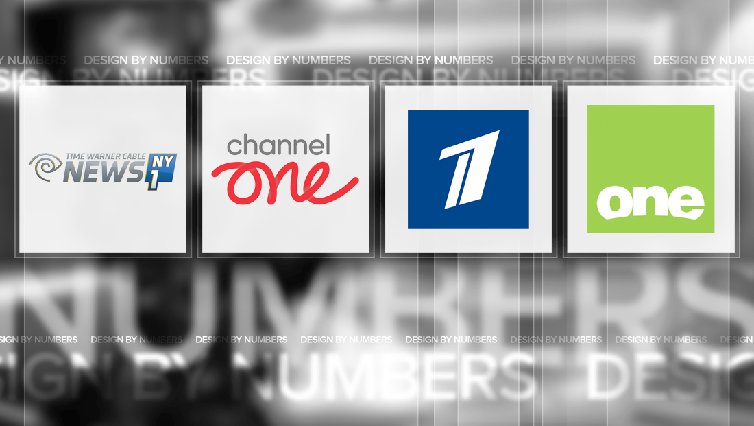
In addition to branding as “NY1” the channel is also known as Time Warner Cable News NY1 and often combines the blue polygon logo with the Time Warner Cable “eye” logo, as shown in the lockup above.
Channel 1 (U.K.)
In the U.K., a channel originally known as Virgin1 was acquired in 2010 by BSkyB and rebranded under the “Channel One” name. However, the network was short lived under the new name and shuttered in 2011.
However, the in the short time under the “Channel” one banner, the network did manage to create a rather unique logo — instead of using the typical numeral seen in TV logos, the network spelled out “one” in an all lowercase ribbon like script typeface.
Under the “Virgin1” name, the network used the familiar hand-scrawled “Virgin” with a cleaner “1” that looked like it was simply tacked on to the logo.
Channel 1 (Russia)
In Russia, the government controlled Channel 1 uses a creative, angular take on the number one. Often set against a field of blue, the number features two simple shapes, one that looks a bit like a “7” and the other more like a “1” that, together, create an active looking logo.
One (Australia)
In Australia, One is an OTA channel owned, somewhat ironically, by Ten Network. Its logo uses a box with fresh shade of green. Inside, the word “one” is written out in all lowercase letters and a curved portion suggesting a sunrise or horizon carved out of the bottom of the letters. The word itself is also positioned in the lower portion of its box.
BNT 1
In Bulgaria, a government owned channel uses the name “BNT 1” with a logo featuring four deep red boxes. The top, and largest box, includes the “1” numeral right aligned. Below this are the letters “BNT,” each in their own box, in the Bulgarian alphabet.
This post is part of a semi-regular series on NewscastStudio that takes a look at TV station and network logos that include the numbers 1 and up. These posts aren’t meant to be a comprehensive list of all logos featuring the number in question, but rather a look at notable logos with creative, historic or an otherwise significant impact on branding design. If you have other logos with the number featured in this post, feel free to share it in the comments.


tags
Channel One, Channel One News, design by numbers, ny1, One, Spectrum News NY1
categories
Branding, Design By Numbers, Heroes