
Readers pick notable Channel 3 station logos
Weekly insights on the technology, production and business decisions shaping media and broadcast. Free to access. Independent coverage. Unsubscribe anytime.
After a brief break, Design By Numbers is back, with our readers’ choice picks for Channel 3 logos.
KTVK-TV
![]()
KTVK-TV, an independent station in Phoenix owned by Meredith, has a unique logo that combines warm colors with overlapping shapes and the numeral 3 at the center.
The outermost shape of the logo, which is rendered in gold and orange, mimics the shape of an “old fashioned” tube television screen. Inset inside of this is a red circle that contains the number “3” in a simple sans serif typeface.
![]()
Although the current version of the logo features shiny 3D planes that appear stacked on top of each other, the station previously used a flatter version of the logo that also included desert imagery blended into the background.
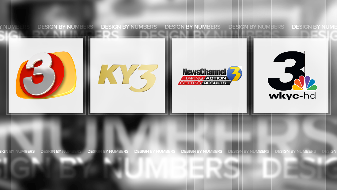
KYTV-TV


KYTV-TV, the NBC affiliate in Springfield, Mo., uses a dramatic and angular “3” numeral.
The station, which is known on air, rather unfortunately, as “KY3,” includes those letters next to the “3” — and one arm of the “Y” is aligned with the sharp angle at the end of the top part of the “3,” which the bottom “hook” of the “3” draws the eye back to the neighboring letters.
WTKR-TV
![]()
Dreamcatcher Broadcasting’s WTKR-TV, the CBS affiliate in Norfolk, Va., has a notable logo that, while a bit dated, is highly recognizable.
The number’s style conjures connections to science fiction television shows, but also creates the look of a flowing river, which may be a reference to the market’s “Hampton Roads” nickname. However, in this case, the “roads” isn’t actually a surface path — but rather a natural bay that’s also known as a “roadstead” or “road” for short.
That said, the weaving path of the “3” could also be taken literally as a road or an illusion to the Elizabeth River that flows from the bay through the city proper.
In some lockups of the logo, meanwhile, the sharply angled descender of the “3” is connected to the angles in a set of boxes that contain the station’s logo — though it’s not a perfect match.
This post is part of a semi-regular series on NewscastStudio that takes a look at TV station and network logos that include the numbers 1 and up. These posts aren’t meant to be a comprehensive list of all logos featuring the number in question, but rather a look at notable logos with creative, historic or an otherwise significant impact on branding design.

tags
design by numbers, ktvk, kytv-tv, phoenix, springfield
categories
Branding, Design By Numbers, Heroes, Uncategorized