Readers pick notable Channel 4 station logos
Weekly insights on the technology, production and business decisions shaping media and broadcast. Free to access. Independent coverage. Unsubscribe anytime.
Last week we took a look at our picks for Channel 4 logos — and now it’s your turn.
Here’s our readers’ picks for notable Channel 4 logos.
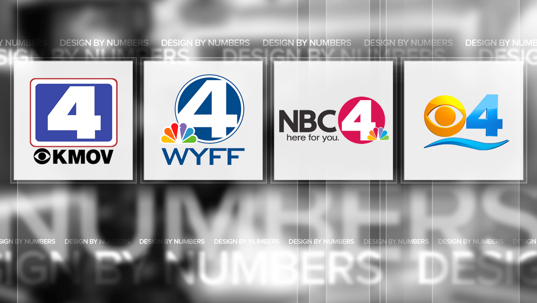
KMOV-TV
![]()
KMOV-TV, the Meredith owned CBS affiliate in St. Louis, Missouri, uses a simple and well known mark.
The logo features a bold blue rounded rectangle, likely meant to represent an tube television monitor, with a thick “4” inside of it is surrounding by negative space and a thin red border.
WYFF-TV
![]()
Hearst’s WYFF-TV, which serves North and South Carolina, has another simple and straightforward logo. Instead of the rounded rectangle, though, the station parks its “4” inside a circle, with parts of character overlapping into the white space around the number.
It’s worth noting that the design partially retains the top, right and bottom parts of the number, rather than extending them into the white space completely, perhaps a move to ensure the number remains recognizable.

The blue circle, meanwhile, is surrounded by a thin blue border.
WCMH-TV
![]()
Echoing the circle and simple look is WCMH-TV’s logo. The station, located in Columbus, Ohio, uses a bold red circle with thick “4” inside of it. None of the “4” extends into the white space around the disc, making it highly legible.
The station then, in certain cases, place the NBC peacock in the lower right of the circle, tucked in between two strokes of the “4” and extending outside of the circle. The One nice touch of the design is how the space between the purple and blue “feather” becomes part of the curve of the circle.
WFOR-TV
![]()
CBS O&O WFOR-TV in Miami uses a twist on the rather boring corporate template design, adding a curved “wave” below both the number and CBS eye.
The color scheme, meanwhile, is also a bit more “cheerful” than most other O&Os, likely a nod at the vibrant and sunny culture and climate of Miami.
The wave element is left over from what was an even more unique logo, used for a brief period in 2009 and 2010:
![]()
This logo made use of a more unique number “4” that featured several jagged-looking points, most notably the one created in the negative space where the upward stroke of the “4” doesn’t quite meet the top of the glyph.
This post is part of a semi-regular series on NewscastStudio that takes a look at TV station and network logos that include the numbers 1 and up. These posts aren’t meant to be a comprehensive list of all logos featuring the number in question, but rather a look at notable logos with creative, historic or an otherwise significant impact on branding design. If you have other logos with the number featured in this post, feel free to share it in the comments.


tags
columbus, design by numbers, KMOV, logos, miami, St. Louis, wcmh, wfor, WYFF
categories
Branding, Design By Numbers, Featured