Notable Channel 4 TV station logo designs

Subscribe to NCS for the latest news, project case studies and product announcements in broadcast technology, creative design and engineering delivered to your inbox.
If three’s a crowd, then four’s a party.
This week’s installment of Design By Numbers features the number 4.
WTMJ-TV

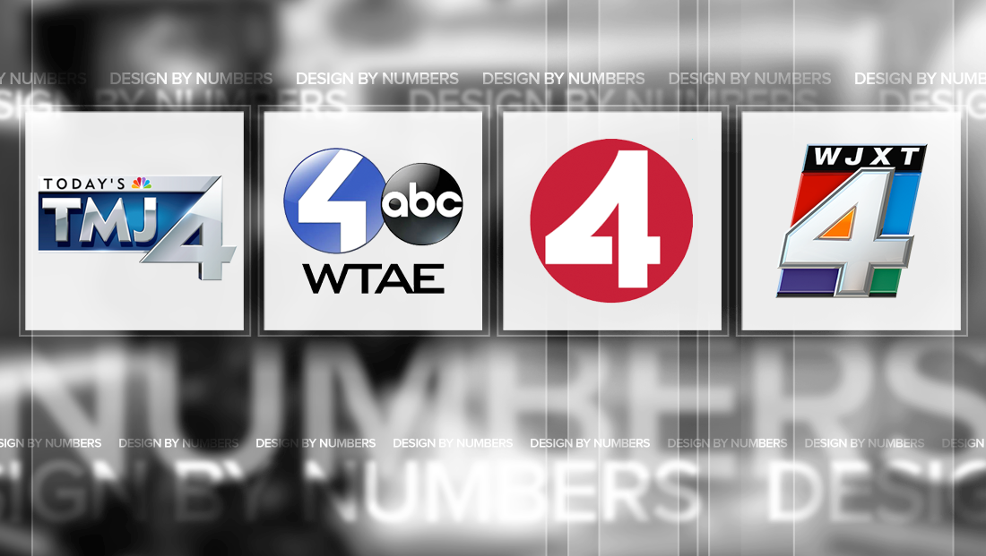
WTMJ-TV, the Scripps owned NBC affiliate in Milwaukee, Wisc., brands on air as “Today’s TMJ 4” and also includes a dramatic number 4 in its logo.
The left angle of the numeral is almost a perfect 45-degrees, whereas other 4s tend to have a less extreme angle. The character also has a very short “leg” and “arm” sticking off the right side.
That “arm,” meanwhile has an angled end, though it’s worth noting it’s not a match to the angle used on the other side of the logo.
WTAE-TV

Hearst Television owned WTAE-TV in Pittsburgh, uses a round blue circle that works great when the logo is locked up next to the ABC circle logo, as shown here.
The station creates the number “4” in the circle by creating a “path” that starts at the top right and angles down sharply toward the left before making a turn to the right and a final 90-degree turn toward the bottom.
KRON-TV

San Francisco independent station KRON-TV, currently owned by Media General, has an iconic “4” logo that’s based on a red circle.
The number “4” itself features a gently draping descender on the upper left side, which is meant to mimic the city’s iconic Gold Gate Bridge.
As an added touch, the left-to-right horizontal bar is broken for a but just before it intersects the vertical bar in the number.
WSMV-TV

Meredith owned WSMV-TV in Nashville, Tenn., features a gold “4” with two “chops” on the left and top.
These angles are slightly different, which is an interesting choice, but also serves as a visual cue to the lower right part of the logo, where the station typically places the NBC peacock.
This creates a nice flow between the number and network icon, which is enhanced by the height of the logo matching the height of the cross bar of the “4.”
WJXT-TV

Graham Media’s WJXT-TV in Jacksonville, Fla., has what’s perhaps one of the most colorful “4” logos out there.
The station uses an angled block that contains a silver-y “4” along with four external quadrants, each shaded a different color, with the negative space in the middle of the “4” getting an orange hue.
The station redid the logo in 2014 after using a similar, albeit non-angled, look for years that had a similar, though brighter, color scheme.
This post is part of a semi-regular series on NewscastStudio that takes a look at TV station and network logos that include the numbers 1 and up. These posts aren’t meant to be a comprehensive list of all logos featuring the number in question, but rather a look at notable logos with creative, historic or an otherwise significant impact on branding design. If you have other logos with the number featured in this post, feel free to share it in the comments and stay tuned for a “reader’s favorites” version of this post coming soon.
Subscribe to NCS for the latest news, project case studies and product announcements in broadcast technology, creative design and engineering delivered to your inbox.


tags
design by numbers, KRON, milwaukee, nashville, pittsburgh, san fransisco, wsmv, wtae, wtmj
categories
Branding, Design By Numbers, Heroes