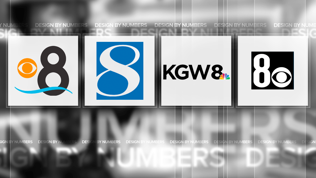
Readers pick notable Channel 8 logo designs

Subscribe to NCS for the latest news, project case studies and product announcements in broadcast technology, creative design and engineering delivered to your inbox.
Last week, we laid out some of our favorite picks for Channel 8 TV station logos — now it’s your turn.
KFMB-TV

KFMB-TV, San Diego’s CBS affiliate, has a fresh take on a Channel 8 logo. The station uses a thick stroked “8” with smaller top ring next. The negative space in the figure is a perfect nod to the CBS eye logo, which is placed off the left side and can read as the sun over the water, which, in turn, is represented by the swish below both elements.
WRIC-TV

I’m glad someone remembered to point out WRIC-TV’s logo, because it’s certainly one of the more unique ones that slipped by my radar on the first pass.
The Richmond station’s logo contains several intertwining ligatures inside a box that form a sort of abstract 8. In some ways, the look mimics that of a double helix or the elegance of the swashes in a blackletter gothic script font. Placing the figures inside a of a thin square box almost seems incongruent in many ways, but somehow the contrast really works.
It’s also worth noting that the the typeface used for the station’s call letters mirrors the fine “tails” int he logo — especially the “foot” of the “R.”
KLAS-TV

KLAS-TV in Las Vegas, meanwhile, uses a nearly symmetrical “8” for its bold and simple logo. Although over the years the logo has changed slightly, the emphasis has always been on a more vertical scale that draws the eye up and down.
KCCI-TV

In a slight departure from the bold, thick looks that usually dominate TV station logo design, KCCI-TV in Des Moines uses an “8” figure that mixes thinner strokes with a bold top left to bottom right stroke.
The logo is placed inside of a box with the far left side of the number cut off. In some variations, the “8” appears in silver with that lower left part hanging off the box.
The italicized font gives the logo a sense of forward movement.
Of note, KCCI-TV still uses the Bankers Gothic font for its call letters and city name that Hearst Television once used across almost all of its properties. The look is a bit of an interesting contrast — between the thick, chunky shapes of the Bankers Gothic and the more elegant curves of the numeral. That said, since KCCI-TV has two “C”s, the very distinct character creates two eye-catching “points.”
KGW-TV

Portland’s KGW-TV uses a logo that worth mentioning not because of its “8” but rather the treatment its call letters are given.
The “8” itself is pretty boring — and even arguably slightly misshapen with one of the negative “holes” appearing significantly wider than the other despite the fact the lower portion of the letter is only slightly wider. The “8” also seems slightly thicker than the call signs it’s placed next to — but not enough so to make it stand out.
It’s also worth noting that whatever fonts inspired the call signs and “8” itself are a bit too similar, which leads to another question of visual separation.
That said, the station did chose to refine its three-letter call sign. Obviously, the most significant character is the “G,” which features a sharp angle taken from the bar in the middle, which creates a nice cohesiveness with the diagonals found so strongly in the “K” and “W.”
That “slash” angle appears to be inspired by the strokes in the “W” whereas the diagonal tip of the upper right of the “G” connects visually to the “K.”
This post is part of a semi-regular series on NewscastStudio that takes a look at TV station and network logos that include the numbers 1 and up. These posts aren’t meant to be a comprehensive list of all logos featuring the number in question, but rather a look at notable logos with creative, historic or an otherwise significant impact on branding design. If you have other logos with the number featured in this post, feel free to share it in the comments.
Subscribe to NCS for the latest news, project case studies and product announcements in broadcast technology, creative design and engineering delivered to your inbox.


tags
Des Moines, design by numbers, kcci, kfmb, kgw, klas, las vegas, portland, Richmond, san diego, WRIC
categories
Branding, Design By Numbers, Local News