Notable Channel 8 TV station logo designs
Subscribe to NCS for the latest news, project case studies and product announcements in broadcast technology, creative design and engineering delivered to your inbox.
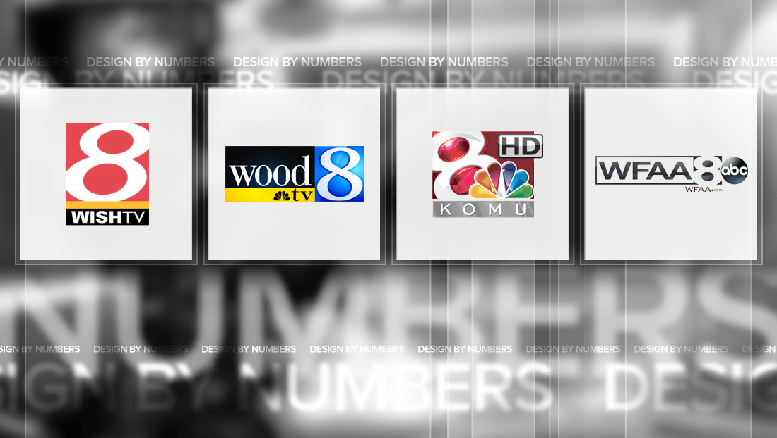
Eight is a fun typographic figure to design with — at its core it’s essentially just two circles perched one of top of the other, which makes it well balanced and, in some cases, nearly perfectly symmetrical.
Here’s our roundup of some notable Channel 8 TV station logos:
WISH-TV

Indianapolis CW affiliate WISH-TV, however, opted to shed the perfect symmetry in favor of a overly italicized “8” that has thick strokes but also a strong emphasis on the ovals inside the character.
The station places its logo inside a red box, with the left, top and upper right side of the white “8” “bleeding” out. Notably, the upper left and lower right of the letter remains completely inside the box, which goes a long way to help with readability.
Below this is a thick red line that cuts off the rounded base of the “8” and a thick black box with the station’s call letters.
The combination of red, yellow and black is by no means unique to WISH-TV, but it’s also a great alternative to the sea of blues and silvers seen so often in TV station logos. Both colors also have a certain sense of urgency and activeness to them, which is another plus.
WFAA-TV

WFAA-TV in Dallas uses a bold eight that stretches almost outside the boundaries of the box it sits inside of, with the only exception being the upper portion of the left and right side of the figure — where there’s a a sliver of the box still visible.
The station’s call signs are typically placed in an open box to the left of the number.
WOOD-TV
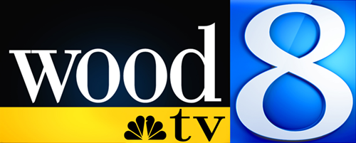
WOOD-TV in Grand Rapids, Mich., is one Channel 8 logo that’s perhaps more notable for its “non-8” parts.
In addition to the curvy sliver eight against a boxed blue field, the station also makes use of the box motif to house both its call letters and network affiliation mark.
The first sign that this logo has some twists is the use of an elegant, rather thin stroked serif font. But the designers didn’t stop there, opting to stylize the call signs in all lowercase. And there’s still more — rather than fill the entire black rectangle in from top to bottom, the designers opted to give a bit of extra breathing room above the letters.
Continuing with the lowercase theme the “TV” also appears in lowercase next to a single toned NBC peacock outline inside of a gold box.
The overall result is a look that seems to do a fairly good job of focusing the eye on the “8” while also making sure the “WOOD” call letters stand out and are highly legible — which is key since that station brands under the word “wood.”
That said, the drop shadow on the “8” could easily be lost to better fit with the flatter, simple look of the rest of the logo — as well as the seemingly random diagonal reflection mark behind the upper part of the number. The gold below the black, meanwhile, seems to have found a great balance of just the right amount of subtle texture and glow.
KOMU-TV
Owned and operated by the University of Missouri, KOMU-TV’s logo features an “8” that’s not italicized — but rather outright tilted.
The station, which serves the Columbia/Jefferson City, Mo. market, uses a wide, thick stroked character to help make it stand out and by tilting it about 30 degrees to the left, makes it easier to see behind the NBC peacock placed in the lower right.
The idea of tilting the number is interesting — on one hand, it does give the station a nice place to tuck the peacock — but the “forward” motion that’s conveyed with italics in logos is basically reversed here. In some ways, it looks like the logo’s tipping over or being blown backward by a strong wind.
Placing the character in such an odd rotation also could make it a bit hard to be obviously seen as an “8” since it has a bit of an odd effect on the character’s readability.
In many applications, the logo has an overly-zealous gel effect applied to it — giving it inevitable comparisons to a circa-1990s iMac.
WTNH-TV
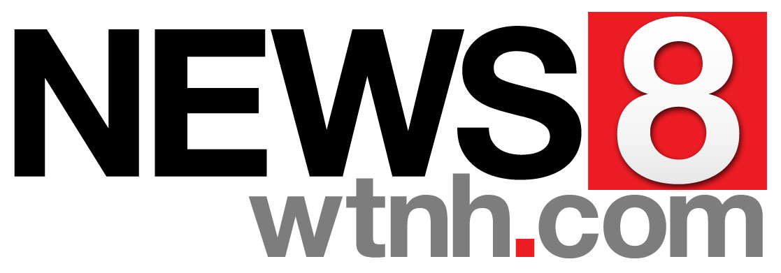
We’re including WTNH-TV here not so much because of its current logo (above), which is rather boring, but mainly so we could mention its more distinct previous logo.
The current logo for the Hartford station, which was introduced when the station switched over to the simplified “News 8” brand, features a light gray “8” in a Helvetica-ish font in a red square. That’s it.
It’s not even a particularly well crafted logo — there’s some odd spacing inconsistencies between the characters in “News” as well as between that word and box.
The designers did manage to sneak the ascenders of the “t” and “h” in the station’s URL up into the negative nooks left under the “W” and “S” — but that results in so more odd spacing where the “.com” seems to be bump into the box.
Meanwhile, the whole URL seems a bit too big compared to the rest of the logo — and why didn’t the design attempt to fit make the “com” part as wide as the red box above it?
The vertical scaling relationships between “News” and “8” and the red box are also a bit of a puzzle — none of them seem to line up exactly on any sort of horizontal line.
The logo does include a red square-shaped period in an attempt to tie it to the other box, which is a nice touch.
Finally, the use of a shadow on the “8” is a bit random given the otherwise flat and clean look of the logo.
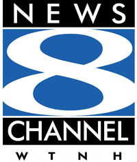
All that said, the station’s previous logo featured an “8” that was stretched horizontally.
Some would say it was stretched a bit too much — and they may be right. However, the result was the ability for the logo to be a bit more eye-catching and distinct, especially where the “curls” of the glyph cross paths.
The logo also included the words “News” and “Channel” in black boxes at the top and bottom, which is a weaker element of the design. First, the stacking makes it seem like the branding might be “News 8 Channel” — plus the different character count in “News” and “Channel” (not to mention “WTNH” when the call letters were included) was pretty glaring.
It would have been interesting to have seen WTNH-TV keep at least some of the characteristics of the old logo when it made the switch — perhaps keeping some version of the stretched “8” rather than the boring “eight in a box” look it uses now, a strategy that could have given viewers familiar with the old logo the chance to keep at least some visual connection to it.
This post is part of a semi-regular series on NewscastStudio that takes a look at TV station and network logos that include the numbers 1 and up. These posts aren’t meant to be a comprehensive list of all logos featuring the number in question, but rather a look at notable logos with creative, historic or an otherwise significant impact on branding design. If you have other logos with the number featured in this post, feel free to share it in the comments.
Subscribe to NCS for the latest news, project case studies and product announcements in broadcast technology, creative design and engineering delivered to your inbox.


tags
dallas, design by numbers, grand rapids, hartford, indianapolis, KOMU, wfaa, wish, wood, wtnh
categories
Branding, Design By Numbers, Heroes