Eurosport unveils Olympics logo design

Subscribe to NCS for the latest news, project case studies and product announcements in broadcast technology, creative design and engineering delivered to your inbox.
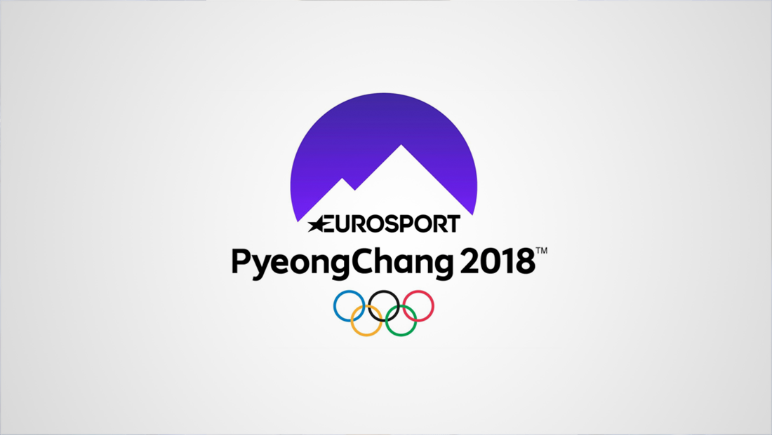
Eurosport has unveiled its design for the 2018 Winter Olympics in Pyeongchang, South Korea.
The broadcast of the winter games will mark the network’s first as the official broadcaster for the Olympic games in the United Kingdom and Europe.
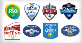
The look uses a bold circle with negative cutouts representing a mountainscape, a design theme also used in American broadcaster NBC’s look:

The logo’s color will change depending on the use, reflecting the vibrancy of South Korean popular culture.
The angles of the wedge shapes appear to be inspired by the angles found in the Eurosport logo, including the logotype’s signature star and the distinctive “R”s.
The mountain motif is a common one found in past Winter Olympics logos, including those used in the past by NBC.
The logotype also features the host city’s name in PyeongChang in camel case (with the capital “C” in the middle) in order to avoid confusion from the North Korean city of Pyongyang.
Subscribe to NCS for the latest news, project case studies and product announcements in broadcast technology, creative design and engineering delivered to your inbox.


tags
2018 Winter Olympics, eurosport, logo design, logos, Pyeongchang
categories
Branding, Featured, Olympics