
A look at the evolution of NBC’s Olympics logos: Updated for 2024
Weekly insights on the technology, production and business decisions shaping media and broadcast. Free to access. Independent coverage. Unsubscribe anytime.
Updated for 2024: NBC, which is the self-proclaimed “America’s Olympics Network,” always invests significant time and energy into branding its coverage of each Olympic games — a design strategy that has evolved significantly over the years.
The logos and branding NBC creates are developed separately from the International Olympic Committee or the host city organizing committees. They are primarily used on air during the broadcasts and promos, but also extend to mobile apps and other platforms.
Designing these logos can be a creative challenge because of the need to capture the look and feel of the host city or country while also being respectful of not using overly stereotypical design fallbacks.
In addition, the logos often appear on air alongside the host city’s own logo and branding, such as the decoration graphics that ring many venues, which is a completely separate design, so that must also be taken into consideration.
NBC’s logos do not appear on other networks.
Paris 2024
![]()
NBC’s 2024 Summer Olympics logo continues the trend of having a distinct wordmark but also brings in a diamond-shaped element. Read more here.
Beijing 2022
![]()

Like previous winter games, the mountain motif was used prominently, but in a bit less of an abstract format for 2022. Read more here.
Tokyo 2020
![]()
NBC’s look for Tokyo 2020 continued the practice of not including more obvious references to the host city or country, but instead used a flowing, custom-drawn logotype that evokes the “spirit” of the country. Some have noted that the “T” looks a bit like at least a portion of a traditional Japanese Torii gate. The 2020 Olympics were delayed due to the coronavirus pandemic and ended being held in 2021, but the IOC said it would still be referred to as “2020” for marketing and record keeping purposes.
PyeongChang 2018
![]()
In 2018, NBC simplified its normal mountain design to three “sail”-like shapes that could also be evocative of mountains. It also followed the convention of using camel case for South Korean host city “PyeongChang” to follow the organizing committee’s preference to avoid confusion with the capital of North Korea, Pyongyang.
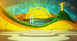
Rio 2016
![]()
We’ve already discussed NBC’s Rio Olympics logo in depth, but it’s still worth noting that this Olympics logo takes on a decidedly different approach.
First one, it’s one of the first that we’ve seen from NBC that didn’t incorporate any blatant local imagery such as local landmarks or landscapes.
The color palette, however, mirrors that of the Brazilian flag and the organic “pebble” shape speaks to the natural beauty of the country.
The Rio logo is also sheds the “heroic” feel of that many past logos include through the use of a shield outline, sharp metallic themes and decidedly pointed lettering and other graphical elements.
Sochi 2014
![]()
For Sochi, NBC captured the Russian mountains found near the resort city that played host to the games, all of which was housed in a shelf-shaped outline. The icy motif of that year’s graphics package is incorporated through the logo’s design.

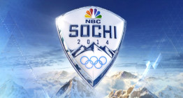
The graphics’ triangular shapes are also hinted at with the sharp point at the base of the shield shape, the mountain imagery and even the sharp “hooks” on the “S” and “C.”
London 2012
![]()
Two years prior to this, in London, NBC opted to use local architecture as its inspiration for the logo design. A similar shield shape to that used in Sochi was used, though softened slightly.
Although not all renditions were quite as simple as the one shown above, designers generally held back a bit on the 3D rendering and metallic light reflections.
The network also opted to use a more elegant serif typeface in the red banner that stretches across the shield. Behind this is a stylized rendition of the tower that houses Big Ben that uses strokes that start out thick and taper off in a pointed end, giving the logo a sense of movement.
A particularly nice touch of these strokes is how the lower portions of the tower trail off to create a neat negative space for the NBC logo.
Also found in the upper portion of the logo is a stylized nod to the host country’s Union Jack flag, which also played a prominent role in the inspiration of the network’s graphics package for this year’s games.
Vancouver 2010
![]()
Vancouver’s 2010 games marked the first appearance of the “shield” shape for NBC, though this one featured more rounded corners instead of the more severe sharp edges.
The sharp edges, however, were definitely prominent in the lighter blue banner that covered the midsection of the logo.
The banner took on a somewhat oddly distorted shape that worked well on the left side, where it matches the angles of the “V” — but the other side seemed a bit awkward with the negative space left by upper right portion of the “R.”
For local imagery, this logo used the outline of a mountain range, similar what would come in a few years for Sochi, though the latter’s were much more pointed and stylized.
It’s worth noting that the logo lacked any blatant references to Canada — whether it be the obvious maple leaf from the flag — or the red and white motif of the same.
Beijing 2008
![]()
Prior to Vancouver, NBC used more restrained designs for its broadcast Olympics logos. For 2008’s games in Beijing, the network managed to find an effective way to blend cultural references to the country’s famous Great Wall (it could also be read as representative of the Forbidden City), along with a bold red and gold palette drawn from the Chinese flag.
The illustration of the wall, meanwhile, doubles as a sort of arch that frames the upper part of the logo, including the curved top of the outline that anchors the entire design.
The result is a logo that’s definitely a non-traditional shape and, in some ways a bit imbalanced. However, the look still works well, and that imbalance not only makes the look eye-catching, but also adds a sense of forward movement to the look.
For the logotype, NBC used a customized typeface that manages to add a bit of the flair found in Asian lettering without taking it to an extreme — a decision that probably also helps keep it a bit more legible.
Torino 2006
![]()
For Torino (Turin), NBC stuck with a simple oval with a mountain motif. It seems that mountains are sort of the go-to imagery for winter Olympics logos. Though there’s nothing wrong with that per se, it’s also worth noting that the element is often used in lieu of any local or cultural imagery that’s unique to that country and more recognizable.
In fairness, looking back at the last few years of winter games, the cities selected don’t exactly have any obvious iconography that would be readily recognizable to an American audience.
Athens 2004
![]()
In 2004, NBC’s logo used a rectangle with a curved bottom. In this design, the NBC peacock and gold Olympic rings under compete a bit with the icon of a Greek building above it. The typography here is also a bit weak, but does have some subtle hints to stereotypical Greek lettering without being difficult to read.
Salt Lake City 2002
![]()
Salt Lake City’s 2002 logo included the mountain imagery that all of the subsequent Winter games would use, though it did add a horizontal gradient that is likely representative of the city’s namesake lake.
This logo would also mark the return of the typography used in the previous games in Sydney, albeit in a bolder rendition.
Sydney 2000
![]()
In Sydney, the logo centered around a stylized reference to the famous architecture of the Sydney Opera House, which was positioned to appear to “sprout” out of the feathers of the NBC peacock.

tags
2012 Summer Olympics, 2014 Winter Olympics, 2016 Olympics, 2016 Summer Olympics, 2018 Winter Olympics, 2020 Summer Olympics, 2022 Winter Olympics, 2024 Summer Olympics, logo design, logos
categories
Branding, Broadcast Design, Heroes, Olympics