Oxygen rebrands as crime focused network with bold new look

Subscribe to NCS for the latest news, project case studies and product announcements in broadcast technology, creative design and engineering delivered to your inbox.
Oxygen, originally conceived as a softer network focused on programming for women, has pivoted to offer a slate of crime-focused programming — and along with that change comes a hard-hitting new look, reports The Hollywood Reporter.
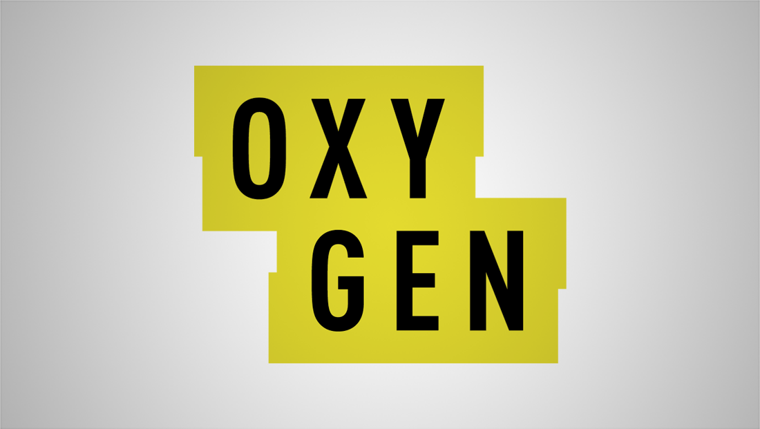
The network’s new logo, from designer Trollbäck+Company, splits the word “Oxygen” in two — right down the middle between the “Y” and “G” — and places the tall, bold black letters inside of two jagged rectangles.

This “arresting new look,” as the network refers to it, includes a color scheme is reminiscent of both crime scene tape and yellow highlighters used by investigators.

The network’s sizzle reel, meanwhile, focuses on the storytelling aspects of true crime programming, with scenes depicting the storyline of a crime — from the act itself to the criminal justice system.

The style of the new brand is decidedly different from the network’s original focus on softer storytelling — incorporating hard hitting music and gritty imagery.
The NBCUniversal owned network worked with Trollback+Company to create a branding campaign that would emphasize the network’s refocus while still appealing to the younger, female demographic the network targets.
In a somewhat interesting move, the network has set up separate social media accounts on most major platforms for the new brand. For example, while @Oxygen remains a registered Twitter handle boasting the network’s old logo, users are pointed to @OxygenCrime.
Subscribe to NCS for the latest news, project case studies and product announcements in broadcast technology, creative design and engineering delivered to your inbox.


tags
logo design, NBCUniversal, Oxygen, Trollbäck+Company
categories
Branding, Broadcast Design, Graphics, Heroes