‘Jeopardy!’ sticks to 3D models, adds nods to iconic gameplay elements
Subscribe to NCS for the latest news, project case studies and product announcements in broadcast technology, creative design and engineering delivered to your inbox.
One unfortunate trend that continues, however, is the mishmash of fonts used throughout the show.

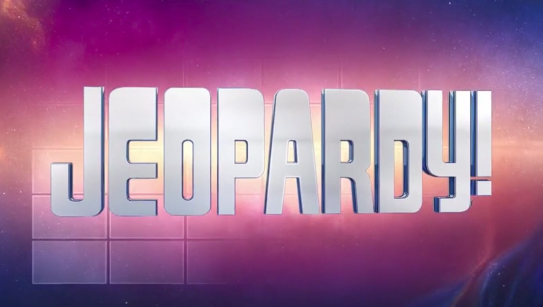
The show’s iconic custom, top-heavy logotype has been a staple of the look for decades.

Korinna, notable for its unique capital “U,” has been used in all caps for clue text for decades as well.

Optima, meanwhile, is used to show the Final Jeopardy! clue on screen as the famous “think music” plays — even when the clue is visible in Korinna on the game board in the background.


Category names are rendered in variations of a Helvetica-ish font.

Different weights and widths of a Helvetica-ish font also find their way in on the “frames” used during contestant introductions, including a rather awkward collection of three different ones for returning champions.

The video and audio Daily Double screens have traditionally used a script typeface of some type, and this season’s graphics are no exception. The actual “Daily Double” text, however, appears to be in a Helvetica-ish font, whereas in the past it was rendered in yet another typeface.

“Jeopardy!” did manage to eliminate one font from its repertoire this season by switching its closing credits to Korinna, a smart move that added an element of consistency, whereas last season an additional typeface was used:

Subscribe to NCS for the latest news, project case studies and product announcements in broadcast technology, creative design and engineering delivered to your inbox.

tags
fonts, Jeopardy!
categories
Branding, Broadcast Design, Broadcast Industry News, Featured, Game Show Set Design, Graphics, TV News Graphics Package, TV Show Production Design