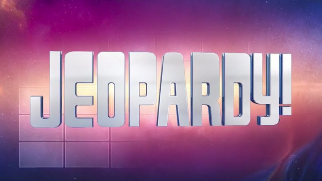
‘Jeopardy!’ sticks to 3D models, adds nods to iconic gameplay elements

Subscribe to NCS for the latest news, project case studies and product announcements in broadcast technology, creative design and engineering delivered to your inbox.
Quiz show “Jeopardy!” kicked off its 34th season with a new graphics package that continues the use of 3D models introduced last season while also mixing in references to its classic “in the form of a question” format and iconic game board.
“Jeopardy!” typically receives a new graphics package every season, so the changeover is no surprise.
What is unique about the new look, however, is that the show’s intros vary from day to day to include a different collection of 3D models representing a variety of topics.
While each 3D model, which range from buildings to leafs to microscopes to boats and planes, appears on screen, floating text “questions” related to the theme of the item appear on screen as well, a nod to the show’s infamous “in the form of a question” format.
Last season, “Jeopardy!” used a series of 3D models, each contained in a glasslike cube, as the camera “flew” through the 3D space before eventually transitioning to the show’s logotype floating above what appeared to be liquid, though this open used the same images for every episode.
In the season before that, Season 32, the show used a set series of still photographs that appeared on the “walls” of a 3D hallway that the camera wandered through before the show logo appeared, so in a way the Season 34 open is the result of a three-year evolution of design.

Another prominent design motif of this year’s graphics is the 6×6 rectangular grid of the show’s video panel game board representing the six categories across, five clues down plus the topmost screen for the category name.
In the graphics package, the game board is simplified with subtle, transparent glass-like rectangles with thick borders and finds its way into almost every graphical element, including the title card, Daily Double OTSs and the frames that appear during contestant introductions.
The overall color schemes of the package remains similar to last season’s, with blues, violets and hints of gold remaining the predominant palette, with subtle arches, light bursts and star-like elements suggestive of outer space blended in.
The show did not, however, update its set — though it typically only does this every few years, which may explain why the color palette remains similar. The set’s black curved elements are also hinted at in some of the graphics.
Subscribe to NCS for the latest news, project case studies and product announcements in broadcast technology, creative design and engineering delivered to your inbox.


tags
fonts, Jeopardy!
categories
Branding, Broadcast Design, Broadcast Industry News, Featured, Game Show Set Design, Graphics, TV News Graphics Package, TV Show Production Design