‘MTP Daily’ gets mothership’s new look

Subscribe to NCS for the latest news, project case studies and product announcements in broadcast technology, creative design and engineering delivered to your inbox.
“MTP Daily,” the weekday political show on MSNBC that shares branding elements and a host with “Meet the Press,” took on its “parent” show’s new look Tuesday.MTP Daily
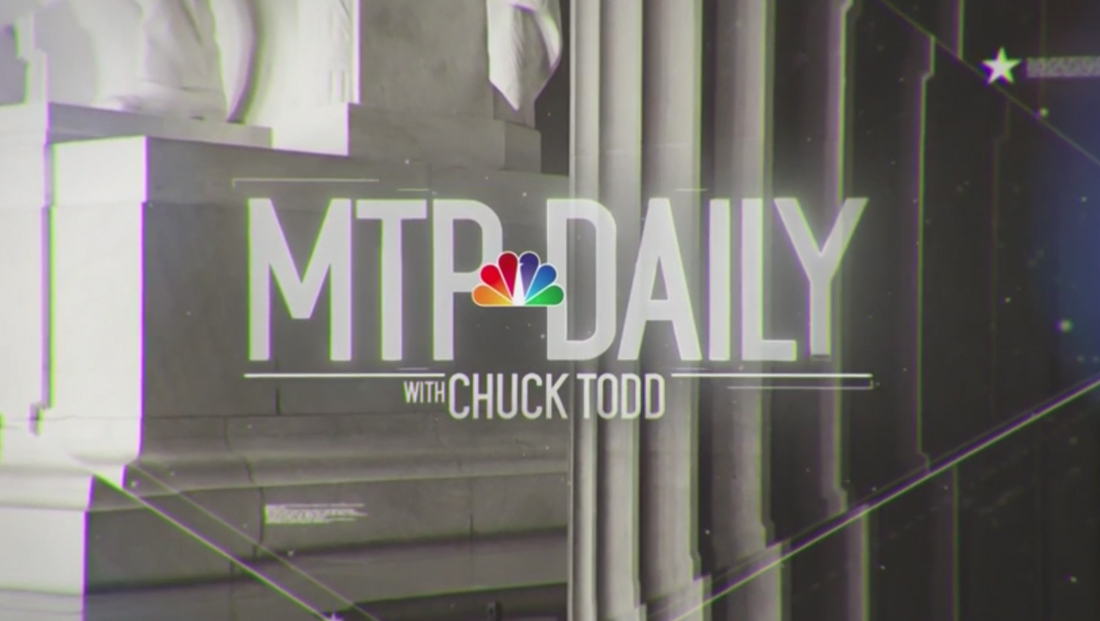
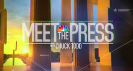
The show, which airs on the NBC owned cable network, has a new logo that matches the typography used in the new look that the venerable “Meet the Press” debuted Sunday.
“MTP Daily” is now using an open that replicates the “faceted” design motif of “Meet the Press” that emphasizes thin angles, stars and microtext but exchanges the morning-centric imagery for alternate D.C.-centric scenes.
Emphasizing its connection to “Meet the Press,” the show’s open briefly displays the full version of the “Meet the Press” logo before the letters “shuffle” around to form the new “MTP Daily” logotype, which also boasts the NBC peacock between the two words and host Chuck Todd’s name below.


The new open also ends on the same flourish of music, though instead of the gold NBC peacock wipe, the letters “MTP” are used.
The show’s insert graphics were also updated to use a similar bold blue and gold color scheme within the standard MSNBC design.


The show, which originates from the same set as “Meet the Press,” also got an overhaul to its on-set graphics, with the new logo and video wall background featuring the “faceted” look that matches the rest of the show’s graphics.
Subscribe to NCS for the latest news, project case studies and product announcements in broadcast technology, creative design and engineering delivered to your inbox.


tags
chuck todd, meet the press, MSNBC, MTP Daily
categories
Branding, Broadcast Design, Graphics, Heroes