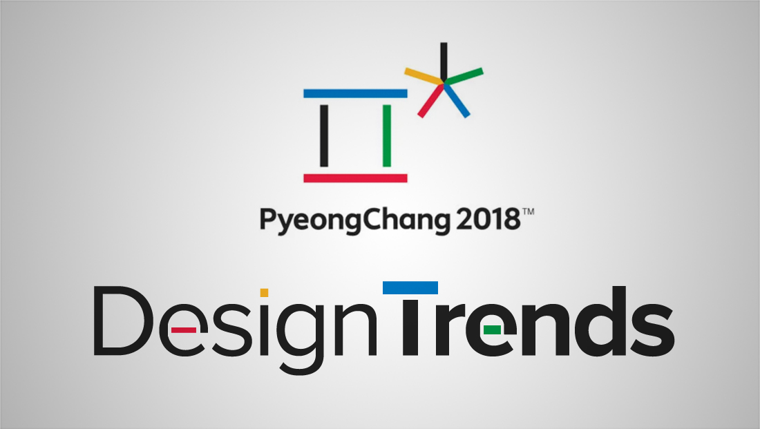
Exploring broadcast design trends from the PyeongChang Olympics
Weekly insights on the technology, production and business decisions shaping media and broadcast. Free to access. Independent coverage. Unsubscribe anytime.
Typography
Typography by itself was used frequently throughout PyeongChang broadcast design. Animated illustrations, which tended to incorporate polygonal facets, was also a big trend for the 2018 Olympics.
[picbox id=”63857″ caption=”NBC used the font Nexa for much of its on air look — including a bold and custom styled logotype.”]
[picbox id=”63531″ caption=”France Télévisions relied on a simple typographic, color coded look that was accented with simple graphical elements.”]
[picbox id=”64179″ caption=”Eurosport used a mix of bold colors, typography in a variety of styles and geometric shapes in its PyeongChang look.”]
[picbox id=”63830″ caption=”Australia’s Seven went with a mostly geometric and typography look — one that included bright, bold color combinations to break up the sea of blues, whites and other cooler shades.”]
Illustrations
[picbox id=”61695″ caption=”Leading up the Olympics, the CBC created a trailer that artfully blended sound, illustrations and live footage.”]
[picbox id=”63262″ caption=”In perhaps one of the most standout examples of illustrative animation, the BBC created an interesting open that combined sports figures with surreal elements — including eyeballs peeking out from the snow.”]
[picbox id=”63719″ caption=”In addition to being a good example of simple typography, Al Jazeera’s look also managed to combine the geometric, polygonal trend as well in its animated, action packed open.”]

[picbox id=”62718″ caption=”Meanwhile, the Olympic Broadcast Service also continued its trends of using an animated open with a highly illustrative feel — while also incorporating geometric elements as well.”]

tags
2018 Winter Olympics, Pyeongchang, PyeongChang Olympics, PyeongChang Winter Olympics, sports augmented reality, temporary set design, temporary studio
categories
Augmented Reality, Virtual Production and Virtual Sets, Branding, Broadcast Design, Heroes, Olympics, Set Design