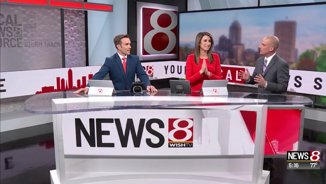
Indianapolis station gets $1.5 million makeover

Subscribe to NCS for the latest news, project case studies and product announcements in broadcast technology, creative design and engineering delivered to your inbox.
In addition to the new set and studio overhaul, which the station says involved a $1.5 million investment from parent company Nexstar, the station also updated its graphics package.

The new look is centered more on red and white than the yellow found in the old look and the station’s logo, and, while it retains 3D elements, the overall look is a bit flatter than before.
Many of the new graphics use dramatic or abstract angles of the station’s familiar “8” icon while also blending in lines, blocky segments and triangular accents.
In addition, the station’s “24 hour” clock motif with hash marks makes appearances as well.
The station also moved its bug to the right side of the screen, while lower third insert graphics appearing next to it are simple and clean.

Subscribe to NCS for the latest news, project case studies and product announcements in broadcast technology, creative design and engineering delivered to your inbox.


tags
Digital Video Group, indianapolis, Lighting Electric and Grid Systems, Nexstar, Nexstar Media Group, Scott Weaver, video ribbon, wish
categories
Branding, Broadcast Design, Broadcast Industry News, Featured, Graphics, Set Design