
ABC gets new ‘Aperture’ branding, tagline for new TV season
Weekly insights on the technology, production and business decisions shaping media and broadcast. Free to access. Independent coverage. Unsubscribe anytime.
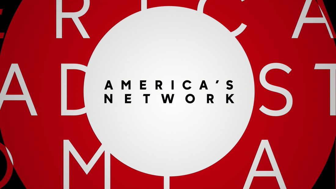
ABC has switched its tagline to “America’s Network” — a slogan inspired by the company’s original name of “American Broadcasting Company” and similar to its previous tagline of the company name turned into a possessive: “America’s Broadcasting Company.”
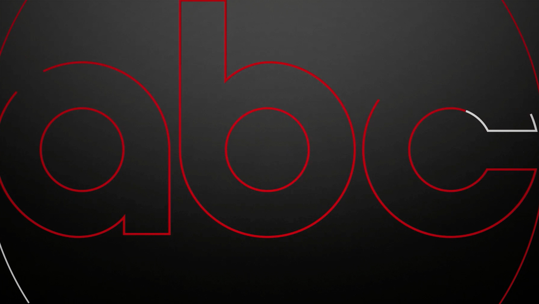
Thanks to its lens-inspired look, the new motif embraces circles and ring segments that also mirror the network’s circular globe logo with custom, curved lettering. This also appears, in outline form, as part of the new branding animation.
In addition to graphical elements, typographic accents can also be placed along a curved path to match the shapes on screen.
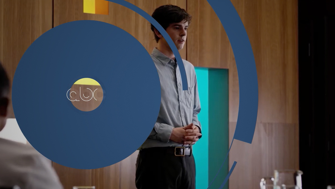
The new brand identity package is designed to be flexible enough to have its color palette updated to match any show’s color palette — while the bold typography is clean enough to work with each show’s logotype and still remain distinctive.
![]()
Curved accents can also be placed in the corner of the screen along with typography highlighting stars’ names.


The mood and genre of each show can be represented with either a “snappy” uptempo style or dramatic look that incorporates wider typographic tracking with smaller point sizes.
“The animation is graceful and deliberate emphasizing the genres it is paired with,” says the creative brief.
The “Aperture” look has already started to make appearances during the network’s summer programming, including in promotions for the upcoming fall debuts.
ABC has retained “Heroes,” Matthew Kajcienski’s brand song it introduced in 2015.
The New Blank previously worked with ABC on design projects for “American Idol,” the Oscars, and also created coordinating print assets for the new look.

tags
ABC, The New Blank, Trollbäck+Company
categories
Branding, Broadcast Design, Broadcast Industry News, Graphics, Heroes, MoGraph, Network Branding, Networks