WaPo takes on ‘sassy, self-aware, snarky’ ‘chyrons’
Weekly insights on the technology, production and business decisions shaping media and broadcast. Free to access. Independent coverage. Unsubscribe anytime.
The Washington Post takes a look at the world of “chyrons” and the not-so-subtle effect they have in the world of TV news.
The label “Chyrons” derives its name from the the company that created some of the first software to insert text over television images, which is now known as ChyronHego — but generically the graphics are known as lower thirds, banners, fonts, bands and numerous other terms.
.@WashingtonPost takes a look at the 'sassy' world of 'chyrons' https://t.co/mlR7DAidlM pic.twitter.com/7YYW0LY86n
— TVNewsMix (@TVNewsMix) October 5, 2018
In its story on lower thirds, The Washington Post not only uses an animated GIF to showcase the idea of increasing graphic overload, but also, as the user scrolls down, adds a CNN-eseque lower third element complete with a time bug along the bottom of the browser window.
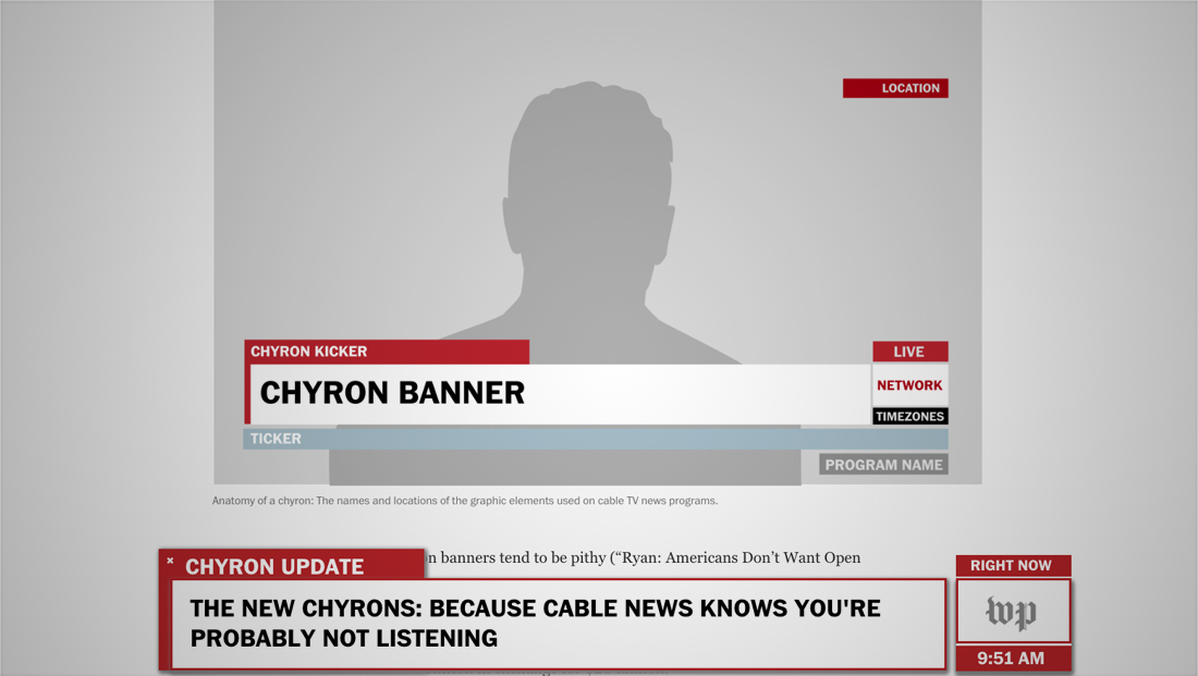
These lower thirds, unlike their real-life counterparts, can be closed thanks to a little “×” (though we’re betting some viewers would love the ability to “X-out” lower thirds.
The article also includes a helpful “anatomy of a chyron” chart — which also takes on a very CNN-like look.


tags
chyron, ChyronHego, lower thirds, the washington post
categories
Broadcast Design, Broadcast Industry News, Cable News, Featured, Graphics