Australia’s ‘Today’ gets glassy new look
Weekly insights on the technology, production and business decisions shaping media and broadcast. Free to access. Independent coverage. Unsubscribe anytime.
Like its American counterpart with the same name, Australia’s Nine Network debuted a new look for its “Today” show to kick off 2019.
The show also unveiled a new anchor lineup as part of an attempt to fend off declining ratings that apparently hasn’t helped.
This isn't good news for Australia's @TheTodayShow https://t.co/nQ0rxIIPOy
— TVNewsMix (@TVNewsMix) January 15, 2019
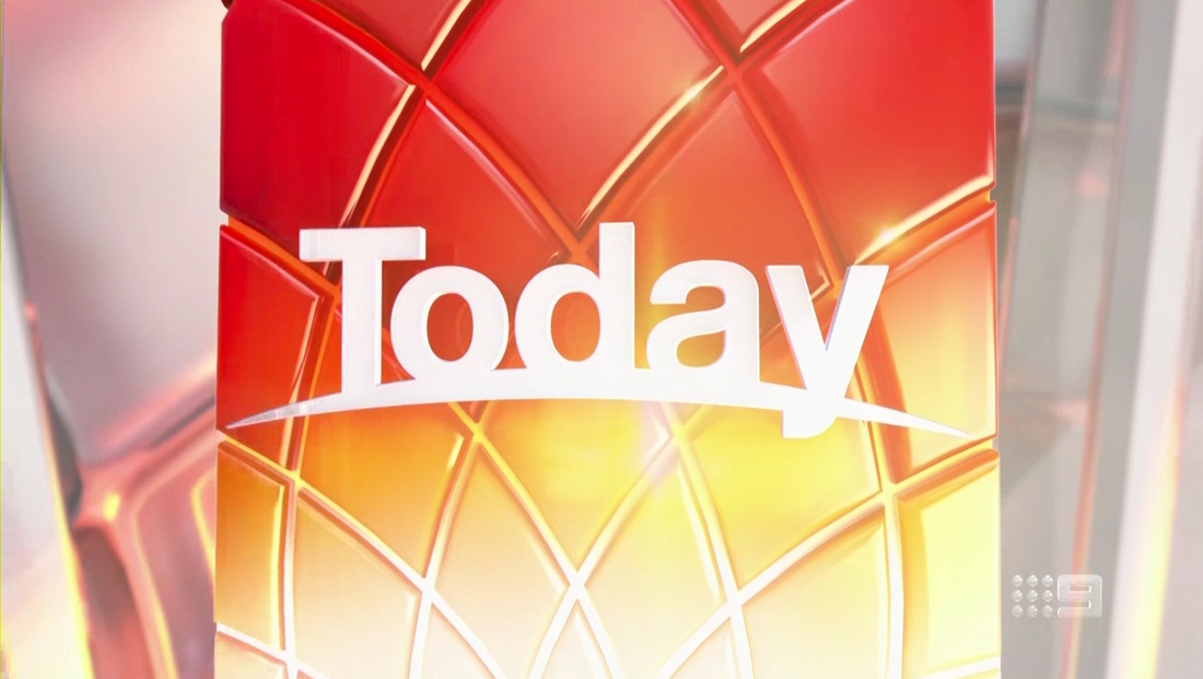
For the new look, the show retained its familiar logotype with curved underline as well as reimagining the curved petal pattern used behind its title.


The previous ‘Today’ logo featured the same logotype as the new look and also laid the groundwork for the arc pattern found in the new look.
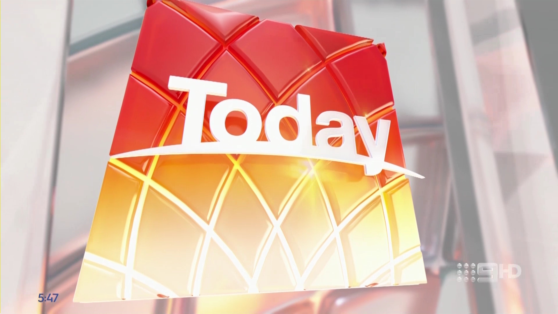

The new look, much like its parent network’s logo, takes on a glassy, gel-like look. The curved pattern background appears in red and gold in the logo — now in white — used in the show’s titles as well as in more muted tones in the backgrounds. Meanwhile, the curves in the arc pattern have become much more pronounced — whereas before they were more suggested by thin, muted lines, they now appear as thick glassy-edged bevels in the new look.
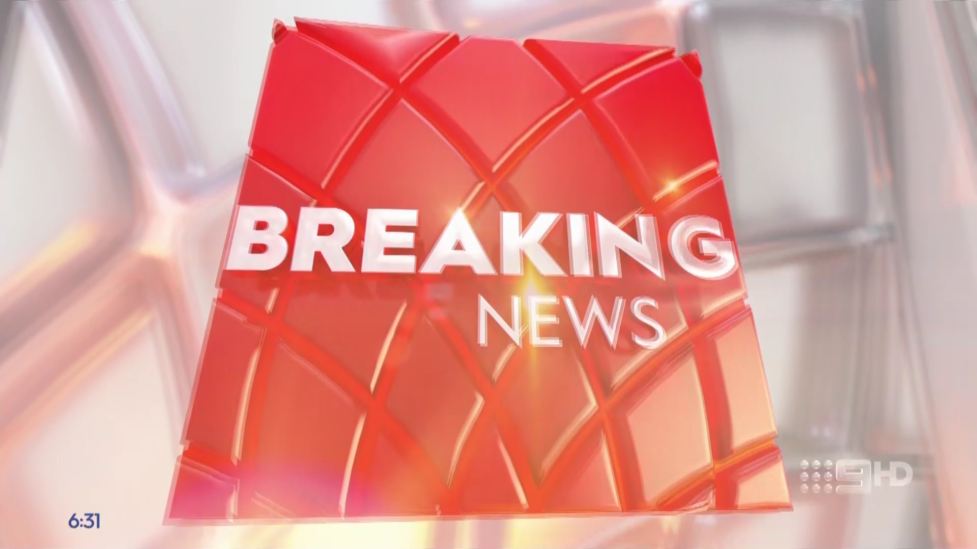

The box and arc motif is also used in segment stingers, including breaking news. The color scheme of the breaking news look is more red — with a gold light burst accenting the screen.
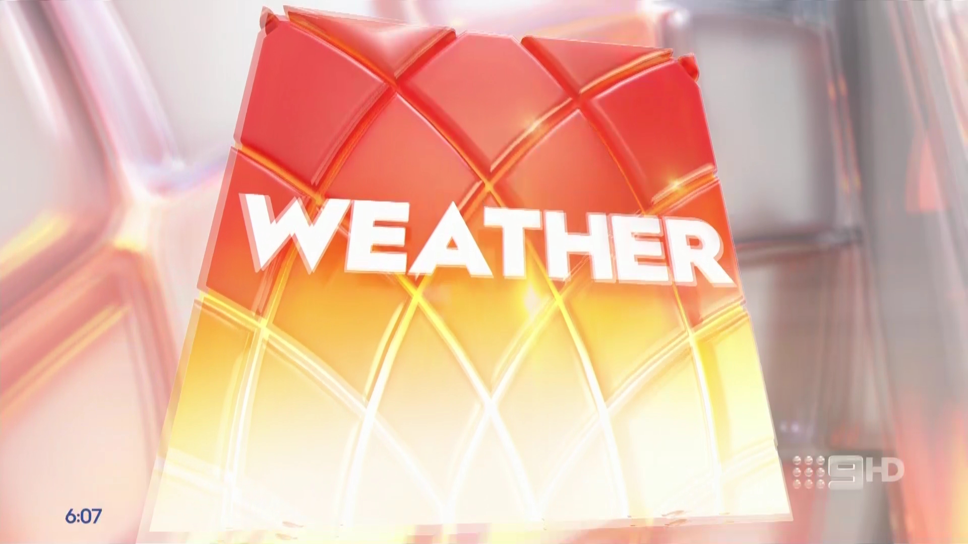

In addition to suggesting the paths of light in a sunrise, the now more prominent pattern also conjures imagery of petals or scales.
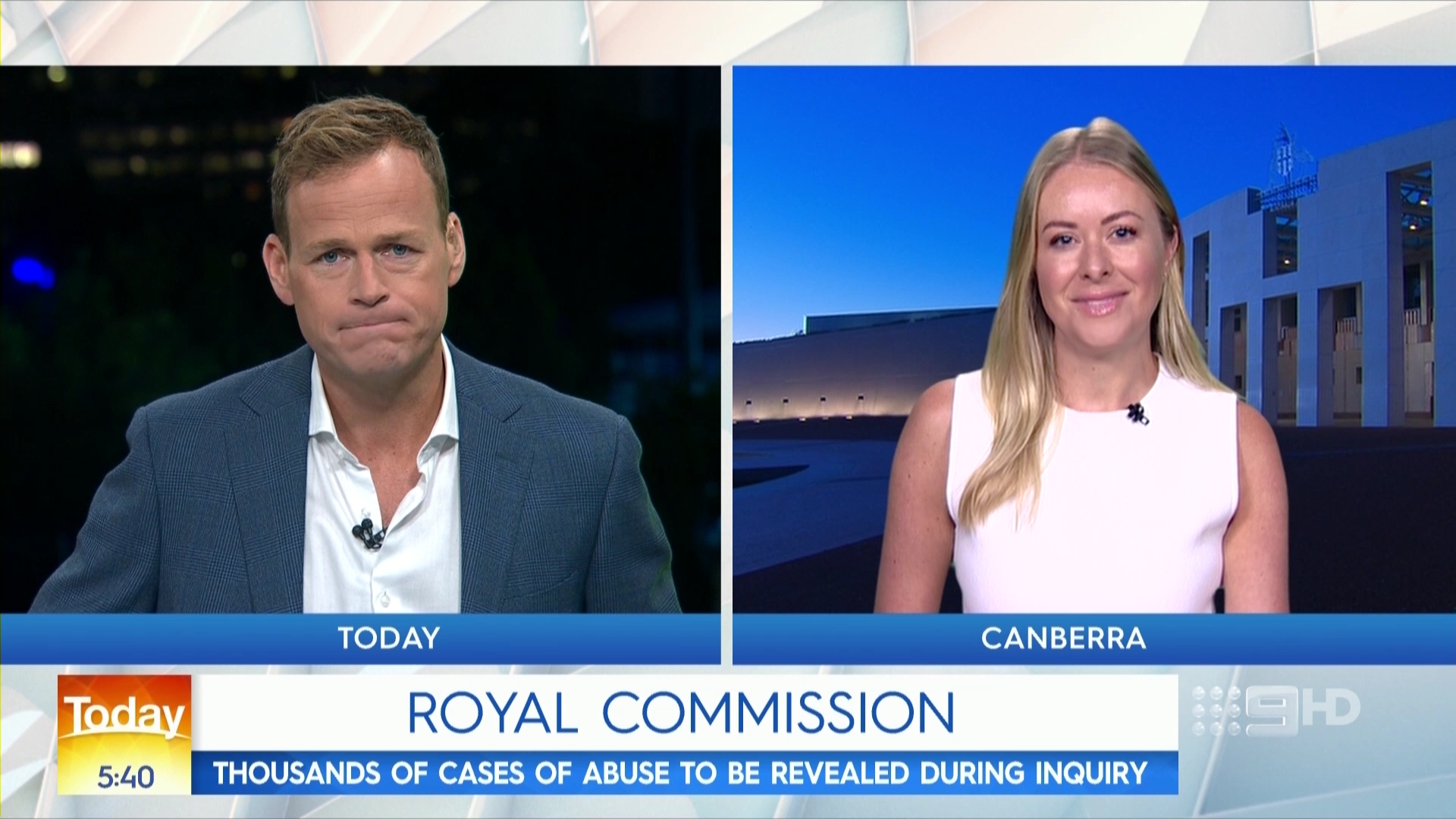

For lower third insert graphics, a much flatter look is used — with a mix of blue and white and clean typography. Blue backgrounds in the look used a subtle gradient, while the glassy arches of the pattern appearing in the background of most fullscreen elements.


For breaking news, the lower third inserts add a red top line with ‘breaking news’ repeater and red second tier below.
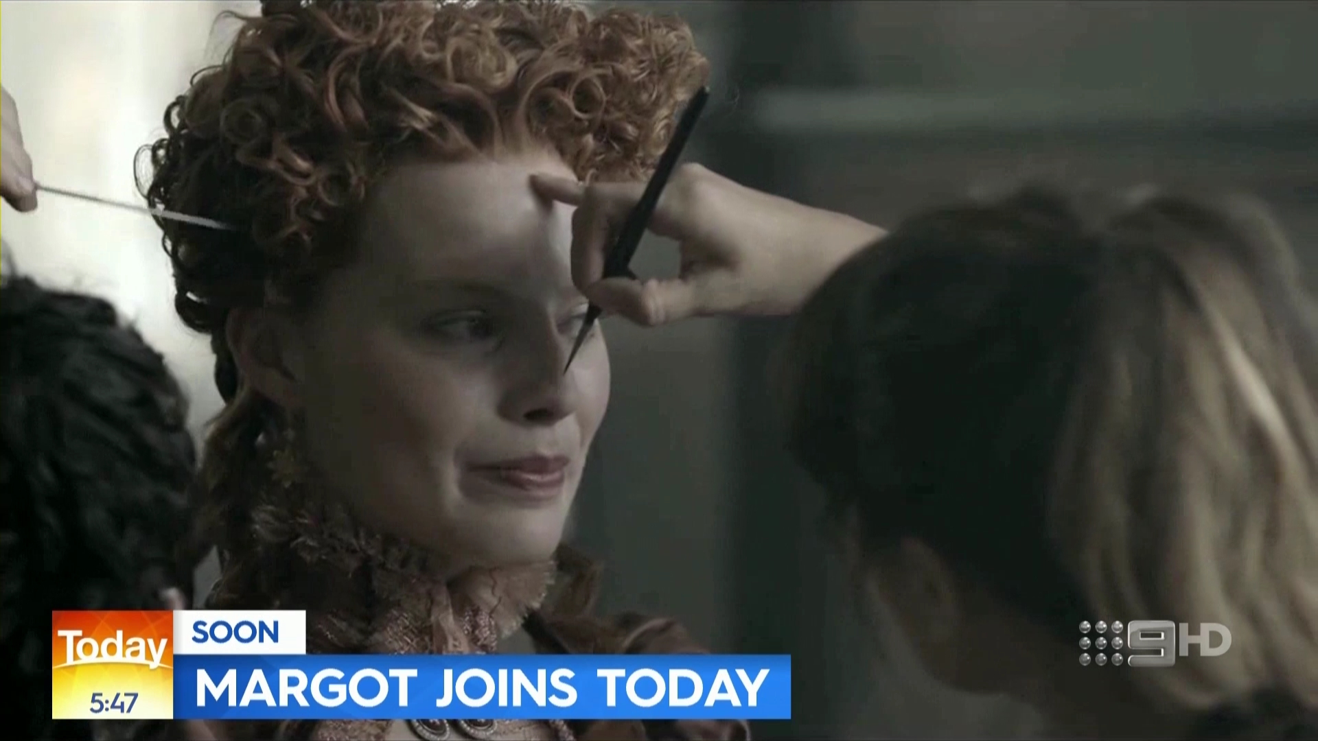

For teases, the blue and white bars swap places. In addition to the lower thirds, the show has also redesigned its bug to mirror the square shaped used in titles and stingers, but with the more subtle arc pattern previously used in the background — a move that makes it easier to see the show’s logo and current time.
Screen captures courtesy Media Spy.


tags
logo design, Nine Network, Today (Australia)
categories
Branding, Broadcast Design, Broadcast Industry News, Graphics, Heroes, MoGraph, TV News Graphics Design, TV News Graphics Package, TV News Motion Graphics Design