A look back: Weather Channel graphics of the past
Weekly insights on the technology, production and business decisions shaping media and broadcast. Free to access. Independent coverage. Unsubscribe anytime.
They’ve come a long way.
After The Weather Channel introduced another round of graphics updates Tuesday, Aug. 21, 2019, here’s a look back at some of the network’s vintage looks.
It’s worth noting that the look of local inserts may have varied per market, because cable and satellite operators may have updated the hardware that generates local forecasts, WeatherScan (and later IntelliStar), at different times.
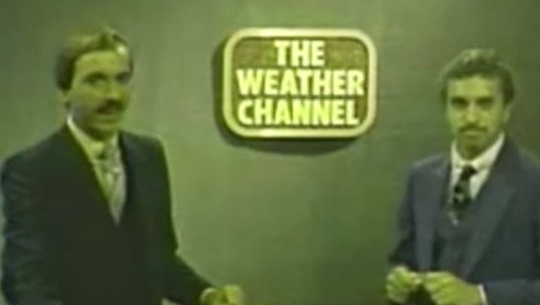
This 1982 image, which re-aired on the Weather Channel, shows the network’s original look when it launched. Image courtesy Regulus Star Notes
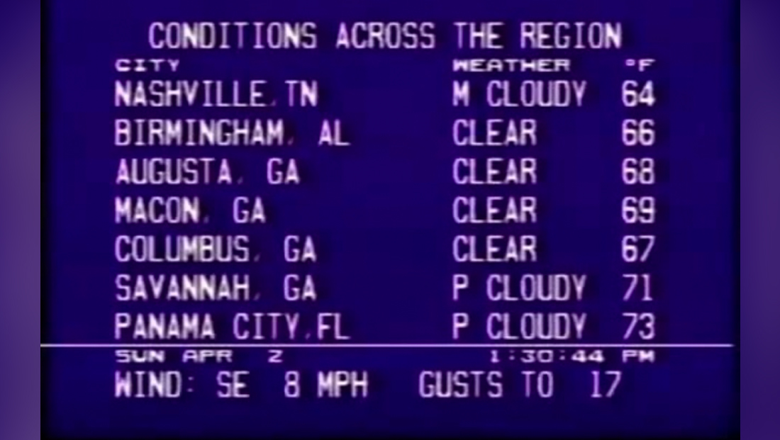
This 1989 image shows a very low-tech graphic used in some regions at the time.
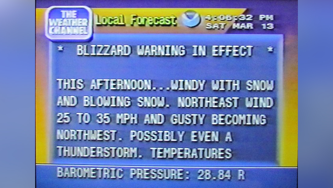
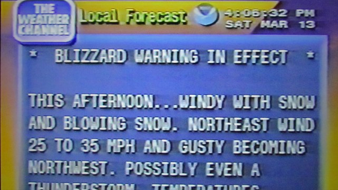
This 1993 image from the National Weather Service shows a slightly updated look that uses a bright gold and blue gradient effect.
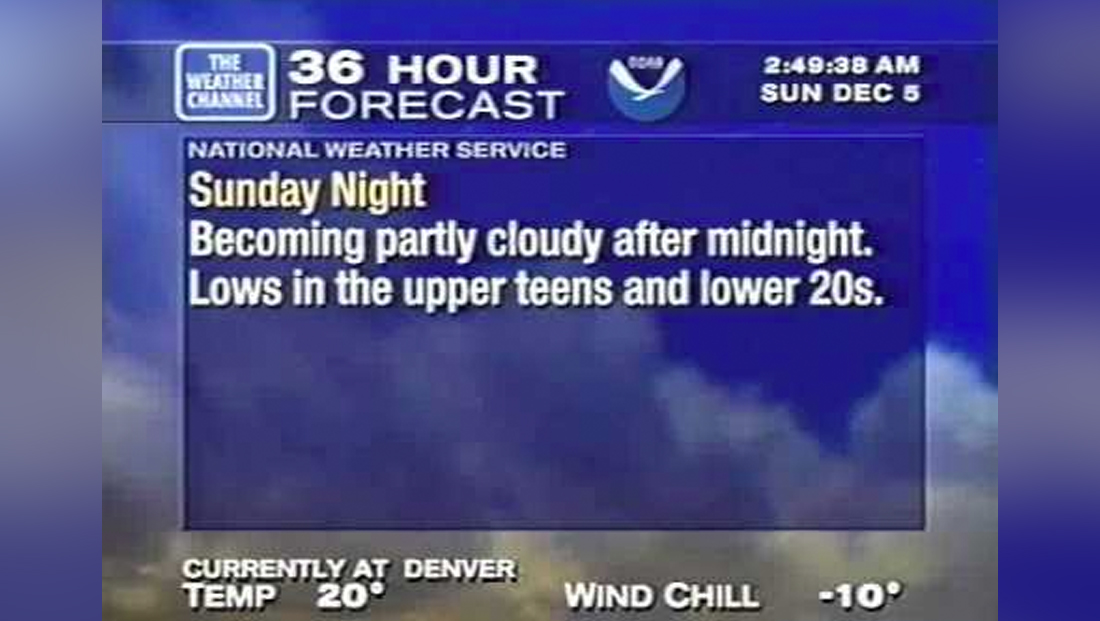
This 1999 graphic from the Denver market and posted to YouTube, shows the network’s shift away from the ‘8 bit’ style font.
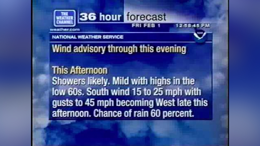
This 2002 image from YouTube shows an updated look with more clouds, removal of any hint of gold in the background and a redesigned header that uses a white gradient.
This 2005 graphic shows a new version of the header that continues to the use the white gradient look. The look also switched to a new typeface. Image courtesy Brandon Notices
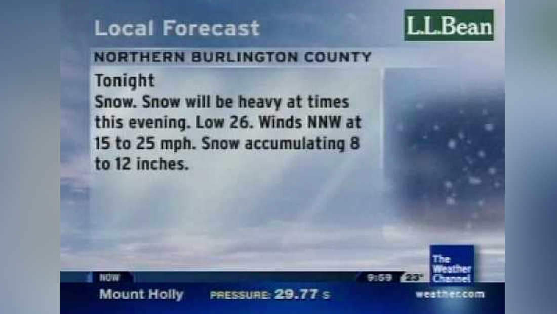
This 2009 graphic from YouTube showcases a softer look that uses more gradients.

tags
the weather channel, Weather
categories
Branding, Broadcast Design, Broadcast Industry News, Featured, Weather