
Fox’s 2019 branding uses shapes to create geometric ‘tableaus’
Weekly insights on the technology, production and business decisions shaping media and broadcast. Free to access. Independent coverage. Unsubscribe anytime.
For the 2019 TV season, the Fox broadcast network has rolled out a new look from Trollbäck+Company that uses bold, geometric patterns and animations to reimagine the shapes in its logo to create subtle “scenes” connected to its programming.
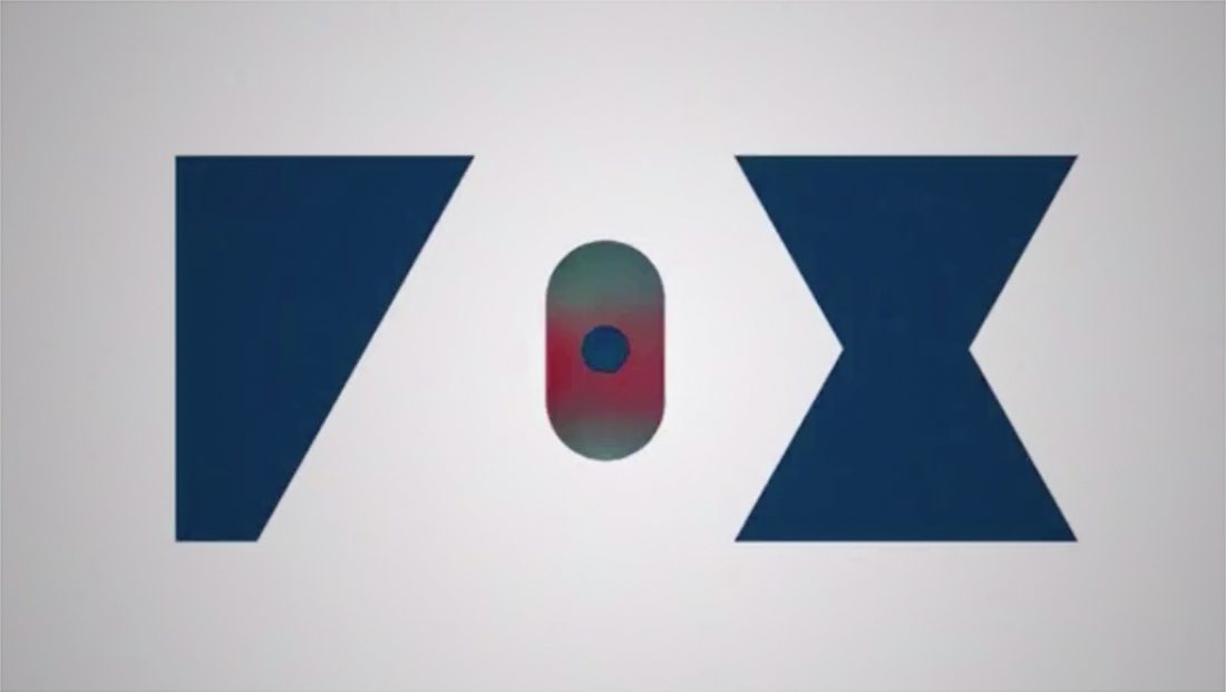
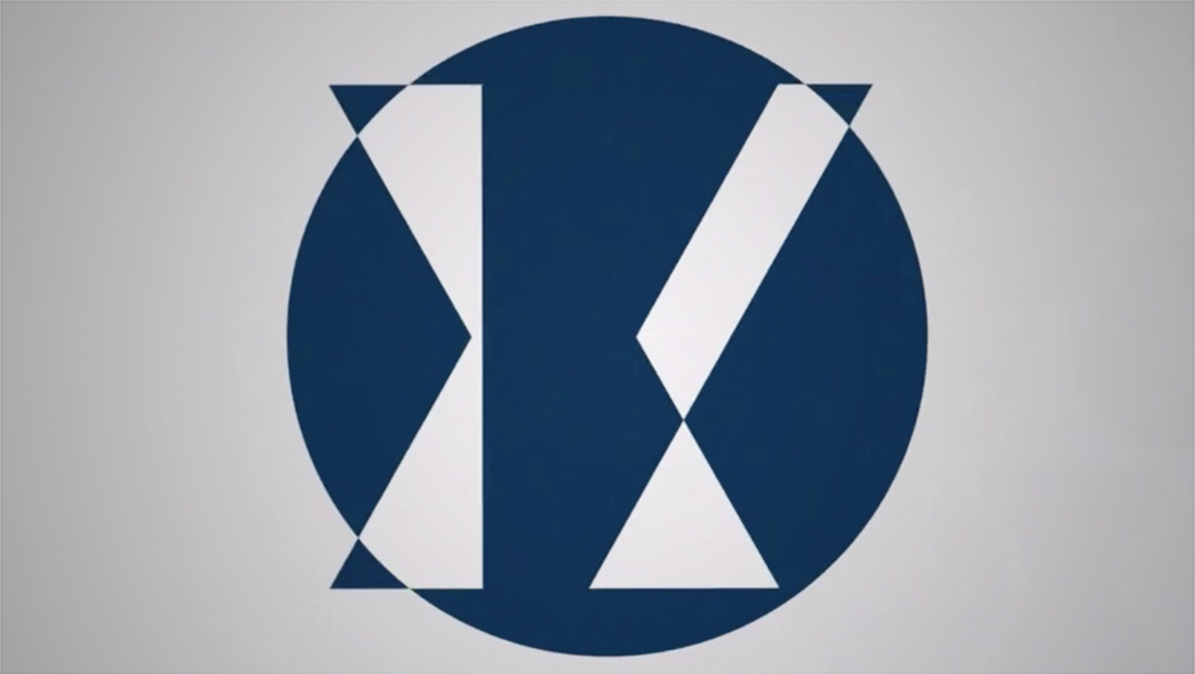
One of the foundations of the new look is a sort of “simplified” version of the iconic Fox logotype — with its prominent “O” with tall, skinny center — as an angled polygon, simple circle and hourglass shaped outline, a shape that roughly still manages to convey the network’s name despite there only being the “suggestion” of letters.
Meanwhile, both these elements and the full logotype are animated in a variety of ways in the network’s slew of promos for new and returning programming.
For example, for the musically-themed ‘Empire,’ the ‘O”‘ becomes enlarged with the center segment spinning around — perhaps suggestive of a phonographic record, an element also featured prominently in the show’s logo design and key art. Many of the network’s dramas also use a dark color palette in these short animated segments.
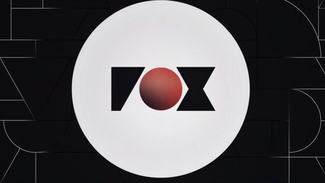
For ‘Prodigal Son,’ the design includes a red circle that matches the show’s crossed logo design and color scheme — and is suggestive of both the ‘Os’ in the title’s two names and the homonymic spelling ‘sun.’ Also included is a thin pattern of lines mirroring the shapes found in the logo.
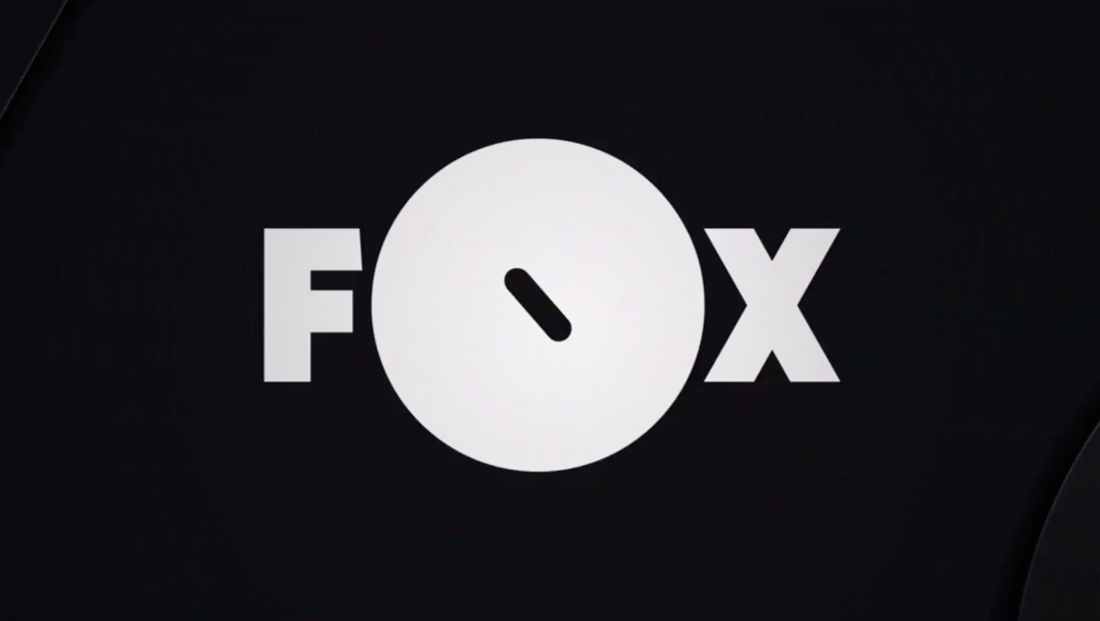
‘9-1-1’ uses a version that has a small, circular ‘blip’ — perhaps representative of a call or ‘ping’ for help — form inside the pill shaped center of the ‘O’ (a ringed life saver?) before it rotates into the full letter.
‘Almost Family,’ which centers around a fertility doctor, uses the shapes to form imagery suggestive of the letters X and Y (as in chromosomes), plus double helixes of DNA and even microscopic human eggs.
‘The Resident’ uses sharper angles and wedge-shaped segments that could be suggestive of sharp medical instruments and measurements, flashing sirens or even the international radioactive symbol. It also sticks with the black color scheme of other dramas.
Animated ‘Bless the Harts’ starts with two pointed elements — perhaps suggesting the bottom of the traditional heart shape — before the ‘O’ ends up atop a vertical rectangle (a person?) before it ‘flops’ into place in the middle and the ‘F’ ‘grows’ its horizontal bars. The background features a splattering of squares, triangles, polygons and circles, which may be meant to represent the cluster and, perhaps, disorder of family life.
In addition to the fullscreen animations, Fox also uses matching animations in its network bug that appears in the corner of the screen.
The network has also adopted a new, narrow typeface that contrasts with the widely spaced letters in its logotype — and is perhaps a nod to the narrow “hole” in the middle of the “O” — to insert promotional text overlays near the bug.
In addition, the typography is typically accented with an animated arrow element borrowed from the negative space at the top and bottom of the “X.”

tags
Branding, Fox, logo design, Trollbäck+Company
categories
Branding, Broadcast Design, Heroes, Network Branding