NESN launches new logo, branding

Subscribe to NCS for the latest news, project case studies and product announcements in broadcast technology, creative design and engineering delivered to your inbox.
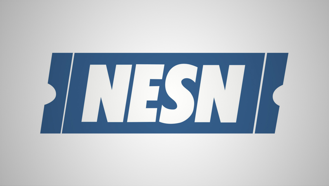
New England Sports Network, more commonly known as NESN, has unveiled a new brand and logo design from the same firm that created the NBC 2020 Tokyo Olympics design.
The change means the network is shedding its “ticket” logo that dates back to 1986, replacing the original logo it used for approximately two years before that.

For the new look, NESN restyled its acronym with a clean, geometric typeface with custom sharp “points” removed from the downward upper left to lower right angle.
Above this, is a glyph formed from strong diagonals with curved tips that’s suggestive of the letter “N,” rolling hills or waves (whether water or over the air waves or signals).
The curved “peak” and “valley,” meanwhile, could also be read as a new take on the half moon notches on either side of the ticket shape.

The glyph can also be scaled up as an oversized graphical element that serves as an “opening” for action shots and imagery.
The new look was designed by Mocean, a Los Angeles based agency that also created NBC’s 2020 Tokyo Olympics logo.

Other elements released by NESN include dramatic stadium and arena inspired environments.

Large “billboard” scenes accented with foggy lighting and bright team color accents are used.
NESN plans to update its on air look as well as its website and apps with the new look.
While the new logotype itself now sits perpendicular to the baseline, the angle from the ticket lockup is carried through in the updated glyph.
While the image of a ticket was a natural choice back in the late 1980s when it was originally designed, paper tickets are increasingly rare in today’s world.
That said, the half circle notch look is still used in many mobile digital ticketing apps.
By removing the obvious ticket reference, the network is also able to solidify its brand as a multiplatform experience that focuses beyond just games.
Subscribe to NCS for the latest news, project case studies and product announcements in broadcast technology, creative design and engineering delivered to your inbox.


tags
logo design, Mocean, nesn
categories
Branding, Broadcast Design, Broadcast Industry News, Featured, Graphics, Sports Broadcasting & Production